
 資料結構
資料結構 網路
網路 關係資料庫管理系統
 作業系統
作業系統 Java
Java MS Excel
 iOS
iOS HTML
HTML CSS
CSS Android
 Python
 C 語言程式設計
 C++
C++ C#
C# MongoDB
 MySQL
MySQL Javascript
 PHP
PHP 物理學
物理學 化學
化學 生物學
生物學 數學
數學 英語
英語 經濟學
經濟學 心理學
心理學 社會學
社會學 服裝設計
服裝設計 法律研究
法律研究Bootstrap 中響應式圖片及示例
Bootstrap 是一款前端框架,這意味著它在客戶端使用,而不是在伺服器端使用,並且它專門用於使用者介面和主題,設計使用者在網站或應用程式中看到的內容。
它包含程式碼片段以及 HTML、CSS 和 JavaScript。它用於構建響應式移動優先的 Web 應用程式和網站;移動優先是指首先針對較小的螢幕進行設計,然後逐步擴充套件到較大的螢幕。
在 Bootstrap 中,我們有不同的類來建立影像的其他外觀,並使其能夠根據其父類進行響應式縮放。
讓我們看看 Bootstrap 中可用於影像的一些類 -
.img-responsive - 透過將 class = .img-responsive 新增到 img 標籤來應用此類。它提供響應式影像,最大寬度為 100%,高度自動。
示例
<!DOCTYPE html>
<html>
<head>
    <!-- Using Bootstrap CDN -->
    <link rel = "stylesheet" href = "https://maxcdn.bootstrapcdn.com/bootstrap/3.3.6/css/bootstrap.min.css"/>
    <title>
        Responsive Image Example
    </title>
</head>
<body>
    <div class="container">
        <h3>Example of img-responsive class </h3>
        <img src="https://ymi.today/wp-content/uploads/2015/07/What-I-Learned-From-Minions-1024x423.jpg" class="img-responsive" alt="Responsive image">
    </div>
</body>
</html>
輸出

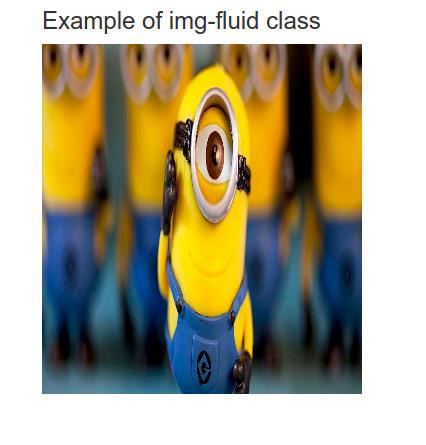
.img-fluid 類 - 此類提供 100% 的最大寬度和“自動”高度。
示例
<!DOCTYPE html>
<html>
<head>
    <!-- Using Bootstrap CDN -->
    <link rel = "stylesheet" href = "https://maxcdn.bootstrapcdn.com/bootstrap/3.3.6/css/bootstrap.min.css"/>
    <title>
        fluid Image Example
    </title>
</head>

<body>
    <div class="container">
        <h3>Example of img-fluid class </h3>

        <img src="https://ymi.today/wp-content/uploads/2015/07/What-I-Learned-From-Minions-1024x423.jpg" class="img-fluid" alt="fluid image"
        height="350" width="320">
    </div>
</body>
</html>
輸出
.img-thumbnail 類 - 此類為影像提供 1px 的圓角邊框。
示例
<!DOCTYPE html>
<html>
<head>
    <!-- Using Bootstrap CDN -->
    <link rel = "stylesheet" href = "https://maxcdn.bootstrapcdn.com/bootstrap/3.3.6/css/bootstrap.min.css"/>
    <title>
        thumbnail Image Example
    </title>
</head>
<body>
    <div class="container">
        <h3>Example of img-thumbnail class </h3>
        <img src="https://ymi.today/wp-content/uploads/2015/07/What-I-Learned-From-Minions-1024x423.jpg" class="img-thumbnail" alt="thumbnail image"
        height="350" width="320">
    </div>
</body>
</html>

輸出
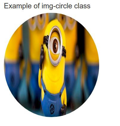
.img-circle 類 - 此類提供一個填充影像的圓形。
示例
<!DOCTYPE html>
<html>
<head>
    <!-- Using Bootstrap CDN -->
    <link rel = "stylesheet" href = "https://maxcdn.bootstrapcdn.com/bootstrap/3.3.6/css/bootstrap.min.css"/>
    <title>
        circle Image Example
    </title>
</head>
<body>
    <div class="container">
        <h3>Example of img-circle class </h3>
        <img src="https://ymi.today/wp-content/uploads/2015/07/What-I-Learned-From-Minions-1024x423.jpg" class="img-circle" alt="circle image"
        height="350" width="320">
    </div>
</body>
</html>
輸出
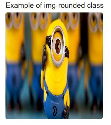
img-rounded 類 - 此類為影像提供圓角邊框。
示例
<!DOCTYPE html>
<html>
<head>
    <!-- Using Bootstrap CDN -->
    <link rel = "stylesheet" href = "https://maxcdn.bootstrapcdn.com/bootstrap/3.3.6/css/bootstrap.min.css"/>
    <title>
        rounded Image Example
    </title>
</head>
<body>
    <div class="container">
        <h3>Example of img-rounded class </h3>
        <img src="https://ymi.today/wp-content/uploads/2015/07/What-I-Learned-From-Minions-1024x423.jpg" class="img-rounded" alt="rounded image"
        height="350" width="320">
    </div>
</body>
</html>
輸出
結論
在本教程中,我們討論了 Bootstrap 的定義以及如何在前端開發中使用它來建立響應式影像,以使應用程式與不同的螢幕尺寸相容。我們還查看了在 Bootstrap 中使影像響應式的示例,其中我們討論了其他類。我們希望您發現本教程對您有所幫助。

更新於: 2021-11-26
522 次瀏覽

廣告