
 資料結構
資料結構 網路
網路 關係型資料庫管理系統
 作業系統
作業系統 Java
Java iOS
iOS HTML
HTML CSS
CSS Android
 Python
 C 程式設計
 C++
C++ C#
C# MongoDB
 MySQL
MySQL Javascript
 PHP
PHP如何使用 Python Matplotlib 繪製餅圖,並突出顯示單個餅塊?
簡介..
你最喜歡的圖表型別是什麼?如果你問管理層或商業分析師這個問題,他們會立即回答:餅圖!它是展示百分比的一種非常常見的方式。
操作方法..
1. 使用以下命令安裝 matplotlib。
pip install matplotlib
2. 匯入 matplotlib
import matplotlib.pyplot as plt
3. 準備臨時資料。
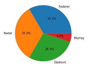
tennis_stats = (('Federer', 20),('Nadal', 20),('Djokovic', 17),('Murray', 3),)4. 下一步是準備資料。
titles = [title for player, title in tennis_stats]
players = [player for player, title in tennis_stats]
5. 使用值作為標題,標籤作為玩家姓名建立餅圖。
autopct 引數 - 用於格式化值,使其以小數點後一位的百分比顯示。axis('equals') - 確保餅圖看起來是圓形的。.show - 顯示生成的圖形。
注意- 執行 .show 會阻塞程式的執行。當您關閉視窗時,程式將繼續執行。
plt.pie(titles, labels=players, autopct='%1.1f%%')
plt.gca().axis('equal')
(-1.1000000175619362, 1.1000000072592333, -1.1090350248729983, 1.100430247887797)
6. 顯示圖形。
plt.show()
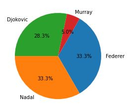
7. 有幾個有趣的引數可以用來調整餅圖/餅塊。startangle - 旋轉餅塊/餅圖的起始位置。
counterclock - 您想要設定的方向,預設為 True。
plt.pie(titles, labels=players, startangle=60, counterclock=False,autopct='%1.1f%%')
plt.show()
8. 對於某些人(比如我),百分比沒有任何意義。請記住,輸出圖形會發送給一些對隱藏在您程式碼深處的值一無所知的人。因此,除了百分比之外(顯然,從餅圖的分割方式可以看出),我們能否顯示實際的標題?
嗯,這有點棘手,因為您需要編寫一個自定義函式。請檢視以下內容。
我將建立一個自定義函式 - format_values 來建立一個字典,其中鍵為百分比,以便我們可以檢索引用的值。
示例
from matplotlib.ticker import FuncFormatter
total = sum(title for player, title in tennis_stats)
print(total)
values = {int(100 * title / total): title for player, title in tennis_stats}
print(values)
def format_values(percent, **kwargs):
value = values[int(percent)]
return '{}'.format(value)
# explode to seperate the pie/wedges.
explode = (0, 0, 0.1, 0.0)
plt.pie(titles, labels=players, explode=explode, autopct=format_values)
plt.show()
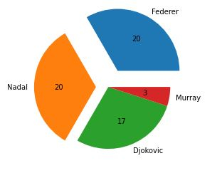
# the more the value the more farther it will be seperated.
explode = (0.3, 0.2, 0.0, 0.0)
plt.pie(titles, labels=players, explode=explode, autopct=format_values)60
{33: 20, 28: 17, 5: 3}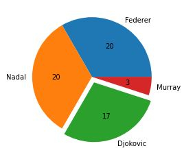
([<matplotlib.patches.Wedge at 0x2279cf8dd00>,
<matplotlib.patches.Wedge at 0x2279cf9b1f0>,
<matplotlib.patches.Wedge at 0x2279cf9b8b0>,
<matplotlib.patches.Wedge at 0x2279cf9bf70>],
[Text(0.6999999621611965, 1.2124355871444568, 'Federer'),
Text(-1.2999999999999945, -1.2171478395895002e-07, 'Nadal'),
Text(0.39420486628845763, -1.0269384223966398, 'Djokovic'),
Text(1.086457194390738, -0.17207778693546258, 'Murray')],
[Text(0.44999997567505484, 0.7794228774500078, '20'),
Text(-0.7999999999999966, -7.490140551320001e-08, '20'),
Text(0.2150208361573405, -0.5601482303981671, '17'),
Text(0.5926130151222206, -0.09386061105570685, '3')])
最後,將所有內容整合在一起。
示例
# imports
import matplotlib.pyplot as plt
from matplotlib.ticker import FuncFormatter

# prepare data
tennis_stats = (('Federer', 20),('Nadal', 20),('Djokovic', 17),('Murray', 3),)

titles = [title for player, title in tennis_stats]
players = [player for player, title in tennis_stats]

total = sum(title for player, title in tennis_stats)
values = {int(100 * title / total): title for player, title in tennis_stats}

# custom function
def format_values(percent, **kwargs):
value = values[int(percent)]
return '{}'.format(value)

# explode to seperate the pie/wedges.
explode = (0, 0, 0.1, 0.0)
plt.pie(titles, labels=players, explode=explode, autopct=format_values)

plt.show()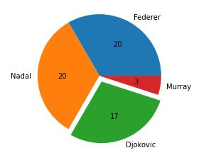

更新於: 2020年11月10日
810 次瀏覽

廣告