
 資料結構
資料結構 網路
網路 關係型資料庫管理系統
 作業系統
作業系統 Java
Java iOS
iOS HTML
HTML CSS
CSS Android
 Python
 C 程式設計
 C++
C++ C#
C# MongoDB
 MySQL
MySQL Javascript
 PHP
PHP如何在 Python 中使用 matplotlib 在單個頁面上繪製多個圖?
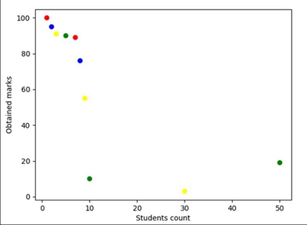
使用 Pandas,我們可以建立一個數據框架並建立一個圖表和軸。之後,我們可以使用 scatter 方法繪製點。
步驟
建立學生列表、他們獲得的成績以及每種成績對應的顏色編碼。
使用 Pandas 的 DataFrame,用步驟 1 中的資料建立一個數據框架。
使用 subplots 方法建立 fig 和 ax 變數,其中預設 nrows 和 ncols 為 1。
使用 plt.xlabel() 方法設定 X 軸標籤。
使用 plt.ylabel() 方法設定 Y 軸標籤。
繪製散點圖,其中 *y* 與 *x* 對應,標記大小和/或顏色各不相同。
若要顯示圖表,請使用 plt.show() 方法。
範例
from matplotlib import pyplot as plt
import pandas as pd

no_of_students = [1, 2, 3, 5, 7, 8, 9, 10, 30, 50]
marks_obtained_by_student = [100, 95, 91, 90, 89, 76, 55, 10, 3, 19]
color_coding = ['red', 'blue', 'yellow', 'green', 'red', 'blue', 'yellow', 'green', 'yellow', 'green']

df = pd.DataFrame(dict(students_count=no_of_students,
marks=marks_obtained_by_student, color=color_coding))

fig, ax = plt.subplots()

plt.xlabel('Students count')
plt.ylabel('Obtained marks')

ax.scatter(df['students_count'], df['marks'], c=df['color'])

plt.show()
輸出

更新於:2021-03-16
323 次閱讀

廣告