
 資料結構
資料結構 網路
網路 關係資料庫管理系統 (RDBMS)
 作業系統
作業系統 Java
Java iOS
iOS HTML
HTML CSS
CSS Android
 Python
 C語言程式設計
 C++
C++ C#
C# MongoDB
 MySQL
MySQL Javascript
 PHP
PHP如何在R中使用ggplot2建立的圖表顯示迴歸截距?
要在ggplot2建立的圖表中顯示模型的迴歸截距,我們可以按照以下步驟操作:
- 首先,建立資料框。
- 使用ggplot2的annotate函式建立散點圖,並在圖上顯示迴歸截距。
- 檢查迴歸截距。
建立資料框
讓我們建立一個如下所示的資料框:
x<-sample(1:100,25)
y<-sample(1:100,25)
df<-data.frame(x,y)
df
執行上述指令碼後,將生成以下輸出(由於隨機化,此輸出在您的系統上會有所不同):
  x  y
1 55 8
2 8 22
3 87 66
4 95 49
5 68 57
6 66 31
7 21 13
8 27 77
9 45 25
10 94 46
11 77 7
12 93 50
13 7 58
14 13 82
15 83 88
16 17 39
17 43 23
18 11 35
19 39 24
20 50 40
21 37 99
22 18 78
23 30 42
24 86 17
25 71 16
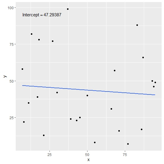
建立帶有迴歸截距的散點圖
建立帶有迴歸線和在圖上顯示的模型截距的散點圖:
x<-sample(1:100,25)
y<-sample(1:100,25)
df<-data.frame(x,y)
library(ggplot2)
ggplot(df,aes(x,y))+geom_point()+stat_smooth(method="lm",se=F)+annotate("text",x=2
0,y=95,label=(paste0("Intercept==",coef(lm(df$y~df$x))[1])),parse=TRUE)
`geom_smooth()` using formula 'y ~ x'
輸出
檢查模型的截距
使用coeff函式查詢模型的截距,並檢查它是否與圖中顯示的截距匹配:
x<-sample(1:100,25)
y<-sample(1:100,25)
df<-data.frame(x,y)
coef(lm(df$y~df$x))[1]
輸出
(Intercept)
47.29387

更新於:2021年8月13日
2K+ 次瀏覽

廣告