
 資料結構
資料結構 網路
網路 關係型資料庫管理系統 (RDBMS)
 作業系統
作業系統 Java
Java iOS
iOS HTML
HTML CSS
CSS Android
 Python
 C語言程式設計
 C++
C++ C#
C# MongoDB
 MySQL
MySQL Javascript
 PHP
PHP如何在R中使用ggplot2建立使用反向灰色調色盤的類別小提琴圖?
要使用ggplot2建立使用反向灰色調色盤的類別小提琴圖,我們可以按照以下步驟操作:
- 首先,建立一個數據框。
- 然後,建立使用灰色調色盤的小提琴圖。
- 建立使用反向灰色調色盤的小提琴圖。
建立資料框
讓我們建立一個如下所示的資料框:
Group<-sample(c("First","Second","Third"),25,replace=TRUE)
Score<-rpois(25,10)
df<-data.frame(Group,Score)
df
執行上述指令碼後,將生成以下輸出(由於隨機化,此輸出會在您的系統上有所不同):
  Group Score
1 Second 10
2 Second 8
3 Second 7
4 Third  11
5 First  3
6 Second 13
7 Third  15
8 Third  7
9 Second 10
10 Second 8
11 Third 13
12 Third 10
13 First 8
14 Third 8
15 Second 14
16 First  9
17 Third  13
18 Second 10
19 First  9
20 Second 8
21 First  11
22 First  8
23 Third  5
24 Third 12
25 Third 11
建立使用灰色調色盤的小提琴圖
使用scale_fill_grey建立使用灰色調色盤的小提琴圖:
Group<-sample(c("First","Second","Third"),25,replace=TRUE)
Score<-rpois(25,10)
df<-data.frame(Group,Score)
library(ggplot2)
ggplot(df,aes(Group,Score,fill=Group))+geom_violin()+scale_fill_grey()
輸出
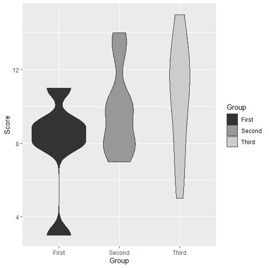
建立使用反向灰色調色盤的小提琴圖
使用scale_fill_grey建立使用反向灰色調色盤的小提琴圖(start和end的預設值分別為start=0.2和end=0.8):
Group<-sample(c("First","Second","Third"),25,replace=TRUE)
Score<-rpois(25,10)
df<-data.frame(Group,Score)
library(ggplot2)
ggplot(df,aes(Group,Score,fill=Group))+geom_violin()+scale_fill_grey(start=0.8,end=0.
2)
輸出


更新於:2021年8月13日
121 次瀏覽

廣告