
 資料結構
資料結構 網路
網路 關係型資料庫管理系統
 作業系統
作業系統 Java
Java iOS
iOS HTML
HTML CSS
CSS Android
 Python
 C 程式設計
 C++
C++ C#
C# MongoDB
 MySQL
MySQL Javascript
 PHP
PHP如何使用 Python 中的 Plotly 建立人口金字塔?
人口金字塔是人口年齡和性別分佈的圖形表示。它由兩個背靠背的條形圖組成,一個顯示男性的分佈,另一個顯示女性在不同年齡組中的分佈。人口金字塔是一種強大的視覺化工具,可以幫助我們瞭解人口的構成,並識別趨勢和模式。
在本文中,我們將探討如何使用 Python 中的 Plotly 建立人口金字塔。Plotly 是一個強大的視覺化庫,它允許我們在 Python 中建立互動式和動態圖表。
我們將使用 Plotly 建立一個顯示人口年齡和性別分佈的人口金字塔。我們將首先將資料載入到 pandas DataFrame 中,然後使用 Plotly 建立人口金字塔。
使用 Plotly Express
Plotly Express 是 Plotly 的高階 API,它可以輕鬆建立多種型別的圖表,包括人口金字塔。我們可以使用 px.bar() 函式建立構成人口金字塔的兩個背靠背的條形圖。
請考慮以下程式碼。
示例
import plotly.express as px
import pandas as pd

# Load the data into a pandas DataFrame
df = pd.read_csv("population_data.csv")

# Create the population pyramid using Plotly Express
fig = px.bar(df, x="count", y="age", orientation="h", color="gender",
         	barmode="relative", range_x=[-1, 1])

# Show the plot
fig.show()
解釋
我們首先匯入庫,包括用於建立圖表的 plotly.express 和用於將資料載入到 DataFrame 中的 pandas。
接下來,我們使用 read_csv() 函式將人口資料從 CSV 檔案載入到 pandas DataFrame 中。
然後,我們建立 px.bar() 函式,它將 DataFrame 作為第一個引數,以及其他幾個引數來指定圖表的佈局和樣式。
x 引數指定用於條形長度的變數,即每個年齡組中的人數。
y 引數指定用於條形高度的變數,即年齡組。
orientation 引數指定條形應為水平方向。
color 引數指定條形應按性別著色。
barmode 引數指定條形應彼此堆疊。
range_x 引數指定 x 軸的範圍,這決定了金字塔的大小。
最後,我們使用 show() 方法列印圖表。
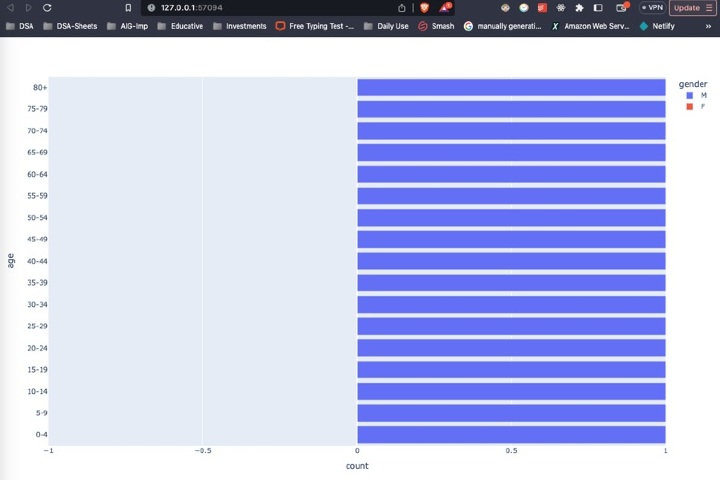
輸出
使用 Plotly 圖形物件
Plotly 圖形物件是 Plotly 的低階 API,它提供了更多靈活性和對圖表佈局和樣式的控制。我們可以使用 Plotly 圖形物件透過建立兩個條形軌跡(一個用於男性,另一個用於女性),然後將它們組合成一個圖形來建立人口金字塔。
請考慮以下程式碼。
示例
import plotly.graph_objs as go
import pandas as pd

# Load the data into a pandas DataFrame
df = pd.read_csv("population_data.csv")

# Create the male and female bar traces
trace_male = go.Bar(x=df[df["gender"]=="M"]["count"],
                	y=df[df["gender"]=="M"]["age"],
                	orientation="h",
                	name="Male",
                	marker=dict(color="#1f77b4"))

trace_female = go.Bar(x=df[df["gender"]=="F"]["count"]*(-1),
                  	y=df[df["gender"]=="F"]["age"],
                  	orientation="h",
                  	name="Female",
                  	marker=dict(color="#d62728"))

# Create the layout
layout = go.Layout(title="Population Pyramid",
               	xaxis=dict(title="Count"),
               	yaxis=dict(title="Age"),
               	barmode="overlay",
               	bargap=0.1)

# Create the figure
fig = go.Figure(data=[trace_male, trace_female], layout=layout)

# Show the plot
fig.show()
解釋
第一步是匯入必要的模組:plotly.graph_objs 和 pandas。
資料使用 pd.read_csv 方法載入到 pandas DataFrame 中。
使用 go.Bar 方法為男性和女性人口建立兩個條形圖軌跡,分別使用計數和年齡組作為 x 和 y 值。方向設定為水平方向,每個軌跡使用 name 和 marker 引數分別指定名稱和顏色。
為圖表建立佈局,包括標題以及 x 軸和 y 軸的標籤。
使用 go.Figure 方法使用兩個軌跡和佈局建立圖形。
最後,使用 fig.show() 方法顯示圖表。
輸出

結論
在本文中,我們學習瞭如何使用 Python 中的 Plotly 建立人口金字塔。我們探索了兩種不同的方法來實現這一點,一種使用 pandas 透視表,另一種使用 Plotly 圖形物件。我們討論了每種方法的優缺點,並提供了每種方法中使用的程式碼的詳細解釋。
透過遵循本文中提供的步驟和示例,您可以使用 Python 中的 Plotly 建立自己的金字塔,並探索各種自定義和分析資料的方法。

790 次檢視
