
 資料結構
資料結構 網路
網路 關係型資料庫管理系統
 作業系統
作業系統 Java
Java iOS
iOS HTML
HTML CSS
CSS Android
 Python
 C 程式設計
 C++
C++ C#
C# MongoDB
 MySQL
MySQL Javascript
 PHP
PHP如何在 Python 中為圖表新增圖例?
簡介…
圖表的核心目的是使資料易於理解。“一張圖片勝過千言萬語”意味著無法用語言表達的複雜思想可以透過單個影像/圖表來傳達。
在繪製包含大量資訊的圖表時,圖例可能有助於顯示相關資訊,從而提高對所呈現資料的理解。
如何操作…
在 matplotlib 中,圖例可以透過多種方式呈現。註釋用於引起讀者對特定點的注意,也有助於讀者理解圖表上顯示的資訊。
1. 透過開啟 Python 命令提示符並執行 pip install matplotlib 來安裝 matplotlib。
2. 準備要顯示的資料。
示例
import matplotlib.pyplot as plt

# data prep (I made up data no accuracy in these stats)
mobile = ['Iphone','Galaxy','Pixel']

# Data for the mobile units sold for 4 Quaters in Million
units_sold = (('2016',12,8,6),
('2017',14,10,7),
('2018',16,12,8),
('2019',18,14,10),
('2020',20,16,5),)
3. 將資料拆分為每個公司手機單元的陣列。
示例
# data prep - splitting the data
IPhone_Sales = [Iphones for Year, Iphones, Galaxy, Pixel in units_sold]
Galaxy_Sales = [Galaxy for Year, Iphones, Galaxy, Pixel in units_sold]
Pixel_Sales = [Pixel for Year, Iphones, Galaxy, Pixel in units_sold]

# data prep - Labels
Years = [Year for Year, Iphones, Galaxy,Pixel in units_sold]

# set the position
Position = list(range(len(units_sold)))

# set the width
Width = 0.2
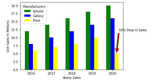
4. 使用準備好的資料建立條形圖。每個產品的銷量都會呼叫 .bar,指定其位置和銷量。
使用 xy 和 xytext 屬性添加註釋。檢視資料,Google Pixel 手機銷量下降了 50%,即從 2019 年的 1000 萬臺下降到 2022 年的 500 萬臺。因此,我們將設定文字和註釋到我們的最後一個條形。
最後,我們將使用 legend 引數新增圖例。預設情況下,matplotlib 會在資料重疊最少的地方繪製圖例。
示例
plt.bar([p - Width for p in Position], IPhone_Sales, width=Width,color='green')
plt.bar([p for p in Position], Galaxy_Sales , width=Width,color='blue')
plt.bar([p + Width for p in Position], Pixel_Sales, width=Width,color='yellow')

# Set X-axis as years
plt.xticks(Position, Years)

# Set the Y axis label
plt.xlabel('Yearly Sales')
plt.ylabel('Unit Sales In Millions')

# Set the annotation Use the xy and xytext to change the arrow
plt.annotate('50% Drop in Sales', xy=(4.2, 5), xytext=(5.0, 12),
horizontalalignment='center',
arrowprops=dict(facecolor='red', shrink=0.05))

# Set the legent
plt.legend(mobile, title='Manufacturers')
輸出
<matplotlib.legend.Legend at 0x19826618400>
如果您覺得在圖表內新增圖例會顯得雜亂,可以使用 bbox_to_anchor 選項將圖例繪製到外部。bbox_to_anchor 具有 (X, Y) 位置,其中 0 是圖表的左下角,1 是右上角。
**注意:** - 使用 .subplots_adjust 調整圖例的起始和結束位置。
例如,right=0.50 值表示它在繪圖右側保留 50% 的螢幕空間。left 的預設值為 0.125,表示它在左側保留 12.5% 的空間。
輸出
plt.legend(mobile, title='Manufacturers', bbox_to_anchor=(1, 0.8))
plt.subplots_adjust(right=1.2)

示例
6. 最後,讓我們儲存圖形。
import matplotlib.pyplot as plt

# data prep (I made up data no accuracy in these stats)
mobile = ['Iphone','Galaxy','Pixel']

# Data for the mobile units sold for 4 Quaters in Million
units_sold = (('2016',12,8,6),
('2017',14,10,7),
('2018',16,12,8),
('2019',18,14,10),
('2020',20,16,5),)

# data prep - splitting the data
IPhone_Sales = [Iphones for Year, Iphones, Galaxy, Pixel in units_sold]
Galaxy_Sales = [Galaxy for Year, Iphones, Galaxy, Pixel in units_sold]
Pixel_Sales = [Pixel for Year, Iphones, Galaxy, Pixel in units_sold]

# data prep - Labels
Years = [Year for Year, Iphones, Galaxy,Pixel in units_sold]

# set the position
Position = list(range(len(units_sold)))

# set the width
Width = 0.2

plt.bar([p - Width for p in Position], IPhone_Sales, width=Width,color='green')
plt.bar([p for p in Position], Galaxy_Sales , width=Width,color='blue')
plt.bar([p + Width for p in Position], Pixel_Sales, width=Width,color='yellow')

# Set X-axis as years
plt.xticks(Position, Years)

# Set the Y axis label
plt.xlabel('Yearly Sales')
plt.ylabel('Unit Sales In Millions')

# Set the annotation Use the xy and xytext to change the arrow
plt.annotate('50% Drop in Sales', xy=(4.2, 5), xytext=(5.0, 12),
horizontalalignment='center',
arrowprops=dict(facecolor='red', shrink=0.05))

# Set the legent
plt.legend(mobile, title='Manufacturers')

plt.legend(mobile, title='Manufacturers')
plt.subplots_adjust(right=1.2)

# plt.show()
plt.savefig('MobileSales.png')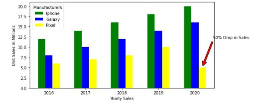

更新於: 2020 年 11 月 10 日
3K+ 閱讀量

廣告