
 資料結構
資料結構 網路
網路 關係資料庫管理系統 (RDBMS)
 作業系統
作業系統 Java
Java MS Excel
 iOS
iOS HTML
HTML CSS
CSS Android
 Python
 C語言程式設計
 C++
C++ C#
C# MongoDB
 MySQL
MySQL Javascript
 PHP
PHP 物理學
物理學 化學
化學 生物學
生物學 數學
數學 英語
英語 經濟學
經濟學 心理學
心理學 社會學
社會學 服裝設計
服裝設計 法學
法學ReactNative SwitchSelector 元件詳解
SwitchSelector 元件類似於單選按鈕。它允許您選擇超過 2 個值。
要使用 SwitchSelector,您需要按照以下步驟安裝軟體包:
npm i react-native-switch-selector --save-dev
基本的 SwitchSelector 如下所示:
<SwitchSelector
   106
   React Native – Q&A
   options={youroptions}
   initial={0}
   onPress={value => console.log(`value selected is : ${value}`)}
/>
以下是一些 SwitchSelector 的重要屬性:
| 屬性 | 描述 |
|---|---|
| options | 一個包含標籤、值和影像圖示 ID 的陣列(必填)。 |
| initial | 將被選擇的陣列中的初始項。 |
| value | 將隨 onPress 事件一起使用的開關值。 |
| onPress | 當開關更改時將呼叫的回撥函式事件。 |
| fontSize | 標籤的字型大小。 |
| selectedColor | 所選項的顏色。 |
| buttonColor | 所選項的背景顏色。 |
| textColor | 未選中的項的標籤顏色。 |
| backgroundColor | SwitchSelector 元件的背景顏色。 |
| borderColor | 元件的邊框顏色。 |
示例:SwitchSelector 的工作原理
要使用 SwitchSelector,我們必須按如下方式匯入元件:
import SwitchSelector from "react-native-switch-selector";
在 SwitchSelector 中,我們將顯示兩個選項:女/男。
在這個例子中,我們使用了女性和男性的影像,並且在 options 陣列中使用了相同的影像。
let male = require('C:/myfirstapp/myfirstapp/assets/male.png');
let female = require('C:/myfirstapp/myfirstapp/assets/female.png');
const images = {
   "female": female,
   "male": male,
};
const options =[
   { label: "Female", value: "f", imageIcon: images.female },
   { label: "Male", value: "m", imageIcon: images.male }
];
SwitchSelector 如下所示:
<SwitchSelector
   initial={0}
   onPress={value => this.setState({ gender: value })}
   textColor='#ccceeaa'
   selectedColor='#7a44cf'
   buttonColor='#ccc'
   borderColor='#ccc'
   hasPadding
   options={options}
/>
以下是 SwitchSelector 的完整程式碼:
示例
import React, { Component } from 'react';
import { StyleSheet, SafeAreaView } from 'react-native';
import SwitchSelector from "react-native-switch-selector";
let male = require('C:/myfirstapp/myfirstapp/assets/male.png');
let female = require('C:/myfirstapp/myfirstapp/assets/female.png');
const images = {
   "female": female,
   "male": male,
};
const options =[
   { label: "Female", value: "f", imageIcon: images.female },
   { label: "Male", value: "m", imageIcon: images.male }
];
export default class MySwitchSelectorComponent extends Component {
   render() {
      return (
         <SafeAreaView style={styles.container}>
            <SwitchSelector
               initial={0}
                  onPress={value => this.setState({ gender: value })}
                  textColor='#ccceeaa'
                  selectedColor='#7a44cf'
                  buttonColor='#ccc'
                  borderColor='#ccc'
                  hasPadding
                  options={options}
            />
         </SafeAreaView>
      )
   }
}
const styles = StyleSheet.create({
   container: {
      flex: 1,
      alignItems: "center",
      justifyContent: "center"
   },
});
輸出
輸出結果如下:

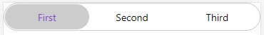
示例 2:帶有三個選項的 SwitchSelector
在下面的示例中,我們使用了三個選項:
const options =[
   { label: "First", value: "a"},
   { label: "Second", value: "b" } ,
   { label: "Third", value: "c" }
];
顯示三個選項的完整程式碼如下:
示例
import React, { Component } from 'react';
import { StyleSheet, SafeAreaView } from 'react-native';
import SwitchSelector from "react-native-switch-selector";
const options =[
   { label: "First", value: "a"},
   { label: "Second", value: "b" } ,
   { label: "Third", value: "c" }
];
export default class MySwitchSelectorComponent extends Component {
   render() {
      return (
         <SafeAreaView style={styles.container}>
            <SwitchSelector
               initial={0}
               onPress={value => this.setState({ gender: value })}
               textColor='#ccceeaa'
               selectedColor='#7a44cf'
               buttonColor='#ccc'
               borderColor='#ccc'
               fontSize='30'
               hasPadding
               options={options}
            />
         </SafeAreaView>
      )
   }
}
const styles = StyleSheet.create({
   container: {
      flex: 1
   }
});
輸出

更新於:2021年7月1日
瀏覽量:331

廣告