
 資料結構
資料結構 網路
網路 關係型資料庫管理系統 (RDBMS)
 作業系統
作業系統 Java
Java Microsoft Excel
 iOS
iOS HTML
HTML CSS
CSS Android
 Python
 C 程式設計
 C++
C++ C#
C# MongoDB
 MySQL
MySQL JavaScript
 PHP
PHP 物理
物理 化學
化學 生物
生物 數學
數學 英語
英語 經濟
經濟 心理學
心理學 社會學
社會學 時尚研究
時尚研究 法律研究
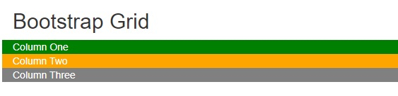
法律研究使用 Bootstrap 網格佈局建立三欄等寬佈局
要使用 Bootstrap 網格佈局建立三欄等寬佈局,可以嘗試執行以下程式碼 −
示例
<!DOCTYPE html>
<html>
   <head>
      <title>Bootstrap Example</title>
      <link rel="stylesheet" ref="https://maxcdn.bootstrapcdn.com/bootstrap/3.4.1/css/bootstrap.min.css">
      <script src="https://ajax.googleapis.com/ajax/libs/jquery/3.5.1/jquery.min.js"></script>
      <script src="https://maxcdn.bootstrapcdn.com/bootstrap/3.4.1/js/bootstrap.min.js"></script>
   </head>
   <body>
      <div class = "container-fluid">
         <h2>Bootstrap Grid</h2>
         <div class = "row">
            <div class = "col-sm-4" style = "background-color:green; color: white;">Column One</div>
            <div class = "col-sm-4" style = "background-color:orange; color: white;">Column Two</div>
            <div class = "col-sm-4" style = "background-color:gray; color: white;">Column Three</div>
         </div>
      </div>
   </body>
</html>
輸出

更新於:2022 年 2 月 9 日
1000+ 次瀏覽

廣告