
 資料結構
資料結構 網路
網路 RDBMS
RDBMS 作業系統
作業系統 Java
Java MS Excel
 iOS
iOS HTML
HTML CSS
CSS 安卓
安卓 Python
 C 語言
C 語言 C++
C++ C#
C# MongoDB
 MySQL
MySQL JavaScript
 PHP
PHP 物理
物理 化學
化學 生物
生物 數學
數學 英語
英語 經濟學
經濟學 心理學
心理學 社會研究
社會研究 時尚研究
時尚研究 法律研究
法律研究如何使用 CSS 建立 4 列布局網格?
要使用 CSS 建立 4 列布局網格,程式碼如下:
示例
<!DOCTYPE html>
<html>
<head>
<meta name="viewport" content="width=device-width, initial-scale=1" />
<style>
body {
font-family: "Segoe UI", Tahoma, Geneva, Verdana, sans-serif;
}
* {
box-sizing: border-box;
}
.first, .second, .third, .fourth {
float: left;
width: 25%;
color: white;
padding: 10px;
height: 500px;
text-align: center;
}
.first {
background-color: tomato;
}
.second {
background-color: teal;
}
.third {
background-color: rgb(166, 71, 255);
}
.fourth {
background-color: rgb(255, 71, 194);
}
.container:after {
clear: both;
}
</style>
</head>
<body>
<h1 style="text-align: center;">Four Column grid example</h1>
<div class="container">
<div class="first">
<h1>Some text on the first div</h1>
</div>
<div class="second">
<h1>Some text on the second div</h1>
</div>
<div class="third">
<h1>Some text on the third div</h1>
</div>
<div class="fourth">
<h1>Some text on the fourth div</h1>
</div>
</div>
</body>
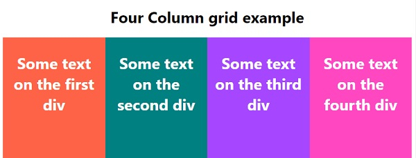
</html>輸出
以上程式碼將產生以下輸出:

更新於:2020 年 5 月 12 日
2K+ 瀏覽量

廣告