
 資料結構
資料結構 網路
網路 RDBMS
RDBMS 作業系統
作業系統 Java
Java MS Excel
 iOS
iOS HTML
HTML CSS
CSS Android
 Python
 C 程式設計
 C++
C++ C#
C# MongoDB
 MySQL
MySQL Javascript
 PHP
PHP 物理
物理 化學
化學 生物
生物 數學
數學 英語
英語 經濟
經濟 心理學
心理學 社會研究
社會研究 時尚研究
時尚研究 法律研究
法律研究如何使用 CSS 建立混合列布局網格?
要使用 CSS 建立混合列布局網格,程式碼如下 −
示例
<!DOCTYPE html>
<html>
<head>
<meta name="viewport" content="width=device-width, initial-scale=1" />
<style>
   body {
      font-family: "Segoe UI", Tahoma, Geneva, Verdana, sans-serif;
   }
   * {
      box-sizing: border-box;
   }
   .col {
      color: white;
      float: left;
      width: 25%;
      padding: 10px;
   }
   .colContainer:after {
      content: "";
      display: table;
      clear: both;
   }
   @media screen and (max-width: 900px) {
      .col {
         width: 50%;
      }
   }
   @media screen and (max-width: 600px) {
      .col {
         width: 100%;
      }
   }
</style>
</head>
<body>
<h1>Mixed col Layout Example</h1>
<h2>Resize the screen to see the below divs resize themselves</h2>
<div class="colContainer">
<div class="col" style="background-color:rgb(153, 29, 224);">
<h2>First col</h2>
</div>
<div class="col" style="background-color:rgb(12, 126, 120);">
<h2>Second col</h2>
</div>
<div class="col" style="background-color:rgb(207, 41, 91);">
<h2>Third col</h2>
</div>
<div class="col" style="background-color:rgb(204, 91, 39);">
<h2>Fourth col</h2>
</div>
</div>
</body>
</html>
輸出
上述程式碼將生成以下輸出 −
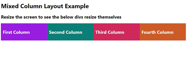
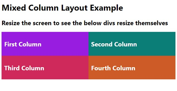
調整螢幕大小時,4 列布局將變為 2 列,依此類推 −

更新於: 12-5-2020
347 次瀏覽

廣告