
 資料結構
資料結構 網路
網路 RDBMS
RDBMS 作業系統
作業系統 Java
Java MS Excel
 iOS
iOS HTML
HTML CSS
CSS Android
 Python
 C 程式設計
 C++
C++ C#
C# MongoDB
 MySQL
MySQL Javascript
 PHP
PHP 物理
物理 化學
化學 生物
生物 數學
數學 英語
英語 經濟學
經濟學 心理學
心理學 社會研究
社會研究 時裝研究
時裝研究 法律研究
法律研究使用 Bootstrap 將彈性專案設定為等寬列
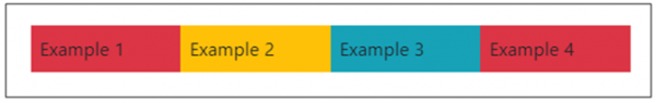
如要將彈性專案設定成相等的寬度列,請使用 flex-fill 類。此類可將專案顯示為相等的寬度。在下面的示例截圖中,你可以看到我們有四個彈性專案,它們寬度相等的列 -
flex-fill 類用於每個彈性專案,透過這種方式,我們可以設定相等的寬度。在下面,我們有兩個 flex 專案 -
<div class="p-2 flex-fill">
Example 1
</div>
<div class="p-2 flex-fill">
Example 2
</div>
示例
以下是一個示例,展示如何使用 flex-fill 類將彈性專案設定成寬度相等的列 -
<!DOCTYPE html>
<html lang="en">
  <head>
    <title>Bootstrap Example</title>
    <meta charset="utf-8">
    <meta name="viewport" content="width=device-width, initial-scale=1">
    <link rel="stylesheet" href="https://maxcdn.bootstrapcdn.com/bootstrap/4.1.0/css/bootstrap.min.css">
    <script src="https://ajax.googleapis.com/ajax/libs/jquery/3.3.1/jquery.min.js"></script>
    <script src="https://maxcdn.bootstrapcdn.com/bootstrap/4.1.0/js/bootstrap.min.js"></script>
  </head>
  <body>
    <div class="container mt-3">
      <p>With flex-fill</p>
      <div class="d-flex mb-3 bg-primary">
        <div class="p-2 flex-fill bg-danger">Example 1</div>
        <div class="p-2 flex-fill bg-warning">Example 2</div>
        <div class="p-2 flex-fill bg-info">Example 3</div>
        <div class="p-2 flex-fill bg-danger">Example 4</div>
      </div>
      <p>Without .flex-fill:</p>
      <div class="d-flex mb-3 bg-secondary">
        <div class="p-2 bg-danger">Example 1</div>
        <div class="p-2 bg-warning">Example 2</div>
        <div class="p-2 bg-info">Example 3</div>
        <div class="p-2 bg-warning">Example 4</div>
      </div>
     </div>
  </body>
</html>

更新於:15-6-2020
5K+ 瀏覽量

廣告