
 資料結構
資料結構 網路
網路 關係資料庫管理系統
 作業系統
作業系統 Java
Java MS Excel
 iOS
iOS HTML
HTML CSS
CSS Android
 Python
 C 程式設計
 C++
C++ C#
C# MongoDB
 MySQL
MySQL Javascript
 PHP
PHP 物理
物理 化學
化學 生物
生物 數學
數學 英語
英語 經濟學
經濟學 心理學
心理學 社會研究
社會研究 時尚研究
時尚研究 法律研究
法律研究從 Bootstrap 中的對齊方式靈活專案
在 Bootstrap 中使用 .justify-content-* 類從開始、結束、中心(center)、中間(between)等方式對齊 flex 專案。
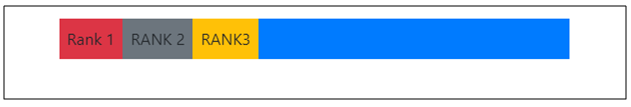
對於 justify-content-start,對齊的 flex 專案將像這樣 −
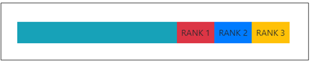
對於 justify-content-end,對齊的 flex 專案將像這樣 −
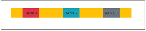
對於 justify-content-around,對齊的 flex 專案將像這樣 −
我們來看看如何對齊內容 −
示例
<!DOCTYPE html>
<html lang="en">
<head>
  <title>Bootstrap Example</title>
  <meta charset="utf-8">
  <meta name="viewport" content="width=device-width, initial-scale=1">
  <link rel="stylesheet" href="https://maxcdn.bootstrapcdn.com/bootstrap/4.1.0/css/bootstrap.min.css">
  <script src="https://ajax.googleapis.com/ajax/libs/jquery/3.3.1/jquery.min.js"></script>
  <script src="https://maxcdn.bootstrapcdn.com/bootstrap/4.1.0/js/bootstrap.min.js"></script>
</head>
<body>
  <div class="container mt-3">
    <div class="d-flex justify-content-start bg-primary mb-5">
      <div class="p-2 bg-danger">Rank 1</div>
      <div class="p-2 bg-secondary">RANK 2</div>
      <div class="p-2 bg-warning">RANK3</div>
    </div>
    <div class="d-flex justify-content-end bg-info mb-5">
      <div class="p-2 bg-danger">RANK 1</div>
      <div class="p-2 bg-primary">RANK 2</div>
      <div class="p-2 bg-warning">RANK 3</div>
    </div>
    <div class="d-flex justify-content-around bg-warning mb-5">
      <div class="p-2 bg-danger">RANK 1</div>
      <div class="p-2 bg-info">RANK 2</div>
      <div class="p-2 bg-secondary">RANK 3</div>
    </div>
  </div>
</body>
</html>

更新於: 18-6-2020
106 次檢視

廣告