
 資料結構
資料結構 網路
網路 關係型資料庫管理系統
 作業系統
作業系統 Java
Java MS Excel
 iOS
iOS HTML
HTML CSS
CSS 安卓
安卓 Python
 C 語言程式設計
 C++
C++ C#
C# MongoDB
 MySQL
MySQL JavaScript
 PHP
PHP 物理
物理 化學
化學 生物
生物 數學
數學 英語
英語 經濟學
經濟學 心理學
心理學 社會研究
社會研究 時尚研究
時尚研究 法律研究
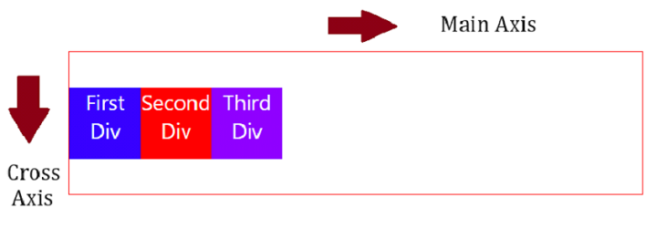
法律研究使用 CSS3 沿交叉軸對齊彈性專案
我們可以很容易地沿交叉軸對齊彈性專案,但首先讓我們瞭解什麼是交叉軸。交叉軸垂直於主軸。主軸類似於 flex direction -
建立容器 div
首先,將 div 設定在容器(flex 容器)中 -
<div class="container">
   <div class="first">First Div</div>
   <div class="second">Second Div</div>
   <div class="third">Third Div</div>
</div>
設定容器樣式並使其靈活
透過將 display 設定為flex 來使 flex 容器變得靈活。使用 align-items 屬性對齊 flex 專案 -
.container {
   height: 200px;
   display: flex;
   width: 100%;
   align-items: center;
   border: 2px solid red;
}
設定 flex 專案樣式
用不同的背景色設定各個 flex 專案的樣式 -
.first {
   background-color: rgb(55, 0, 255);
}
.second {
   background-color: red;
}
.third {
   background-color: rgb(140, 0, 255);
}
沿交叉軸對齊 flex 專案
示例
使用 CSS3 沿交叉軸對齊 flex 專案的程式碼如下 -
<!DOCTYPE html>
<html>
<head>
   <style>
      body {
         font-family: "Segoe UI", Tahoma, Geneva, Verdana, sans-serif;
      }
      .container {
         height: 200px;
         display: flex;
         width: 100%;
         align-items: center;
         border: 2px solid red;
      }
      div {
         width: 100px;
         height: 100px;
         color: white;
         text-align: center;
         font-size: 30px;
      }
      .first {
         background-color: rgb(55, 0, 255);
      }
      .second {
         background-color: red;
      }
      .third {
         background-color: rgb(140, 0, 255);
      }
   </style>
</head>
<body>
   <h1>Align flex items along cross axis</h1>
   <div class="container">
      <div class="first">First Div</div>
      <div class="second">Second Div</div>
      <div class="third">Third Div</div>
   </div>
</body>
</html>

更新日期: 2023-10-27
107 次瀏覽

廣告