
 資料結構
資料結構 網路
網路 關係資料庫管理系統 (RDBMS)
 作業系統
作業系統 Java
Java iOS
iOS HTML
HTML CSS
CSS Android
 Python
 C語言程式設計
 C++
C++ C#
C# MongoDB
 MySQL
MySQL Javascript
 PHP
PHP使用 Python Matplotlib 繪製等值線圖
Matplotlib 是 Python 中一個免費且開源的繪相簿。它用於使用 Python 指令碼建立二維圖形和圖表。要使用 Matplotlib 的功能,首先需要安裝該庫。
使用 pip 安裝
在命令提示符中執行以下命令,可以輕鬆地從 PyPi 安裝 Matplotlib 的最新穩定版本。
pip install Matplotlib
您可以透過conda安裝Matplotlib,使用以下命令:
conda install -c conda-forge matplotlib
等值線圖用於透過繪製稱為等值線的恆定 z 切片,在二維曲面上視覺化三維資料。
它藉助等值線函式 (Z) 繪製,該函式是兩個輸入 X 和 Y(X 軸和 Y 軸座標)的函式。
Z = fun(x,y)
Matplotlib 提供兩個函式plt.contour和plt.contourf來繪製等值線圖。
contour() 方法
matplotlib.pyplot.contour() 方法用於繪製等值線。它返回 QuadContourSet。以下是此函式的語法:
contour([X, Y,] Z, [levels], **kwargs)
引數
[X, Y]:可選引數,它表示 Z 中值的座標。
Z:繪製等值線的高度值。
levels:用於確定等值線/區域的數量和位置。
示例
讓我們來看一個示例,並使用 numpy 三角函式繪製等值線。
import numpy as np
import matplotlib.pyplot as plt

def f(x, y):
   return np.sin(x) ** 10 + np.cos(10 + y * x) * np.cos(x)

xlist = np.linspace(-4.0, 4.0, 800)
ylist = np.linspace(-4.0, 4.0, 800)

# A mesh is created with the given co-ordinates by this numpy function
X, Y = np.meshgrid(xlist, ylist)
Z = f(X,Y)

fig = plt.figure()
ax = fig.add_axes([0.1, 0.1, 0.8, 0.8])

cp = ax.contour(X, Y, Z)
fig.colorbar(cp) # Add a colorbar to a plot
ax.set_title('Contour Plot')

ax.set_xlabel('x (cm)')
ax.set_ylabel('y (cm)')
plt.show()
輸出
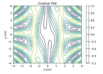
f(x,y) 函式使用 numpy 三角函式定義。
示例
讓我們再來看一個示例,並繪製等值線。
import numpy as np
import matplotlib.pyplot as plt

def f(x, y):
    return np.sqrt(X**2 + Y**2)

xlist = np.linspace(-10, 10, 400)
ylist = np.linspace(-10, 10, 400)

# create a mesh
X, Y = np.meshgrid(xlist, ylist)

Z = f(X, Y)

fig = plt.figure(figsize=(6,5))
ax = fig.add_axes([0.1, 0.1, 0.8, 0.8])

cp = ax.contour(X, Y, Z)
ax.set_title('Contour Plot')
ax.set_xlabel('x (cm)')
ax.set_ylabel('y (cm)')
plt.show()
輸出
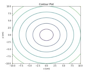
z 函式是 x 和 y 座標值的平方根之和。使用 numpy.sqrt() 函式實現。
contourf() 函式
matplotlib.pyplot 提供了一個 contourf() 方法來繪製填充等值線。以下是此函式的語法:
contourf([X, Y,] Z, [levels], **kwargs)
其中,
[X, Y]:可選引數,它表示 Z 中值的座標。
Z:繪製等值線的高度值。
levels:用於確定等值線/區域的數量和位置。
示例
讓我們再來看一個示例,並使用 contourf() 方法繪製等值線圖。
import numpy as np
import matplotlib.pyplot as plt

xlist = np.linspace(-8, 8, 800)
ylist = np.linspace(-8, 8, 800)

X, Y = np.meshgrid(xlist, ylist)
Z = np.sqrt(X**2 + Y**2)

fig = plt.figure(figsize=(6,5))
ax = fig.add_axes([0.1, 0.1, 0.8, 0.8])

cp = ax.contourf(X, Y, Z)
fig.colorbar(cp) # Add a colorbar to a plot
ax.set_title('Filled Contours Plot')
#ax.set_xlabel('x (cm)')
ax.set_ylabel('y (cm)')
plt.show()
輸出
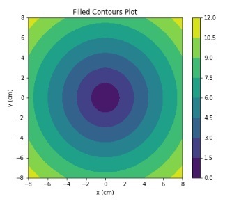
使用 fig.colorbar() 方法,我們已向圖表中添加了顏色。z 函式是 x 和 y 座標值的平方根之和。
示例
在此示例中,我們將使用 matplotlib.plt.contourf() 方法繪製極座標等值線圖。
import numpy as np
import matplotlib.pyplot as plt

a = np.radians(np.linspace(0, 360, 20))
b = np.arange(0, 70, 10)

Y, X = np.meshgrid(b, a)
values = np.random.random((a.size, b.size))

fig, ax = plt.subplots(subplot_kw=dict(projection='polar'))
ax.set_title('Filled Contours Plot')
ax.contourf(X, Y, values)

plt.show()
輸出
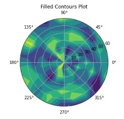
在以上所有示例中,我們都使用了 numpy.meshgrid() 函式來生成 X 和 Y 座標的陣列。

932 次瀏覽
