- Bootstrap 4 教程
- Bootstrap 4 - 首頁
- Bootstrap 4 - 概述
- Bootstrap 4 - 環境設定
- Bootstrap 4 - 佈局
- Bootstrap 4 - 網格系統
- Bootstrap 4 - 內容
- Bootstrap 4 - 元件
- Bootstrap 4 - 工具類
- Bootstrap 3 和 4 之間的區別
- Bootstrap 4 有用資源
- Bootstrap 4 快速指南
- Bootstrap 4 - 有用資源
- Bootstrap 4 - 討論
Bootstrap 4 快速指南
Bootstrap 4 - 概述
什麼是 Bootstrap 4?
Bootstrap 4 是一款功能強大且流行的移動優先前端框架,用於構建響應式移動優先網站。它是 Bootstrap 的最新版本,它使用 HTML、CSS 和 JavaScript。
歷史
Bootstrap v3.3.7 的最後一個穩定版本釋出在 2016 年 7 月,並在 2017 年 8 月釋出了 Bootstrap 4.0.0 測試版。
為什麼要使用 Bootstrap?
它在整個庫中包含移動優先樣式,而不是將它們放在單獨的檔案中。
只需瞭解 HTML 和 CSS,任何人都可以開始使用 Bootstrap。此外,Bootstrap 官方網站提供了良好的文件。
它受所有流行瀏覽器支援,其響應式 CSS 可以適應桌上型電腦、平板電腦和手機。
為開發人員構建介面提供了一個乾淨且統一的解決方案。
它包含美觀且功能強大的內建元件,易於自定義。
它是開源的,並提供基於 Web 的自定義。
Bootstrap 3 與 Bootstrap 4
Bootstrap 4 是 Bootstrap 3 的最新版本,其源 CSS 檔案已轉換為 SCSS。它使用 flex 模式作為網格系統,並支援所有最新的瀏覽器。但是,它支援 Internet Explorer 9+ 和 iOS 7+,並放棄了對 IE 8 及更低版本、iOS 6 及更低版本的支援。有關 Bootstrap 3 和 Bootstrap 4 之間差異的更多資訊,請檢視此 章節。
Bootstrap 4 - 環境設定
您可以透過從 CDN(內容分發網路)包含 Bootstrap 4 或從 getbootstrap.com 下載它來開始在您的網站中使用它。
使用 CDN
Bootstrap 4 可以透過從 內容分發網路 包含到網站中來使用。
在您的專案中使用以下編譯後的 Bootstrap 的 CSS 和 JS 的 CDN。
<!-- Compiled and Minified Bootstrap CSS -->
<link rel = "stylesheet"
   href = "https://maxcdn.bootstrapcdn.com/bootstrap/4.0.0/css/bootstrap.min.css"
   integrity = "sha384-Gn5384xqQ1aoWXA+058RXPxPg6fy4IWvTNh0E263XmFcJlSAwiGgFAW/dAiS6JXm"
   crossorigin = "anonymous">

<!-- jQuery Library -->
<script src = "https://code.jquery.com/jquery-3.2.1.slim.min.js"
   integrity = "sha384-KJ3o2DKtIkvYIK3UENzmM7KCkRr/rE9/Qpg6aAZGJwFDMVNA/GpGFF93hXpG5KkN"
   crossorigin = "anonymous">
</script>

<!-- Popper -->
<script src = "https://cdnjs.cloudflare.com/ajax/libs/popper.js/1.12.9/umd/popper.min.js"
   integrity = "sha384-ApNbgh9B+Y1QKtv3Rn7W3mgPxhU9K/ScQsAP7hUibX39j7fakFPskvXusvfa0b4Q"
   crossorigin = "anonymous">
</script>

<!-- Compiled and Minified Bootstrap JavaScript -->
<script src = "https://maxcdn.bootstrapcdn.com/bootstrap/4.0.0/js/bootstrap.min.js"
   integrity = "sha384-JZR6Spejh4U02d8jOt6vLEHfe/JQGiRRSQQxSfFWpi1MquVdAyjUar5+76PVCmYl"
   crossorigin = "anonymous">
</script>
如果您使用的是 JavaScript 的編譯版本,則在 最小化 Bootstrap JavaScript 之前包含 jQuery 和 Popper.js(Bootstrap 4 使用 jQuery 和 Popper.js 來使用 JavaScript 元件,例如模態框、工具提示、彈出框等)的 CDN 版本。
以下是一些需要 jQuery 的元件:
用於可關閉的警報
使用按鈕和複選框/單選按鈕切換狀態,並使用摺疊來切換內容
用於幻燈片、控制元件和指示器的輪播
下拉選單(使用 Popper.js 進行完美定位)
開啟和關閉模態框
用於摺疊導航欄
工具提示和彈出框(使用 Popper.js 進行完美定位)
下載 Bootstrap 4
您可以從 https://bootstrap.tw/docs/4.1/getting-started/download/ 下載 Bootstrap 4。當您點選此連結時,您將看到如下所示的螢幕:
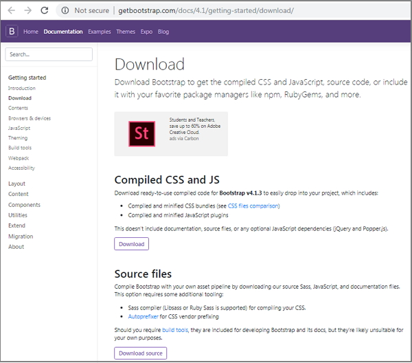
在這裡您可以看到兩個按鈕:
下載 - 點選此按鈕,您可以下載 Bootstrap 的 CSS 和 JavaScript 的預編譯和最小化版本。不包含文件或原始原始碼檔案。
下載原始碼 - 點選此按鈕,您可以獲取最新的 Bootstrap SCSS、JavaScript 原始碼和文件檔案。
為了更好地理解和易於使用,我們將在整個教程中使用 Bootstrap 的預編譯版本。由於檔案已編譯和最小化,因此您不必每次都為單個功能包含單獨的檔案。
檔案結構
預編譯的 Bootstrap 4
下載編譯後的 Bootstrap 4 後,解壓縮 ZIP 檔案,您將看到以下檔案/目錄結構:
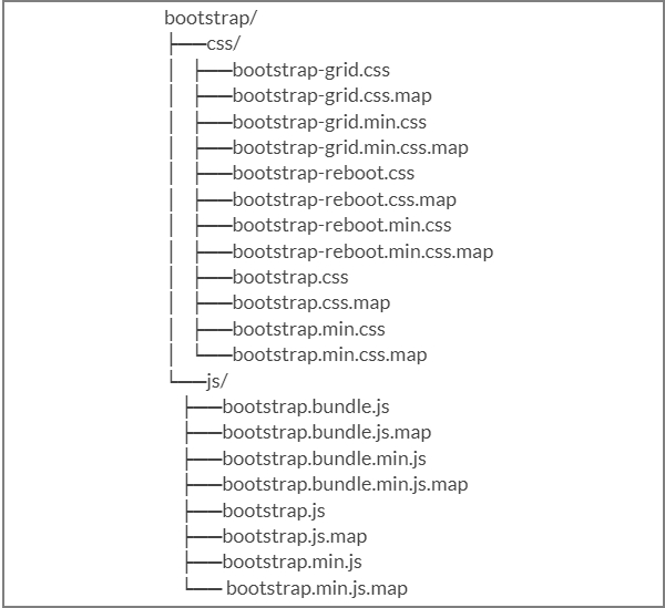
如您所見,這裡有編譯後的 CSS 和 JS (bootstrap.*),以及編譯後和最小化後的 CSS 和 JS (bootstrap.min.*)。
Bootstrap 4 原始碼
如果您已下載 Bootstrap 4 原始碼,則檔案結構如下:

js/ 和 scss/ 下的檔案是 Bootstrap CSS 和 JavaScript 的原始碼。
dist/ 資料夾包含上面預編譯下載部分列出的所有內容。
docs/examples/ 包含 Bootstrap 文件的原始碼以及 Bootstrap 用法的示例。
使用 Bootstrap 4 建立第一個網頁
以下示例指定了 Bootstrap 4 的簡單網頁:
示例
<html lang = "en">
   <head>
      <!-- Meta tags -->
      <meta charset = "utf-8">
      <meta name = "viewport" content = "width=device-width, initial-scale = 1, shrink-to-fit = no">

      <!-- Bootstrap CSS -->
      <link rel = "stylesheet"
      href = "https://stackpath.bootstrapcdn.com/bootstrap/4.1.3/css/bootstrap.min.css"
         integrity =" sha384-MCw98/SFnGE8fJT3GXwEOngsV7Zt27NXFoaoApmYm81iuXoPkFOJwJ8ERdknLPMO"
         crossorigin = "anonymous">

      <title>Bootstrap 4 Example</title>
   </head>

   <body>
      <h2>Hello, world!!! Welcome to Tutorialspoint...</h2>

      <!-- jQuery first, then Popper.js, then Bootstrap JS -->
      <script src = "https://code.jquery.com/jquery-3.3.1.slim.min.js"
         integrity = "sha384-q8i/X+965DzO0rT7abK41JStQIAqVgRVzpbzo5smXKp4YfRvH+8abtTE1Pi6jizo"
         crossorigin = "anonymous">
      </script>

      <script src = "https://cdnjs.cloudflare.com/ajax/libs/popper.js/1.14.3/umd/popper.min.js"
         integrity = "sha384-ZMP7rVo3mIykV+2+9J3UJ46jBk0WLaUAdn689aCwoqbBJiSnjAK/l8WvCWPIPm49"
         crossorigin = "anonymous">
      </script>

      <script src = "https://stackpath.bootstrapcdn.com/bootstrap/4.1.3/js/bootstrap.min.js"
         integrity = "sha384-ChfqqxuZUCnJSK3+MXmPNIyE6ZbWh2IMqE241rYiqJxyMiZ6OW/JmZQ5stwEULTy"
         crossorigin = "anonymous">
      </script>

   </body>
</html>
它將產生以下結果:
輸出
Bootstrap 4 - 佈局
Bootstrap 4 使用容器類來包裝頁面內容。它包含兩個容器類:
.container - 它表示一個固定寬度的容器。
.container-fluid - 它表示一個全寬容器。
容器
.container 類用於使用固定寬度包裝頁面內容,並且可以使用 .container 類輕鬆地將內容放置在中心,如下所示。
<div class = "container">
   ...
</div>
示例
以下示例指定了一個具有固定寬度容器的簡單網頁:
<html lang = "en">
   <head>
      <!-- Meta tags -->
      <meta charset = "utf-8">
      <meta name = "viewport" content = "width = device-width, initial-scale = 1, shrink-to-fit = no">

      <!-- Bootstrap CSS -->
      <link rel = "stylesheet"
         href = "https://stackpath.bootstrapcdn.com/bootstrap/4.1.3/css/bootstrap.min.css"
         integrity = "sha384-MCw98/SFnGE8fJT3GXwEOngsV7Zt27NXFoaoApmYm81iuXoPkFOJwJ8ERdknLPMO"
         crossorigin = "anonymous">
      <title>Bootstrap 4 Example</title>
      <style>
         .container {
            background: #a52c644a;
            text-align: center;
            padding-top: 100px;
            padding-bottom: 100px;
         }
      </style>
   </head>

   <body>
      <div class = "container">
         <h2>Fixed Width Container</h2>
         This is a simple web page with fixed width container by using
         <code>.container</code> class.
      </div>

      <!-- jQuery first, then Popper.js, then Bootstrap JS -->
      <script src = "https://code.jquery.com/jquery-3.3.1.slim.min.js"
         integrity = "sha384-q8i/X+965DzO0rT7abK41JStQIAqVgRVzpbzo5smXKp4YfRvH+8abtTE1Pi6jizo"
         crossorigin = "anonymous">
      </script>

      <script src = "https://cdnjs.cloudflare.com/ajax/libs/popper.js/1.14.3/umd/popper.min.js"
         integrity = "sha384-ZMP7rVo3mIykV+2+9J3UJ46jBk0WLaUAdn689aCwoqbBJiSnjAK/l8WvCWPIPm49"
         crossorigin = "anonymous">
      </script>

      <script src = "https://stackpath.bootstrapcdn.com/bootstrap/4.1.3/js/bootstrap.min.js"
         integrity = "sha384-ChfqqxuZUCnJSK3+MXmPNIyE6ZbWh2IMqE241rYiqJxyMiZ6OW/JmZQ5stwEULTy"
         crossorigin = "anonymous">
      </script>

   </body>
</html>
它將產生以下結果:
輸出
流體容器
您可以使用 .container-fluid 類建立全寬容器,如下所示。
<div class = "container-fluid">
   ...
</div>
以下示例指定了一個具有全寬容器的簡單網頁:
示例
<html lang = "en">
   <head>
      <!-- Meta tags -->
      <meta charset = "utf-8">
      <meta name = "viewport" content = "width = device-width, initial-scale = 1, shrink-to-fit = no">

      <!-- Bootstrap CSS -->
      <link rel = "stylesheet"
         href = "https://stackpath.bootstrapcdn.com/bootstrap/4.1.3/css/bootstrap.min.css"
         integrity = "sha384-MCw98/SFnGE8fJT3GXwEOngsV7Zt27NXFoaoApmYm81iuXoPkFOJwJ8ERdknLPMO"
         crossorigin = "anonymous">
      <title>Bootstrap 4 Example</title>
       <style>
         .container-fluid {
            background: #a52c644a;
            text-align: center;
            padding-top: 100px;
            padding-bottom: 100px;
         }
      </style>
   </head>

   <body>
      <div class = "container-fluid">
         <h2>Full Width Container</h2>
         This is a simple web page with full width container by using
         <code>.container-fluid</code> class.
      </div>

      <!-- jQuery first, then Popper.js, then Bootstrap JS -->
      <script src = "https://code.jquery.com/jquery-3.3.1.slim.min.js"
         integrity = "sha384-q8i/X+965DzO0rT7abK41JStQIAqVgRVzpbzo5smXKp4YfRvH+8abtTE1Pi6jizo"
         crossorigin = "anonymous">
      </script>

      <script src = "https://cdnjs.cloudflare.com/ajax/libs/popper.js/1.14.3/umd/popper.min.js"
         integrity =" sha384-ZMP7rVo3mIykV+2+9J3UJ46jBk0WLaUAdn689aCwoqbBJiSnjAK/l8WvCWPIPm49"
         crossorigin = "anonymous">
      </script>

      <script src = "https://stackpath.bootstrapcdn.com/bootstrap/4.1.3/js/bootstrap.min.js"
         integrity = "sha384-ChfqqxuZUCnJSK3+MXmPNIyE6ZbWh2IMqE241rYiqJxyMiZ6OW/JmZQ5stwEULTy"
         crossorigin = "anonymous">
      </script>

   </body>
</html>
它將產生以下結果:
輸出
Bootstrap 4 - 網格系統
描述
Bootstrap 4 網格系統使用 flexbox 構建,它完全響應式,並透過建立跨頁面的行和列布局擴充套件到 12 列(根據裝置的大小)。它提供了一個響應式、移動優先的流體網格系統,該系統會隨著裝置或視口大小的增加而縮放列。
網格系統的運作方式
行必須放置在 .container 類中才能正確對齊和填充。
對於響應式寬度,使用 .container 類,對於在所有視口中保持固定寬度,使用 .container-fluid 類。
使用行建立水平列組。
內容應放置在列中,並且只有列可能是行的直接子元素。
列包含用於控制它們之間間距的填充。
如果您在一行中放置超過 12 列,則這些列將放置在新的一行中。
列透過填充在列內容之間建立間隙。因此,您可以使用行上的 .no-gutters 類從行中刪除邊距並從列中刪除填充。
您可以使用五個網格斷點(例如超小、小、中、大、超大)使網格系統響應式。
預定義的網格類(如 .col-4)可用於快速建立網格佈局。LESS 混合器也可用於更語義化的佈局。
網格選項
下表總結了 Bootstrap 4 網格系統在多個裝置上的工作方式:
| 超小裝置(<576px) | 小裝置(≥576px) | 中型裝置(≥768px) | 大型裝置(≥992px) | 超大型裝置(≥1200px) | |
|---|---|---|---|---|---|
| 網格行為 | 始終水平 | 最初摺疊,在斷點以上水平 | 最初摺疊,在斷點以上水平 | 最初摺疊,在斷點以上水平 | 最初摺疊,在斷點以上水平 |
| 最大容器寬度 | 無(自動) | 540px | 720px | 960px | 1140px |
| 類類 | .col- | .col-sm- | .col-md- | .col-lg- | .col-xl- |
| 列數 | 12 | 12 | 12 | 12 | 12 |
| 槽寬 |
30px (每列兩側各 15px) |
30px (每列兩側各 15px) |
30px (每列兩側各 15px) |
30px (每列兩側各 15px) |
30px (每列兩側各 15px) |
| 可巢狀 | 是 | 是 | 是 | 是 | 是 |
| 列排序 | 是 | 是 | 是 | 是 | 是 |
基本網格結構
以下是 Bootstrap 4 網格的基本結構:
<div class = "container">
   <div class = "row">
      <div class = "col-*-*"></div>
      <div class = "col-*-*"></div>
   </div>

   <div class = "row">
      <div class = "col-*-*"></div>
      <div class = "col-*-*"></div>
      <div class = "col-*-*"></div>
   </div>

   <div class = "row">...</div>
</div>
網格系統示例
以下是 Bootstrap 4 網格系統的示例:
示例
<html lang = "en">
   <head>
      <!-- Meta tags -->
      <meta charset = "utf-8">
      <meta name = "viewport" content = "width = device-width, initial-scale = 1, shrink-to-fit = no">

      <!-- Bootstrap CSS -->
      <link rel = "stylesheet"
         href = "https://stackpath.bootstrapcdn.com/bootstrap/4.1.3/css/bootstrap.min.css"
         integrity = "sha384-MCw98/SFnGE8fJT3GXwEOngsV7Zt27NXFoaoApmYm81iuXoPkFOJwJ8ERdknLPMO"
         crossorigin = "anonymous">
      <title>Bootstrap 4 Example</title>
      </style>
         .grid_system  div[class^="col"] {
            border: 1px solid white;
            background: #e4dcdc;
            text-align: center;
            padding-top: 5px;
            padding-bottom: 5px
         }
      </style>
   </head>

   <body>
      <div class = "grid_system">
         <div class = "row">
            <div class = "col-sm-1">.col-sm-1</div>
            <div class = "col-sm-1">.col-sm-1</div>
            <div class = "col-sm-1">.col-sm-1</div>
            <div class = "col-sm-1">.col-sm-1</div>
            <div class = "col-sm-1">.col-sm-1</div>
            <div class = "col-sm-1">.col-sm-1</div>
            <div class = "col-sm-1">.col-sm-1</div>
            <div class = "col-sm-1">.col-sm-1</div>
            <div class = "col-sm-1">.col-sm-1</div>
            <div class = "col-sm-1">.col-sm-1</div>
            <div class = "col-sm-1">.col-sm-1</div>
            <div class = "col-sm-1">.col-sm-1</div>
         </div>

         <div class = "row">
            <div class = "col-sm-3">.col-sm-3</div>
            <div class = "col-sm-3">.col-sm-3</div>
            <div class = "col-sm-3">.col-sm-3</div>
            <div class = "col-sm-3">.col-sm-3</div>
         </div>

         <div class = "row">
            <div class = "col-sm-4">.col-sm-4</div>
            <div class = "col-sm-4">.col-sm-4</div>
            <div class = "col-sm-4">.col-sm-4</div>
         </div>

         <div class = "row">
            <div class =" col-sm-3">.col-sm-3</div>
            <div class = "col-sm-3">.col-sm-3</div>
            <div class = "col-sm-6">.col-sm-6</div>
         </div>

         <div class = "row">
            <div class = "col-sm-5">.col-sm-5</div>
            <div class = "col-sm-7">.col-sm-7</div>
         </div>

         <div class = "row">
            <div class = "col-sm-6">.col-sm-6</div>
            <div class = "col-sm-6">.col-sm-6</div>
         </div>

         <div class = "row">
            <div class = "col-sm-12">.col-sm-12</div>
         </div>
      </div>

      <!-- jQuery first, then Popper.js, then Bootstrap JS -->
      <script src = "https://code.jquery.com/jquery-3.3.1.slim.min.js"
         integrity = "sha384-q8i/X+965DzO0rT7abK41JStQIAqVgRVzpbzo5smXKp4YfRvH+8abtTE1Pi6jizo"
         crossorigin = "anonymous">
      </script>

      <script src = "https://cdnjs.cloudflare.com/ajax/libs/popper.js/1.14.3/umd/popper.min.js"
         integrity = "sha384-ZMP7rVo3mIykV+2+9J3UJ46jBk0WLaUAdn689aCwoqbBJiSnjAK/l8WvCWPIPm49"
         crossorigin = "anonymous">
      </script>

      <script src = "https://stackpath.bootstrapcdn.com/bootstrap/4.1.3/js/bootstrap.min.js"
         integrity = "sha384-ChfqqxuZUCnJSK3+MXmPNIyE6ZbWh2IMqE241rYiqJxyMiZ6OW/JmZQ5stwEULTy"
         crossorigin = "anonymous">
      </script>

   </body>
</html>
它將產生以下結果:
輸出
建立兩列布局
以下示例描述了為小型、中型和大型裝置建立兩列布局。在小型裝置(如手機)上,列將自動變為水平,這是預設設定。
示例
<html lang = "en">
   <head>
      <!-- Meta tags -->
      <meta charset = "utf-8">
      <meta name = "viewport" content = "width = device-width, initial-scale = 1, shrink-to-fit = no">

      <!-- Bootstrap CSS -->
      <link rel = "stylesheet" href = "https://stackpath.bootstrapcdn.com/bootstrap/4.1.3/css/bootstrap.min.css"
         integrity = "sha384-MCw98/SFnGE8fJT3GXwEOngsV7Zt27NXFoaoApmYm81iuXoPkFOJwJ8ERdknLPMO"
         crossorigin = "anonymous">
      <title>Bootstrap 4 Example</title>
   </head>

   <body>
      <div class = "grid_system">
         <div class = "row">
            <div class = "col-sm-6">.col-sm-6</div>
            <div class = "col-sm-6">.col-sm-6</div>
         </div>

         <div class = "row">
            <div class = "col-sm-7">.col-sm-7</div>
            <div class = "col-sm-5">.col-sm-5</div>
         </div>

         <div class = "row">
            <div class = "col-sm-4">.col-sm-4</div>
            <div class = "col-sm-8">.col-sm-8</div>
         </div>

         <div class = "row">
            <div class = "col-sm-9">.col-sm-9</div>
            <div class = "col-sm-3">.col-sm-3</div>
         </div>
      </div>

      <!-- jQuery first, then Popper.js, then Bootstrap JS -->
      <script src = "https://code.jquery.com/jquery-3.3.1.slim.min.js"
         integrity = "sha384-q8i/X+965DzO0rT7abK41JStQIAqVgRVzpbzo5smXKp4YfRvH+8abtTE1Pi6jizo"
         crossorigin = "anonymous">
      </script>

      <script src = "https://cdnjs.cloudflare.com/ajax/libs/popper.js/1.14.3/umd/popper.min.js"
         integrity = "sha384-ZMP7rVo3mIykV+2+9J3UJ46jBk0WLaUAdn689aCwoqbBJiSnjAK/l8WvCWPIPm49"
         crossorigin = "anonymous">
      </script>

      <script src = "https://stackpath.bootstrapcdn.com/bootstrap/4.1.3/js/bootstrap.min.js"
         integrity = "sha384-ChfqqxuZUCnJSK3+MXmPNIyE6ZbWh2IMqE241rYiqJxyMiZ6OW/JmZQ5stwEULTy"
         crossorigin = "anonymous">
      </script>

   </body>
</html>
它將產生以下結果:
輸出
建立三列布局
以下示例描述了為中型和大型裝置建立三列布局。如果螢幕解析度大於或等於 992 畫素,則它將在平板電腦上以橫向模式顯示,照常,它將在縱向模式下顯示。
示例
<html lang = "en">
   <head>
      <!-- Meta tags -->
      <meta charset = "utf-8">
      <meta name = "viewport" content = "width = device-width, initial-scale = 1, shrink-to-fit = no">

      <!-- Bootstrap CSS -->
      <link rel = " stylesheet" href = " https://stackpath.bootstrapcdn.com/bootstrap/4.1.3/css/bootstrap.min.css"
         integrity = "sha384-MCw98/SFnGE8fJT3GXwEOngsV7Zt27NXFoaoApmYm81iuXoPkFOJwJ8ERdknLPMO"
         crossorigin = "anonymous">
      <title>Bootstrap 4 Example</title>
   </head>

   <body>
      <div class = "grid_system">
         <div class = "row">
            <div class = "col-sm-4">.col-sm-4</div>
            <div class = "col-sm-4">.col-sm-4</div>
            <div class = "col-sm-4">.col-sm-4</div>
         </div>

         <div class = "row">
            <div class = "col-sm-3">.col-sm-3</div>
            <div class = "col-sm-4">.col-sm-4</div>
            <div class = "col-sm-5">.col-sm-5</div>
         </div>

         <div class = "row">
            <div class = "col-sm-2">.col-sm-2</div>
            <div class = "col-sm-8">.col-sm-8</div>
            <div class = "col-sm-2">.col-sm-2</div>
         </div>

         <div class = "row">
            <div class = "col-sm-2">.col-sm-2</div>
            <div class = "col-sm-3">.col-sm-3</div>
            <div class = "col-sm-7">.col-sm-7</div>
         </div>
      </div>

      <!-- jQuery first, then Popper.js, then Bootstrap JS -->
      <script src = "https://code.jquery.com/jquery-3.3.1.slim.min.js"
         integrity = "sha384-q8i/X+965DzO0rT7abK41JStQIAqVgRVzpbzo5smXKp4YfRvH+8abtTE1Pi6jizo"
         crossorigin = "anonymous">
      </script>

      <script src = "https://cdnjs.cloudflare.com/ajax/libs/popper.js/1.14.3/umd/popper.min.js"
         integrity = "sha384-ZMP7rVo3mIykV+2+9J3UJ46jBk0WLaUAdn689aCwoqbBJiSnjAK/l8WvCWPIPm49"
         crossorigin = "anonymous">
      </script>

      <script src = "https://stackpath.bootstrapcdn.com/bootstrap/4.1.3/js/bootstrap.min.js"
         integrity = "sha384-ChfqqxuZUCnJSK3+MXmPNIyE6ZbWh2IMqE241rYiqJxyMiZ6OW/JmZQ5stwEULTy"
         crossorigin = "anonymous">
      </script>

   </body>
</html>
它將產生以下結果:
輸出
Bootstrap 4 - 內容
描述
Bootstrap 4 使用內容方法的集合來顯示網頁上的文字、程式碼塊、響應式影像、表格格式的資料等。
下表列出了您可以用來操作 Bootstrap 4 的內容方法:
| 序號 | 方法和描述 |
|---|---|
| 1 |
排版功能建立標題、段落、列表和其他內聯元素。 |
| 2 |
它用於在文件中顯示內聯和多行程式碼塊。 |
| 3 |
Bootstrap 4 透過使用 <img> 標籤提供對影像的支援。 |
| 4 |
表格用於以表格格式顯示資料。 |
| 5 |
figure 元素指定內容以及相關影像,以及可選的標題。 |
Bootstrap 4 - 元件
描述
Bootstrap 4 使用內容方法的集合來顯示網頁上的文字、程式碼塊、響應式影像、表格格式的資料等。
下表列出了您可以用來操作 Bootstrap 4 的內容方法:
| 序號 | 方法和描述 |
|---|---|
| 1 |
alert 元件指定使用者操作的預定義訊息。 |
| 2 |
徽章用於突出顯示內容的其他資訊。 |
| 3 |
它用於顯示網站的基於層次結構的資訊。 |
| 4 |
Bootstrap 提供可點選的按鈕來放置內容,例如文字和影像。 |
| 5 |
按鈕組允許將多個按鈕堆疊在一行上。 |
| 6 |
卡片是一個內容容器,它顯示一個帶邊框的框,周圍有一些填充。 |
| 7 |
輪播是在您的網站上新增滑塊的一種靈活且響應式的方式。 |
| 8 |
它用於顯示或隱藏內容。 |
| 9 |
下拉選單可用於以列表格式顯示連結。 |
| 10 |
表單元素用於收集使用者的輸入。 |
| 11 |
使用輸入組,您可以輕鬆地將文字或按鈕附加到基於文字的輸入之前和之後。 |
| 12 |
它增加了標題的大小,併為登入頁面內容添加了大量邊距。 |
| 13 |
模態框是一個子視窗,它疊加在其父視窗上。 |
| 14 |
Bootstrap 在水平選單中為您網站提供導航項。 |
| 15 |
導航欄為您的應用程式或網站提供導航標題。 |
| 16 |
分頁用於將相關內容劃分為多個頁面。 |
| 17 |
彈出框類似於工具提示,提供了一個擴充套件檢視,包括標題。 |
| 18 |
進度條透過堆疊的條形、動畫背景和文字標籤顯示程序的進度。 |
| 19 |
滾動偵聽用於根據滾動位置指示選單中當前啟用的連結。 |
| 20 |
當您需要描述連結時,工具提示很有用。 |
Bootstrap 4 - 工具類
描述
Bootstrap 4 使用一系列實用程式在網頁上顯示邊框、文字顏色、嵌入影片等。
下表列出了您可以用來操作 Bootstrap 4 的實用程式型別 -