
 Data Structure
 Networking
 RDBMS
RDBMS Operating System
 Java
Java MS Excel
 iOS
iOS HTML
HTML CSS
CSS Android
 Python
 C Programming
 C++
C++ C#
C# MongoDB
 MySQL
MySQL Javascript
 PHP
PHP Physics
 Chemistry
 Biology
 Mathematics
 English
 Economics
 Psychology
 Social Studies
 Fashion Studies
 Legal Studies
使用 CSS3 向影像應用復古效果
filter 屬性用於設定視覺效果,例如陰影、對比度、亮度、飽和度和影像的陰影。以下是語法:
語法
filter: none | drop-shadow() | blur() | brightness() | contrast() | grayscale() | hue-rotate() | invert() | opacity() | saturate() | sepia() | url();
如您在上面看到的,使用 filter 屬性,我們可以設定以下效果:對比度、陰影、模糊、亮度、灰度、色相,反轉、不透明度、飽和度、復古、URL。
sepia 將復古效果設定為影像。要在 CSS3 中設定復古效果,請針對 filter 屬性使用 sepia 值,例如,
實際影像:0%
完全復古:100%
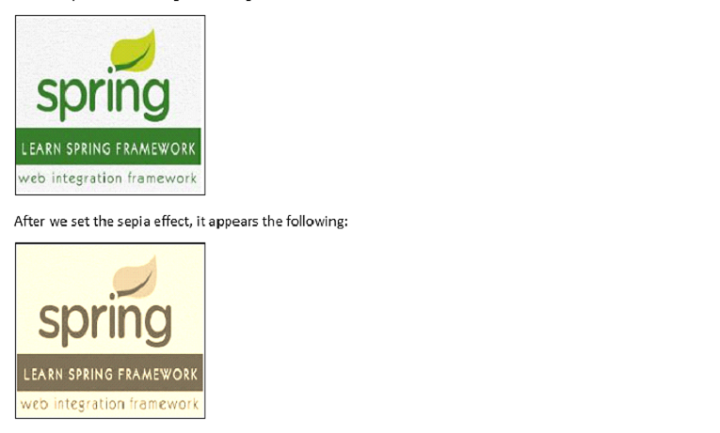
例如,下面是我們的影像:

在設定了復古效果後,顯示效果如下:
對影像應用復古效果
示例
在此,我們針對完全效果將復古效果設定為 100%:
<!DOCTYPE html>
<html>
<head>
   <style>
      img.demo {
         filter: sepia(100%);
      }
   </style>
</head>
<body>
   <h1>Learn Spring Framework</h1>
   <img src="https://tutorialspoint.tw/spring/images/spring-mini-logo.jpg" alt="Spring Framework" width="160" height="150">
   <h1>Learn Spring Framework</h1>
   <img class="demo" src="https://tutorialspoint.tw/spring/images/spring-mini-logo.jpg" alt="Spring Framework" width="160" height="150">
</body>
</html>
對影像應用 50% 的復古效果
示例
我們來看另一個示例,其中我們將復古效果設定為 50%:
<!DOCTYPE html>
<html>
<head>
   <style>
      img.demo {
         filter: sepia(50%);
      }
   </style>
</head>
<body>
   <h1>Learn Spring Framework</h1>
   <img src="https://tutorialspoint.tw/spring/images/spring-mini-logo.jpg" alt="Spring Framework" width="160" height="150">
   <h1>Learn Spring Framework</h1>
   <img class="demo" src="https://tutorialspoint.tw/spring/images/spring-mini-logo.jpg" alt="Spring Framework" width="160" height="150">
</body>
</html>
對影像應用 0% 的復古效果
示例
我們來看另一個示例,其中我們將復古效果設定為 0%:
<!DOCTYPE html>
<html>
<head>
   <style>
      img.demo {
         filter: sepia(0%);
      }
   </style>
</head>
<body>
   <h1>Learn Spring Framework</h1>
   <img src="https://tutorialspoint.tw/spring/images/spring-mini-logo.jpg" alt="Spring Framework" width="160" height="150">
   <h1>Learn Spring Framework</h1>
   <img class="demo" src="https://tutorialspoint.tw/spring/images/spring-mini-logo.jpg" alt="Spring Framework" width="160" height="150">
</body>
</html>

更新於:2023 年 10 月 27 日
263 次瀏覽

廣告