
 資料結構
資料結構 網路
網路 關係型資料庫管理系統(RDBMS)
 作業系統
作業系統 Java
Java MS Excel
 iOS
iOS HTML
HTML CSS
CSS Android
 Python
 C語言程式設計
 C++
C++ C#
C# MongoDB
 MySQL
MySQL Javascript
 PHP
PHP 物理學
物理學 化學
化學 生物學
生物學 數學
數學 英語
英語 經濟學
經濟學 心理學
心理學 社會學
社會學 服裝設計
服裝設計 法學
法學如何在HTML中建立Flexbox佈局?
要在HTML中建立Flexbox佈局,我們使用CSS浮動。我們有多種佈局來顯示網頁上的內容。CSS浮動是實現多列布局的方法之一。
Flexbox佈局在CSS3中引入。此佈局有助於調整螢幕大小,以便在多個顯示裝置上正確顯示,並使網頁具有響應性。透過內容邊距的摺疊,Flexbox不會摺疊。它會根據螢幕大小進行調整。
這是一個您可以輕鬆建立的Flexbox佈局。調整頁面大小後,可見如下內容。頁面會根據多個裝置螢幕進行調整:
示例1 - 不使用Flexbox
讓我們首先來看一個不使用Flexbox佈局的示例:
<!DOCTYPE html>
<html>
<head></head>
<body>
   <div class="mycontent">
      <header>
         <h1>Tutorialspoint.com</h1>
         <h3>Simply Easy Learning</h3>
      </header>
      <nav>
         <ul>
            <li><a href="/tutorialslibrary.htm">Tutorials Library</a></li>
            <li><a href="/videotutorials/index.htm">Video Tutorials</a></li>
            <li><a href="/codingground.htm">Coding Ground</a></li>
            <li><a href="/tutor_connect/index.php">Tutor Connect</a></li>
            <li><a href="/online_dev_tools.htm">Tools</a></li>
         </ul>
      </nav>
      <article>
         <h1>About Us</h1>
         <p>This is demo content.</p>
         <p>This is demo content.</p>
         <p>This is demo content.</p>
         <p>This is demo content.</p>
      </article>
      <footer>Add the footer content here</footer>
   </div>
</body>
</html>
示例2
下面是一個在HTML中建立Flexbox佈局的示例。
<!DOCTYPE html>
<html>
<head>
   <meta charset="UTF-8">
   <meta http-equiv="X-UA-Compatible" content="IE=edge">
   <meta name="viewport" content="width=device-width, initial-scale=1.0">
   <style>
      .head{
         font-size:17px;
         margin-left:10px;
         margin-bottom:15px;
      }
      body {
         margin: 0 auto;
         background-position:center;
         background-size: contain;
      }
      .menu {
         position:static;
         top: 0;
         background-color:skyblue;
         padding:10px 0px 10px 0px;
         color:white;
         margin: 0 auto;
         overflow: hidden;
      }
      .menu a {
         display: flex;
         background-color: DodgerBlue;
         float: left;
         color: white;
         text-align: center;
         padding: 14px 16px;
         text-decoration: none;
         font-size: 20px;
         background-color: #f1f1f1;
         margin: 10px;
         padding: 20px;
         font-size: 30px;
      }
      .menu{
         right: auto;
         float: right;
      }
      footer {
         width: 100%;
         bottom: 0px;
         background-color:slategrey;
         color: #fff;
         position: absolute;
         padding-top:20px;
         padding-bottom:50px;
         text-align:center;
      }
      .body{
         margin-left:10px;
      }
      .aside{
         right:inherit;
         float: right;
         width: 20%;
      }
   </style>
</head>
<body>
   <header>
      <div class="head"><h1><span style="color: red">NPTEL</span></h1> Online Learning Initiatives by IITs and IISc
funded by MoE, Govt. of India</div>
   </header>
   <div class="menu">
      <a href="#home">HOME</a>
      <a href="#course">COURSE</a>
      <a href="#help">HELP</a>
      <a href="#about">ABOUT</a>
      <a href="#settings">SETTINGS</a>
   <div class="menu">
   <a href="#login">LOGIN</a>
   </div>
   </div>
   <div class = "body">
      <section id="Content">
         <h3>1.6 crore+ enrollments<br>
         15 lakhs+ exam registrations<br>
         4500+ LC colleges<br>
         3500+ MOOCs completed<br>
         60+ Industry associates</h3>
      </section>
   </div>
   <div class="aside"><aside>1.3 Billion+ views<br>
      37 lakhs+ YouTube subscribers<br>
      2300+ unique courses available for self study</aside></div>
   <footer style="font-size: 20px">Documents
      Careers
      Help Videos
      Live Sessions
      Information on NPTEL semesters</footer>
</body>
</html>
以下是上述示例程式的輸出。
當我們最小化和最大化瀏覽器標籤時,佈局會根據標籤和裝置的螢幕大小進行調整。這使得我們的網頁具有響應性。
如下所示。
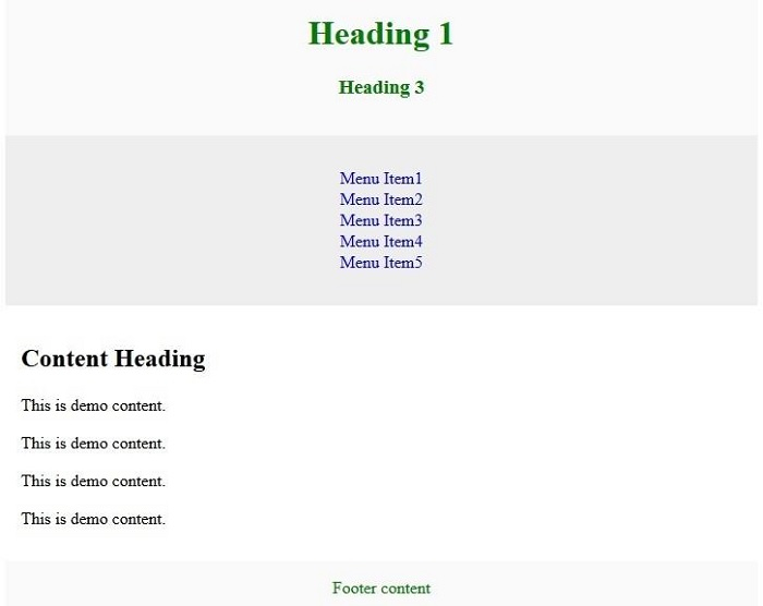
示例3
您可以嘗試執行以下程式碼,在HTML中建立上述靈活的佈局:
<!DOCTYPE html>
<html>
<head>
   <style>
      .flexmycontent {
         display: -webkit-flex;
         display: flex;
         -webkit-flex-flow: row wrap;
         flex-flow: row wrap;
         text-align: center;
      }
      .flexmycontent > * {
         padding: 15px;
         -webkit-flex: 1 100%;
         flex: 1 100%;
      }
      .article {
         text-align: left;
      }
      header {background: #FAFAFA;color:green;}
      footer {background: #FAFAFA;color:green;}
      .nav {background:#eee;}
      .nav ul {
         list-style-type: none;
         padding: 0;
      }
      .nav ul a {
         text-decoration: none;
      }
      @media all and (min-width: 768px) {
         .nav {text-align:left;-webkit-flex: 1 auto;flex:1 auto;-webkit-order:1;order:1;}
         .article {-webkit-flex:5 0px;flex:5 0px;-webkit-order:2;order:2;}
         footer {-webkit-order:3;order:3;}
      }
   </style>
</head>
<body>
   <div class="flexmycontent">
      <header>
         <h1>Tutorialspoint.com</h1>
         <h3>Simply Easy Learning</h3>
      </header>
      <nav class ="nav">
         <ul>
            <li><a href="/tutorialslibrary.htm">Tutorials Library</a></li>
            <li><a href="/videotutorials/index.htm">Video Tutorials</a></li>
            <li><a href="codingground.htm">Coding Ground</a></li>
            <li><a href="/tutor_connect/index.php">Tutor Connect</a></li>
            <li><a href="/online_dev_tools.htm">Tools</a></li>
         </ul>
      </nav>
      <article class="article">
         <h1>About Us</h1>
         <p>This is demo content.</p>
         <p>This is demo content.</p>
         <p>This is demo content.</p>
         <p>This is demo content.</p>
      </article>
      <footer>Add the footer content here</footer>
   </div>
</body>
</html>
更新於:2022年10月19日
810次瀏覽

廣告