
 資料結構
資料結構 網路
網路 關係資料庫管理系統 (RDBMS)
 作業系統
作業系統 Java
Java iOS
iOS HTML
HTML CSS
CSS Android
 Python
 C語言程式設計
 C++
C++ C#
C# MongoDB
 MySQL
MySQL Javascript
 PHP
PHP從NumPy陣列繪製折線圖
折線圖是一種常用的顯示兩個相關資料集之間關係的方法。其主要用途是顯示隨時間的變化。要從NumPy陣列繪製折線圖,可以使用matplotlib,它是使用最廣泛、歷史最悠久的Python繪相簿。它可以輕鬆地與NumPy整合,方便建立折線圖以表示給定資料集中的趨勢和模式。
從NumPy陣列繪製折線圖的Python程式
以下是一些示例程式,演示如何從NumPy陣列繪製折線圖。
示例1
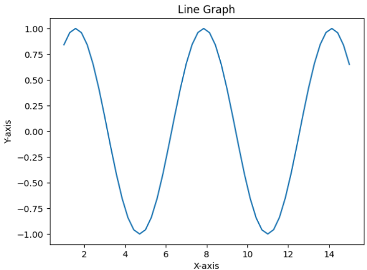
在這個程式中,我們將生成一個值範圍為1到15的NumPy陣列axisX,然後使用sin方法建立一個相應的陣列axisY。為了繪製折線圖,我們將使用plot()方法,並自定義圖表標題以及x軸和y軸的標籤。
# importing required packages
import numpy as np
import matplotlib.pyplot as plt
# To generate random data for plotting
axisX = np.linspace(1, 15, 50)
axisY = np.sin(axisX)
# To create the line graph from above data
plt.plot(axisX, axisY)
# Adding title and labels for the graph
plt.title('Line Graph')
plt.xlabel('X-axis')
plt.ylabel('Y-axis')
# to show the final graph
plt.show()
輸出
示例2
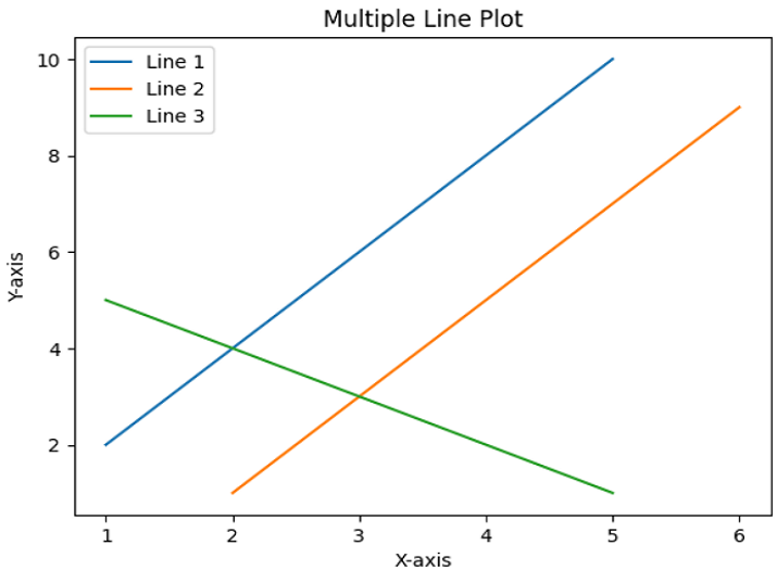
在這個示例中,我們將展示'plot()'方法在繪製多條線中的用法。
方法
匯入NumPy庫,引用名為'np',並從matplotlib庫匯入pyplot模組,並將其重新命名為plt。
使用NumPy陣列初始化三條線作為資料點。
使用'plot()'方法繪製x座標值與y座標值。
然後,使用'title'、'legend'、'xlabel'和'ylabel'新增一些關於繪圖的資訊。
使用'show()'方法顯示結果並退出。
import numpy as np
import matplotlib.pyplot as plt
# Data points of line 1
x1 = np.array([1, 2, 3, 4, 5])
y1 = np.array([2, 4, 6, 8, 10])
# Data points of line 2
x2 = np.array([2, 3, 4, 5, 6])
y2 = np.array([1, 3, 5, 7, 9])
# Data points of line 3
x3 = np.array([1, 2, 3, 4, 5])
y3 = np.array([5, 4, 3, 2, 1])
# Plotting all lines with labels
plt.plot(x1, y1, label='Line 1')
plt.plot(x2, y2, label='Line 2')
plt.plot(x3, y3, label='Line 3')
# Adding legend, x and y labels, and title for the lines
plt.legend()
plt.xlabel('X-axis')
plt.ylabel('Y-axis')
plt.title('Multiple Line Plot')
# Displaying the plot
plt.show()
輸出
示例3
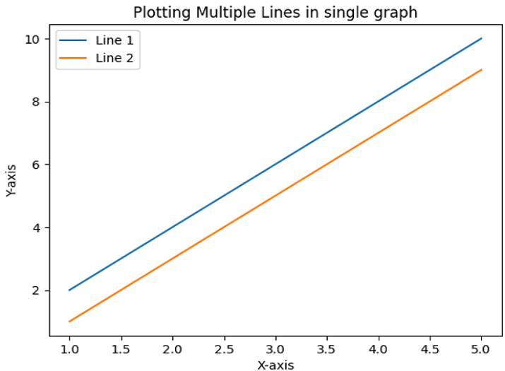
這是另一個示例,我們將使用與前一個示例相同的程式碼來繪製兩條線而不是三條線。
import matplotlib.pyplot as plt
import numpy as np
# Data points of line 1
x1 = np.array([1, 2, 3, 4, 5])
y1 = np.array([2, 4, 6, 8, 10])
# Data points of line 2
x2 = np.array([1, 2, 3, 4, 5])
y2 = np.array([1, 3, 5, 7, 9])
# Plotting all lines with specifying labels
plt.plot(x1, y1, label='Line 1')
plt.plot(x2, y2, label='Line 2')
# Adding legend, x and y labels, and titles for the lines
plt.legend()
plt.xlabel('X-axis')
plt.ylabel('Y-axis')
plt.title('Plotting Multiple Lines in single graph')
# Displaying the plot
plt.show()
輸出
結論
在本文中,我們看到了三個示例程式,它們展示了在從NumPy陣列繪製折線圖中plot()方法的用法。此方法在matplotlib庫中可用。折線圖是視覺化複雜趨勢和資料集的一種方法。

更新於:2023年7月25日
3K+ 次瀏覽

廣告