
 資料結構
資料結構 網路
網路 關係資料庫管理系統
 作業系統
作業系統 Java
Java iOS
iOS HTML
HTML CSS
CSS Android
 Python
 C 程式設計
 C++
C++ C#
C# MongoDB
 MySQL
MySQL Javascript
 PHP
PHP如何在 Python Plotly 中設定 Y 軸的範圍?
Plotly 支援在 X 軸和 Y 軸上設定範圍。讓我們瞭解如何在 Plotly 中設定 Y 軸的範圍。
plotly.graph_objects 用於生成圖形。它包含許多方法來自定義圖表並在 HTML 格式中渲染圖表。
建立一個 NumPy 模組 併為 X 軸和 Y 軸生成隨機範圍。
建立 Figure() 方法,以線條模式繪製 X 軸和 Y 軸
建立 update_layout() 方法並設定 Y 軸範圍。
按照給定的步驟在 Plotly 中設定 Y 軸的範圍。
步驟 1 - 匯入 Plotly
匯入 plotly.graphs_objs 模組並將其別名為 go
import plotly.graphs_objs as go
步驟 2 - 匯入 NumPy
匯入 numpy 模組並將其別名為 np,並設定隨機 seed 值。
import numpy as np
np.random.seed(3)
步驟 3 - 在 X 軸上生成隨機數
讓我們在 X 軸上生成一個 隨機數範圍列表。
x = list(range(0,20,2))
步驟 4 - 在 Y 軸上生成隨機數
如下在 Y 軸上生成隨機數:
y = np.random.randn(10)
步驟 5 - 生成散點圖
讓我們使用以下座標生成散點圖:
fig = go.Figure(data=go.Scatter(x=x, y=y, mode='lines'))
步驟 6 - 設定 Y 軸範圍
使用 update_layout() 方法設定 Y 軸範圍。
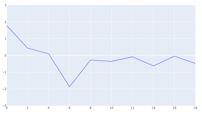
fig.update_layout(yaxis_range=[-3,3])
步驟 7 - 顯示圖形
使用 show() 方法顯示圖形。
fig.show()
示例
在 Python Plotly 中設定 Y 軸範圍的完整程式碼如下:
# Importing Libraries
import plotly.graph_objs as go
import numpy as np

np.random.seed(3)

# generating numbers ranging from 0 to 18 on X-axis
x = list(range(0,20,2))

# generating random numbers on y-axis
y = np.random.randn(10)

# plotting scatter plot on x and y data with
# 'lines' as mode
fig = go.Figure(data=go.Scatter(x=x, y=y, mode='lines'))

# setting the y-axis range from -3 to 3
fig.update_layout(yaxis_range=[-3,3])

# to display the figure in the output screen
fig.show()
輸出
它將在瀏覽器上顯示以下輸出:

更新於:2023-08-27
28K+ 瀏覽量

廣告