
 資料結構
資料結構 網路
網路 關係資料庫管理系統 (RDBMS)
 作業系統
作業系統 Java
Java iOS
iOS HTML
HTML CSS
CSS Android
 Python
 C語言程式設計
 C++
C++ C#
C# MongoDB
 MySQL
MySQL Javascript
 PHP
PHP如何在Python Plotly中繪製到次座標軸?
Plotly是一個開源的、互動式的、基於瀏覽器的Python圖表庫。Python使用者可以使用Plotly生成不同型別的圖表,包括科學圖表、3D圖形、統計圖表、金融圖表等。
在本教程中,我們將演示如何使用Plotly在次座標軸上繪製資料。這裡我們將使用plotly.graph_objects模組來生成圖形。它包含許多方法來自定義圖表並將它們渲染成HTML格式。我們將使用add_trace()方法繪製兩個條形圖,然後使用update_layout()方法設定具有dict引數的屬性。
請按照以下步驟在次座標軸上繪製圖表。
步驟1
匯入plotly.graphs_objs模組並將其別名為go。
import plotly.graphs_objs as go
步驟2
使用Figure()方法建立一個圖形。
fig = go.Figure()
步驟3
使用add_trace()方法建立兩個條形圖。
fig.add_trace(go.Bar(
   x=[5,6,7],
   y=[1,2,3],
   name="yaxis1",
   yaxis='y1'
))

fig.add_trace(go.Bar(
   x=[1,2,3],
   y=[1,2,3],
   name="yaxis2",
   yaxis="y2"
))
步驟4
為第一和第二Y軸建立軸物件。
fig.update_layout(
   xaxis=dict(domain=[0.15, 0.15]),

   # create first Y-axis
   yaxis=dict(
      title="yaxis1 title",
      titlefont=dict(color="blue"),
      tickfont=dict(color="red")
   ),

   # create second Y-axis
   yaxis2=dict(
      title="yaxis2 title",
      overlaying="y",
      side="right", position=0.15)
)
步驟5
使用update_layout()方法設定佈局並分配標題文字。
fig.update_layout(title_text="secondary y-axis")
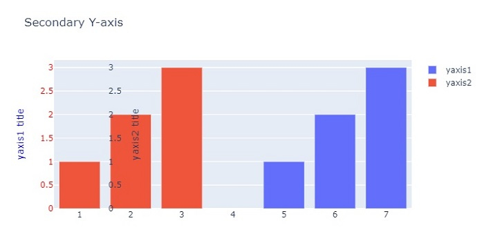
示例
以下是繪製在次Y軸上的完整程式碼:
import plotly.graph_objects as go
fig = go.Figure()
fig.add_trace(go.Bar(
   x=[5, 6, 7], y=[1, 2, 3],
   name="yaxis1", yaxis='y1'))
   fig.add_trace(go.Bar(
   x=[1, 2, 3], y=[1, 2, 3],
   name="yaxis2", yaxis="y2"))

# Create axis objects
fig.update_layout(
   xaxis=dict(domain=[0.15, 0.15]),

# create first y axis
yaxis=dict(
   title="yaxis1 title",
   titlefont=dict(color="blue"),
   tickfont=dict(color="red")
),

# Create second y axis
yaxis2=dict(
   title="yaxis2 title",
   overlaying="y",
   side="right",
   position=0.15)
)

fig.update_layout(title_text="Secondary Y-axis",
width=716, height=400)
fig.show()
輸出
它將在瀏覽器上顯示以下輸出:

更新於:2022年10月26日
7000+ 次瀏覽

廣告