
 資料結構
資料結構 網路
網路 關係資料庫管理系統
 作業系統
作業系統 Java
Java iOS
iOS HTML
HTML CSS
CSS Android
 Python
 C 語言程式設計
 C++
C++ C#
C# MongoDB
 MySQL
MySQL Javascript
 PHP
PHP如何在 Seaborn 圖表中設定座標軸標籤和限制?
使用 Seaborn 建立圖表將調整標籤和座標軸限制,使圖表更易於理解。座標軸標籤是我們可以為 x 軸和 y 軸提供的名稱,以便其他人理解圖表顯示的內容。我們可以透過更改座標軸的限制來關注資料中重要的特定區域。Seaborn 包含用於設定座標軸標籤和限制的簡單方法,使我們能夠使圖表更具資訊量。在 Python 中,我們有一些內建函式,如 xlabel()、ylabel()、xlim() 和 ylim(),可用於在 Seaborn 圖表中設定座標軸標籤和限制。
語法
以下語法在示例中使用:
xlabel()
ylabel()
xlabel() 和 ylabel() 是 Python 中的內建函式,用於設定 x 軸(水平)和 y 軸(垂直)上的文字。
xlim()
ylim()
xlim() 和 ylim() 是內建函式,分別用於設定 x 軸和 y 軸上的指定範圍。
scatterplot()
scatterplot() 是 Python 中的內建方法,它根據資料集幫助設定圖形的點圖。
lineplot()
lineplot() 方法用於顯示圖表的區間。這是一種基本圖表,主要用於機器學習資料集中。
barplot()
這是一種 Python 中的內建方法,將用於建立資料集的條形圖。
histplot()
histplot() 根據資料集建立基於直方圖的圖表。
boxplot()
boxplot() 方法以標準化方式顯示高階摘要,以根據資料集彙總資料。
演算法
以下步驟為:
步驟 1 - 匯入 seaborn 模組並獲取物件引用為 sns
步驟 2 - 匯入名為 matplotlib.pyplot 的模組並獲取引用為 plt,這有助於設定 Seaborn 圖表的座標軸標籤和限制。
步驟 3 - 使用隨機資料建立兩個列表,並分別將其儲存在變數 x 和 y 中。
步驟 4 - 然後根據使用者選擇建立圖表圖形,例如 scatterplot()、lineplot()、boxplot() 和 histplot(),它們接受兩個引數 - x(這將值儲存為變數 x)和 y(這將值儲存為變數 y)以及物件引用 sns。
步驟 5 - 接下來,使用內建方法 xlabel() 和 ylabel() 分別在水平(x 軸)和垂直軸(y 軸)上建立文字表示。
步驟 6 - 要設定圖形的範圍,它將使用內建方法 xlim() 用於水平軸,ylim() 用於垂直軸。
步驟 7 - 最後使用名為 show() 的方法,它將生成程式的輸出。
示例 1
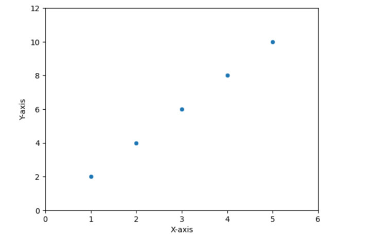
在以下示例中,我們將展示如何透過設定標籤和限制來繪製散點圖。眾所周知,Seaborn 庫可以方便地與 matplotlib 模組一起使用,它將根據給定的資料集生成圖表。
# Scatter plot
import seaborn as sns
import matplotlib.pyplot as plt

# Generate some random data
x = [1, 2, 3, 4, 5]
y = [2, 4, 6, 8, 10]

# Create a scatter plot
sns.scatterplot(x=x, y=y)

# Set labels and limits
plt.xlabel('X-axis')
plt.ylabel('Y-axis')
plt.xlim(0, 6)
plt.ylim(0, 12)

# Show the plot
plt.show()
輸出
示例 2
在以下示例中,我們將展示如何使用 Seaborn 圖表設定標籤和限制來繪製線形圖。它還使用 matplotlib 子模組,即 pyplot,它有助於繪製圖形並透過向其提供特定的內建方法來生成輸出。
import seaborn as sns
import matplotlib.pyplot as plt

# Generate some random data
x = [1, 2, 3, 4, 5]
y = [2, 4, 6, 8, 10]

# Create a line plot
sns.lineplot(x=x, y=y)

# Set labels and limits
plt.xlabel('X-axis')
plt.ylabel('Y-axis')
plt.xlim(0, 6)
plt.ylim(0, 12)

# Show the plot
plt.show()
輸出

示例 3
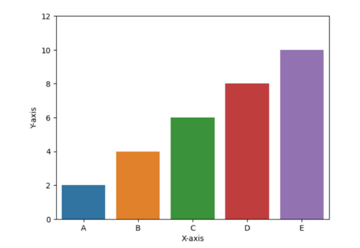
在以下示例中,我們將展示條形圖barplots(),並且要設定標籤和座標軸,它必須使用以下方法:xlabel()、ylabel()、ylim()。接下來,使用 show() 方法獲取結果。
# Bar plot
import seaborn as sns
import matplotlib.pyplot as plt

# Generate some random data
x = ['A', 'B', 'C', 'D', 'E']
y = [2, 4, 6, 8, 10]

# Create a bar plot
sns.barplot(x=x, y=y)

# Set labels and limits
plt.xlabel('X-axis')
plt.ylabel('Y-axis')
plt.ylim(0, 12)

# Show the plot
plt.show()
輸出
示例 4
在以下示例中,我們將展示如何使用內建方法 histplot() 繪製直方圖,該方法接受名為 data 的變數作為引數,該變數包含隨機資料,並使用 xlabel() 和 ylabel() 等內建函式分別在水平和垂直軸上設定文字名稱。然後使用 xlim() 和 ylim() 分別獲取 x 軸和 y 軸上整數的範圍限制。最後,它將使用 show() 方法獲取程式的輸出。
import seaborn as sns
import matplotlib.pyplot as plt

# Generate some random data
data = [1, 2, 3, 4, 5, 2, 3, 4, 5, 6, 7, 8, 9, 10]

# Create a histogram
sns.histplot(data)

# Set labels and limits
plt.xlabel('Values')
plt.ylabel('Frequency')
plt.xlim(0, 11)

# Show the plot
plt.show()
輸出

示例 5
在以下示例中,我們將透過匯入模組 seaborn 和 matplotlib.pyplot 開始程式,這有助於繪製圖形圖表。然後它使用列表中的隨機資料來描繪虛假資料。接下來,使用名為 boxplot() 的方法以及物件引用 sns 建立箱線圖。然後僅使用 ylim() [設定圖形範圍] 在垂直軸上設定限制,並僅使用 xlabel() [填寫文字以在水平軸上顯示某些內容] 在 x 軸上設定標籤。最後,使用 show() 方法獲取輸出。
import seaborn as sns
import matplotlib.pyplot as plt

# Generate some random data
data = [1, 2, 3, 4, 5, 2, 3, 4, 5, 6, 7, 8, 9, 10]

# Create a box plot
sns.boxplot(data)

# Set labels and limits
plt.xlabel('Values')
plt.ylim(0, 11)

# Show the plot
plt.show()
輸出

結論
我們討論了繪製不同型別圖形的各種方法,以及使用 xlim()、ylim()、xlabel() 和 ylabel() 等相同內建函式可以設定圖形的名稱和範圍。Seaborn 圖表通常用於分析各種資料視覺化模式。

10K+ 次檢視
