
 資料結構
資料結構 網路
網路 關係型資料庫管理系統
 作業系統
作業系統 Java
Java iOS
iOS HTML
HTML CSS
CSS Android
 Python
 C 程式設計
 C++
C++ C#
C# MongoDB
 MySQL
MySQL Javascript
 PHP
PHP如何設定 Seaborn 圖表大小?
Seaborn 是一個基於 Matplotlib 的 Python 資料視覺化庫。它提供了美觀的預設樣式和調色盤,使統計圖更具吸引力。它也與 Pandas 中的資料結構緊密整合。Seaborn 的目標是使視覺化成為探索和理解資料的核心部分。
這種型別的圖表允許使用者在同一變數的不同視覺表示之間切換,以便更好地理解資料集。Seaborn 用於各種應用,例如視覺化變數之間的關係、檢查單變數和雙變數分佈等等。單變數分佈顯示單個變數的分佈,而雙變數分佈顯示兩個變數的聯合分佈。例如,您可以使用直方圖檢視單個變數的分佈,或使用聯合圖檢視兩個變數的聯合分佈。
語法
以下語法在示例中使用 -
pie()
這是一個內建函式,它遵循 Seaborn 繪製用於資料視覺化的餅圖。
figure()
Python 中的 figure 方法用於根據不同的內建函式(如 pie()、lineplot() 等)設定不同圖形的圖形大小。
hist()
hist() 是 Python 中的內建方法,用於建立直方圖。它在名為 numpy 和 matplotlib 的模組中可用。
lineplot()
使用 line plot() 方法繪製具有許多語義組的線圖。它可以在 Seaborn 庫中訪問,Seaborn 庫是一個基於 matplotlib 的 Python 資料視覺化庫。
barplot()
這是一個 Python 中的內建函式,可用於表示條形圖。
pointplot()
此內建方法遵循 Seaborn 和 Matplotlib 模組,在 x 和 y 座標在特定點相遇時設定圓形點。
set()
此方法收集唯一元素的無序集合,並在其中設定一些屬性。
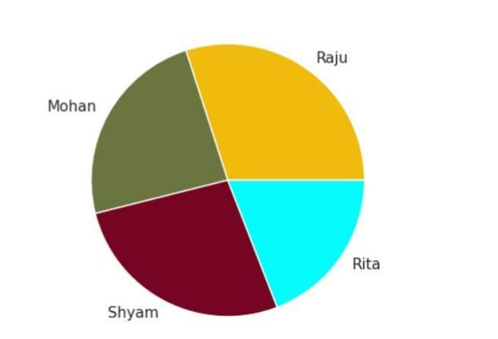
示例 1
在以下示例中,此程式使用 matplotlib 和 seaborn 庫建立餅圖。然後使用 sns.set() 設定樣式。接下來,定義餅圖的資料,包括每個扇區的標籤和值以及每個區域的顏色。使用 plt.figure() 設定餅圖的大小,然後使用 plt.pie() 繪製餅圖,並使用指定的資料和顏色。使用 plt.axis() 將軸設定為相等,以確保餅圖顯示為圓形。最後,使用 plt.show() 顯示繪圖。
import matplotlib.pyplot as plt
import seaborn as sns

# Set the style and color palette
sns.set(style='white')

# Data Plotting
student = 'Raju', 'Mohan', 'Shyam', 'Rita'
weight = [80, 64, 72, 51]
color_region = ['#f0bb0c', '#6a7542', '#780423',
'#03fcfc']

# Set the size of the pie chart
plt.figure(figsize=(4,4))

# Plot to set the different color region to each student
plt.pie(weight, labels = student, colors = color_region )
plt.axis('equal')
plt.show()
輸出
示例 2
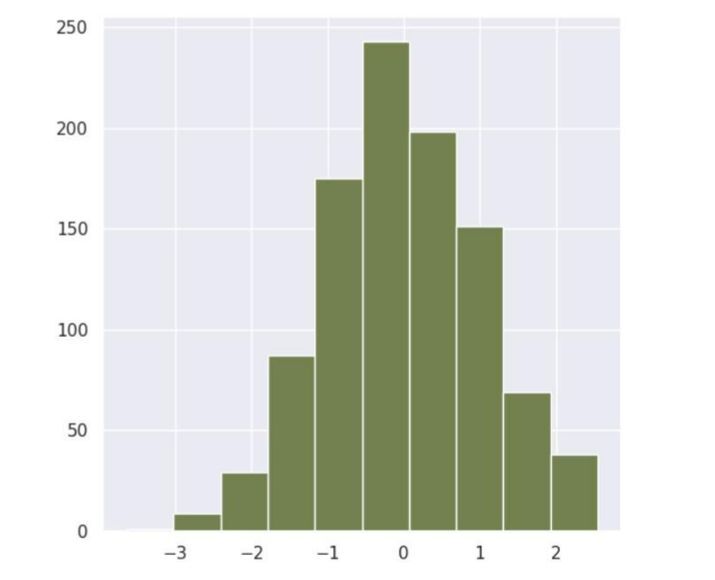
在以下示例中,我們將根據名為直方圖的圖形設定 Seaborn 圖表大小。此程式碼使用 matplotlib、numpy 和 seaborn 庫生成直方圖。使用 sns.set() 設定樣式。接下來,使用 np.random.randn() 方法生成隨機資料。使用 plt.figure() 設定直方圖的大小。然後使用 plt.hist() 繪製直方圖,並使用指定的資料、bin 數和顏色。最後,使用 plt.show() 顯示繪圖。
import matplotlib.pyplot as plt
import numpy as np
import seaborn as sns
sns.set(style='darkgrid')

# To generate the random data by using a random method
data = np.random.randn(1000)

# Set the size of the histogram
plt.figure(figsize=(6,6))

# Plot
plt.hist(data, bins=10, color='#738050')
plt.show()
輸出
示例 3
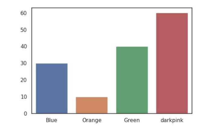
在以下示例中,我們將根據 barplot() 顯示 Seaborn 圖表大小。首先,提及必要的庫。然後為水平和垂直軸建立資料。接下來,使用 subplot 設定所需圖形大小,並將其儲存在變數 fig、ax 中。然後使用遵循 Seaborn 模組並接受三個引數(x、y 和 ax)的 barplot。最後,使用 show() 方法列印結果。
import seaborn as sns
import matplotlib.pyplot as plt

# create data
color = ['Blue', 'Orange', 'Green','darkpink']
color_percentage = [30, 10, 40, 60]

# Create a figure and axes with the desired size
fig, ax = plt.subplots(figsize=(6, 4))

# Plot the data
sns.barplot(x=color, y=color_percentage, ax=ax)
plt.show()
輸出
示例 4
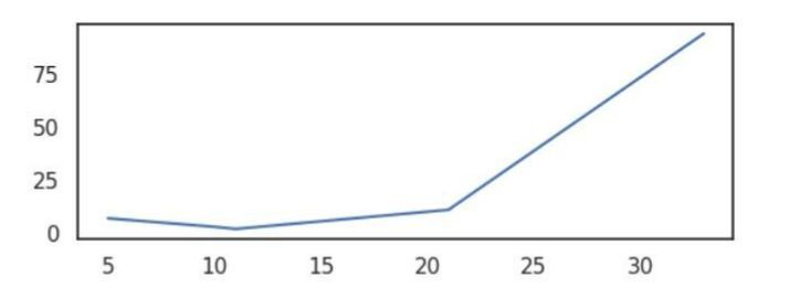
在以下示例中,我們將顯示 lineplot() 圖表的大小。首先,提及必要的模組,然後為在圖形中滿足特定點的 x 和 y 軸建立資料。接下來,使用內建方法 subplots 設定圖形大小,該方法設定名為 figsize 的引數,該引數將寬度設定為 6,高度設定為 2。然後將圖形設定為 lineplot,該圖形接受引數 - x、y 和 ax。此方法在圖形上構建繪圖線。最後,使用名為 show() 的方法獲取結果。
import seaborn as sns
import matplotlib.pyplot as plt

# Data
x_axes = [10, 21, 33, 5, 11]
y_axes = [3, 11, 94, 7, 2]

# Create a figure and axes with the desired size
fig, ax = plt.subplots(figsize=(6, 2))

# Plot the data
sns.lineplot(x=x_axes, y=y_axes, ax=ax)
plt.show()
輸出
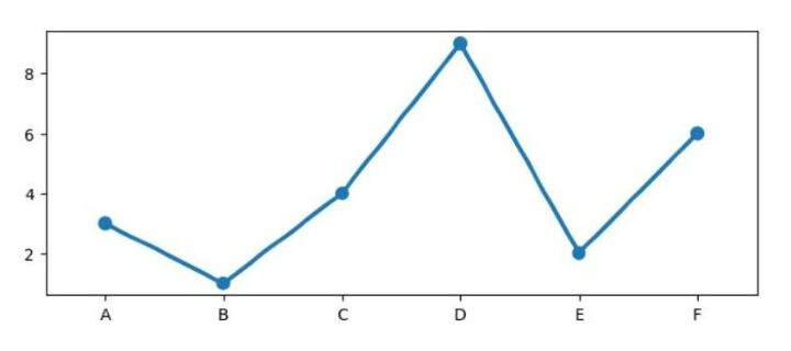
示例 5
在以下示例中,我們將使用 seaborn 和 matplotlib 庫生成一個 **pointplot**。定義 x 和 y 軸的資料,並使用 plt.subplots() 建立具有所需大小的圖形和軸。然後使用 sns.pointplot() 和指定的軸物件繪製資料。最後,使用 plt.show() 顯示繪圖。
import seaborn as sns
import matplotlib.pyplot as plt

# Data
x_ax = ['A', 'B', 'C', 'D', 'E', 'F']
y_ax = [3, 1, 4, 9, 2, 6]

# Create a figure and axes with the desired size
fig, ax = plt.subplots(figsize=(8, 3))

# Plot the data
sns.pointplot(x=x_ax, y=y_ax, ax=ax)
plt.show()
輸出
結論
在本文中,我們討論了基於 seaborn 庫的不同型別的圖表,例如 pie()、histogram()、barplot()、lineplot() 和 pointplot()。根據資料集的要求,所有繪圖都有不同的含義。這種型別的圖形通常用於分析任何公司或組織的資料。

369 次檢視
