
 資料結構
資料結構 網路
網路 關係資料庫管理系統 (RDBMS)
 作業系統
作業系統 Java
Java iOS
iOS HTML
HTML CSS
CSS Android
 Python
 C語言程式設計
 C++
C++ C#
C# MongoDB
 MySQL
MySQL Javascript
 PHP
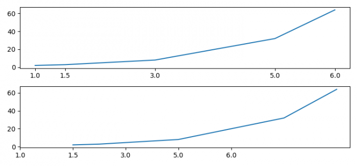
PHP如何在Matplotlib中即使刻度值不均勻也能使x軸刻度均勻分佈?
為了使x軸刻度即使刻度值不均勻也能均勻分佈,我們可以使用 **set_ticks()** 和 **set_ticklabels()** 方法。
步驟
- 設定圖形大小並調整子圖之間和周圍的填充。
- 使用numpy建立 **x** 和 **y** 資料點。
- 使用 **subplots()** 方法建立一個圖形和一組子圖。
- 在軸1上繪製 **x** 和 **y** 資料點。
- 使用 **xaxis.set_ticks()** 方法設定 **xticks**。
- 在軸2上繪製 **x** 和 **y** 資料點。
- 使用 **xaxis.set_ticks()** 和 **xaxis.set_ticklabels()** 方法設定 **xticks** 和刻度標籤。
- 要顯示圖形,請使用 **show()** 方法。
示例
import numpy as np
from matplotlib import pyplot as plt

plt.rcParams["figure.figsize"] = [7.50, 3.50]
plt.rcParams["figure.autolayout"] = True

x = np.array([1, 1.5, 3, 5, 6])
y = np.power(2, x)

fig, (ax1, ax2) = plt.subplots(2, 1)
ax1.plot(x, y)
ax1.xaxis.set_ticks(x)

ax2.plot(x, y)
ax2.xaxis.set_ticks(range(len(x)))
ax2.xaxis.set_ticklabels(x)

plt.show()
輸出

更新於:2021年6月10日
4K+ 次瀏覽

廣告