
 資料結構
資料結構 網路
網路 關係資料庫管理系統 (RDBMS)
 作業系統
作業系統 Java
Java iOS
iOS HTML
HTML CSS
CSS Android
 Python
 C語言程式設計
 C++
C++ C#
C# MongoDB
 MySQL
MySQL Javascript
 PHP
PHP如何在Python中繪製帶有滾動平均線的時序圖?
在這篇文章中,我們將介紹兩種使用Python繪製帶有滾動平均線的時序圖的方法。這兩種方法都使用了像Matplotlib、Pandas和Seaborn這樣知名的庫,這些庫提供了強大的資料處理和視覺化功能。按照這些方法,您可以高效地視覺化帶有滾動平均線的時序資料,並瞭解其總體行為。
這兩種方法都使用了類似的步驟序列,包括載入資料,將日期列轉換為DateTime物件,計算滾動平均值以及生成圖表。主要區別在於用於生成圖表的庫和函式。您可以自由選擇最適合您的知識和偏好的方法。
方法
使用Pandas和Matplotlib。
使用Seaborn和Pandas。
注意:此處使用的資料如下所示:
檔名可以根據需要更改。這裡檔名是dataS.csv。
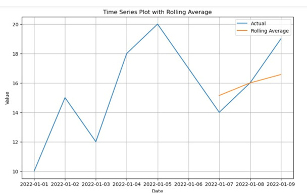
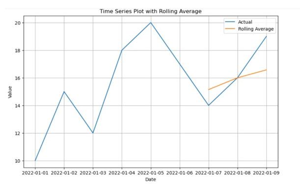
date,value
2022-01-01,10
2022-01-02,15
2022-01-03,12
2022-01-04,18
2022-01-05,20
2022-01-06,17
2022-01-07,14
2022-01-08,16
2022-01-09,19
讓我們檢查一下這兩種方法:
方法1:使用Pandas和Matplotlib
此方法使用Pandas和matplotlib庫來繪製時序圖。流行的繪相簿Matplotlib提供了豐富的工具,用於建立靜態、動畫和互動式視覺化。另一方面,強大的資料處理庫Pandas提供了有用的資料結構和函式,用於處理結構化資料,包括時間序列。
演算法
步驟1 - 匯入用於資料視覺化的matplotlib.pyplot以及用於資料處理的pandas。
步驟2 - 使用pd.read_csv()從CSV檔案載入時間序列資料。假設檔名為'dataS.csv'。
步驟3 - 使用pd.to_datetime()將DataFrame的'date'列轉換為DateTime物件。
步驟4 - 使用data.set_index('date', inplace=True)將'date'列設定為DataFrame的索引。
步驟5 - 指定滾動平均值計算的視窗大小。根據預期的視窗大小調整window_size變數。
步驟6 - 使用data['value'].rolling(window=window_size).mean()計算'value'列的滾動平均值。
步驟7 - 使用plt.figure()建立圖表。使用figsize=(10, 6)根據需要調整圖表大小。
步驟8 - 使用plt.plot(data.index, data['value'], label='Actual')繪製實際值。
步驟9 - 使用plt.plot(data.index, rolling_avg, label='Rolling Average')繪製滾動平均值。
步驟10 - 使用plt.xlabel()和plt.ylabel()設定x軸和y軸的標籤。
步驟11 - 使用plt.title()設定圖表的標題。
步驟12 - 使用plt.legend()顯示已繪製線的圖例。
步驟13 - 使用plt.grid(True)在圖表上啟用網格。
步驟14 - 使用plt.show()顯示圖表。
程式
#pandas library is imported
import pandas as pd
import matplotlib.pyplot as plt

# Load the time series data
data = pd.read_csv('dataS.csv')

# Transform the column date to a datetime object
data['date'] = pd.to_datetime(data['date'])

# Put the column date column as the index
data.set_index('date', inplace=True)

# Calculate the rolling average
window_size = 7  # Adjust the window size as per your requirement
rolling_avg = data['value'].rolling(window=window_size).mean()

#  Create the plot
plt.figure(figsize=(10, 6))  # Adjust the figure size as needed
plt.plot(data.index, data['value'], label='Actual')
plt.plot(data.index, rolling_avg, label='Rolling Average')
plt.xlabel('Date')
plt.ylabel('Value')
plt.title('Time Series Plot with Rolling Average')
plt.legend()
plt.grid(True)
plt.show()
輸出
方法2:使用Seaborn和Pandas
這介紹了Seaborn的使用,Seaborn是一個基於Matplotlib的高階資料視覺化框架。Seaborn是建立視覺上吸引人的時間序列圖的一個很好的選擇,因為它提供了一個簡單而有吸引力的統計圖形介面。
步驟1 - 匯入seaborn、pandas和matplotlib.pyplot庫。
步驟2 - 使用pd.read_csv()函式從'dataS.csv'檔案載入時間序列資料,並將其儲存在data變數中。
步驟3 - 使用pd.to_datetime()函式將data DataFrame中的'date'列轉換為datetime物件。
步驟4 - 使用set_index()方法將'date'列設定為DataFrame的索引。
步驟5 - 指定滾動平均值計算的視窗大小。根據需要調整window_size變數。
步驟6 - 使用data DataFrame的'value'列上的rolling()函式並指定視窗大小來計算滾動平均值。
步驟7 - 使用plt.figure(figsize=(10, 6))建立一個具有特定大小的新圖表。
步驟8 - 使用sns.lineplot()和data DataFrame的'value'列繪製實際時間序列資料。
步驟9 - 使用sns.lineplot()和rolling_avg變數繪製滾動平均值。
步驟10 - 使用plt.xlabel()設定x軸標籤。
步驟11 - 使用plt.ylabel()設定y軸標籤。
步驟12 - 使用plt.title()設定圖表的標題。
步驟13 - 使用plt.legend()顯示圖例。
步驟14 - 使用plt.grid(True)在圖表上新增網格線。
步驟15 - 使用plt.show()顯示圖表。
示例
import pandas as pd
import seaborn as sns
import matplotlib.pyplot as plt

# Step 1: Fill the time series data with the csv file provided
data = pd.read_csv('your_data.csv')

#  Transform the column date to the object of DateTime
data['date'] = pd.to_datetime(data['date'])

# Put the column data as the index
data.set_index('date', inplace=True)

# Adjust the window size as per your requirement
# and then compute the rolling average
window_size = 7
# rolling_avg = data['value'].rolling(window=window_size).mean()

# Build the plot utilizing Seaborn
plt.figure(figsize=(10, 6))
# Adjust the figure size as needed
sns.lineplot(data=data['value'], label='Actual')
sns.lineplot(data=rolling_avg, label='Rolling Average')
plt.xlabel('Date')
plt.ylabel('Value')
plt.title('Time Series Plot with Rolling Average')
plt.legend()
plt.grid(True)
plt.show()
輸出
結論
透過使用像Pandas和Matplotlib這樣的Python模組,可以輕鬆建立滾動平均時間序列圖。這些視覺化效果使我們能夠成功地分析時間相關資料中的趨勢和模式。清晰的程式碼概述瞭如何匯入資料、轉換日期列、計算滾動平均值以及視覺化結果。這些方法使我們能夠理解資料的行為並做出明智的結論。金融、經濟學和氣候研究都將時間序列分析和視覺化作為有效的工具。

896 次瀏覽
