
 資料結構
資料結構 網路
網路 關係型資料庫管理系統
 作業系統
作業系統 Java
Java iOS
iOS HTML
HTML CSS
CSS Android
 Python
 C 程式設計
 C++
C++ C#
C# MongoDB
 MySQL
MySQL Javascript
 PHP
PHP如何在 R 中使用 grid.arrange 顯示繪圖列表?
在資料分析中,我們一次處理許多變數,並且我們希望一次視覺化這些變數的直方圖。這有助於我們瞭解資料集中每個變數的分佈,因此我們可以應用適當的技術來處理這些變數。要建立繪圖列表,我們可以在 gridExtra 包中使用 grid.arrange 函式,該函式可以根據我們的需要排列繪圖。
示例
考慮以下資料框 -
> set.seed(10)
> df<-data.frame(x1=rnorm(10),x2=rnorm(20,0.2),x3=rnorm(20,0.5),x4=rnorm(10,0.5))
> head(df,20)
            x1     x2           x3         x4
1  0.01874617 1.301779503 -1.3537405 0.09936245
2 -0.18425254 0.955781508 0.4220539 0.16544343
3 -1.37133055 -0.038233556 1.4685663 1.86795395
4 -0.59916772   1.187444703  0.6849260   2.63776710
5  0.29454513   0.941390128 -0.8799436   1.00581926
6  0.38979430   0.289347266 -0.9355144   1.28634238
7  -1.20807618 -0.754943856  0.8620872  -0.40221194
8  -0.36367602 0.004849615  -1.2590868   1.03289699
9  -1.62667268 1.125521262  0.1754560   -0.14589425
10 -0.25647839 0.682978525  -0.1515630   0.79098749
11  0.01874617 -0.396310637  1.5865514   0.09936245
12 -0.18425254 -1.985286838 -0.2625449   0.16544343
13 -1.37133055 -0.474865938 -0.3286625   1.86795395
14 -0.59916772 -1.919061192  1.3344739   2.63776710
15 0.29454513  -1.065198022 -0.4676520   1.00581926
16 0.38979430  -0.173661555  0.4711847   1.28634238
17 -1.20807618 -0.487555430  0.7325252  -0.40221194
18 -0.36367602 -0.672158827  0.1987913   1.03289699
19 -1.62667268  0.098238994 -0.1776146  -0.14589425
20 -0.25647839 -0.053780530  1.1552276   0.79098749
載入 ggplot2 包 -
> library(ggplot2)
載入 gridExtra 包 -
> library(gridExtra)
建立 x1、x2、x3 和 x4 的直方圖 -
> p1 <- ggplot(df, aes(x1)) + geom_histogram()
> p2 <- ggplot(df, aes(x2)) + geom_histogram()
> p3 <- ggplot(df, aes(x3)) + geom_histogram()
> p4 <- ggplot(df, aes(x4)) + geom_histogram()
> PlotsList<- list(p1,p2,p3,p4)
在一個圖中排列繪圖 -
> grid.arrange(grobs = PlotsList, ncol = 2)
`stat_bin()` using `bins = 30`. Pick better value with `binwidth`.
`stat_bin()` using `bins = 30`. Pick better value with `binwidth`.
`stat_bin()` using `bins = 30`. Pick better value with `binwidth`.
`stat_bin()` using `bins = 30`. Pick better value with `binwidth`.
輸出
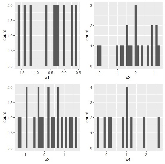
這裡 R 在輸出中顯示“`stat_bin()` using `bins = 30`. Pick better value with `binwidth`.”,但這並不是錯誤,它只是告訴我們更改 binwidth,我們可以在 geom_histogram() 中將其更改為 geom_histogram(binwidth=1)。

更新於: 2020年8月10日
2K+ 閱讀量

廣告