
 資料結構
資料結構 網路
網路 關係資料庫管理系統
 作業系統
作業系統 Java
Java iOS
iOS HTML
HTML CSS
CSS Android
 Python
 C 語言程式設計
 C++
C++ C#
C# MongoDB
 MySQL
MySQL Javascript
 PHP
PHP如何在 Matplotlib 中建立 K 線圖?
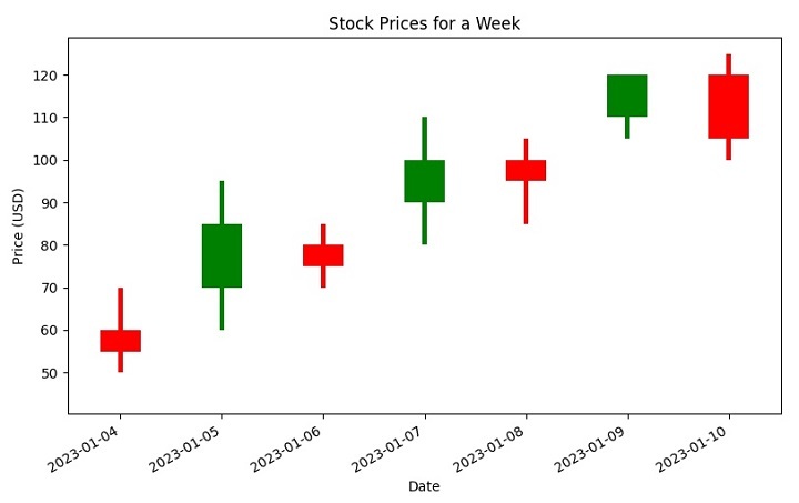
K 線圖是視覺化股票市場資料的一種常用方法。它們顯示了特定時間段內股票或證券的開盤價、收盤價、最高價和最低價。K 線圖由一系列垂直條形或“蠟燭”組成,其中每個蠟燭代表一個時間段。每個蠟燭的頂部和底部分別代表該期間內交易的最高價和最低價,而蠟燭的主體則代表開盤價和收盤價。
在本教程中,我們將探討一些程式碼,我們將使用 Matplotlib(Python 中一個流行的資料視覺化庫)為一週的股票價格建立 K 線圖。
我們將使用 Pandas 庫建立一個表示股票價格的 DataFrame,然後使用 Matplotlib 的條形圖函式繪製 K 線圖。
要建立 K 線圖,我們使用特定的語法,其中涉及在 Matplotlib 中使用 plt.bar 方法。
使用 plt.bar 建立條形圖
plt.bar 是 Matplotlib 庫中的一個函式,允許您在 Python 中建立條形圖。它接受幾個引數,包括 x 軸值、y 軸值、條形的寬度和條形的顏色。您可以使用此函式建立水平和垂直條形圖,並且可以自定義條形的外觀以滿足您的需求。
以下是 **plt.bar** 的語法。
plt.bar(up.index,up.close-up.open,bottom=up.open,color)
The "up" dataframe contains the stock prices where the closing price is greater than or equal to the opening price.

plt.bar(down.index, down.close - down.open, bottom=down.open, color)
The "down" dataframe contains the stock prices where the closing price is less than the opening price.
示例:Matplotlib 中的 K 線圖
現在讓我們探討下面顯示的程式碼。此程式碼建立一個 K 線圖,以使用 Python 中的 matplotlib 庫表示一週內股票的開盤價、收盤價、最高價和最低價。
首先,建立一個 Pandas DataFrame 來儲存一週的股票價格。然後,建立兩個新的 DataFrame - “up” 儲存收盤價大於或等於開盤價的股票價格,而 “down” 儲存收盤價小於開盤價的股票價格。
接下來,定義 K 線圖的顏色:“綠色”表示股票價格上漲,“紅色”表示股票價格下跌。還設定了 K 線圖元素的寬度。
然後,使用 plt.bar 方法在圖表上繪製上漲和下跌的股票價格,其中 bottom 引數指定每個條形的起始點。將 x 軸刻度標籤向右旋轉 45 度,以提高可見度。最後,使用 plt.show() 對圖表進行標題、x 軸標籤、y 軸標籤和顯示。
import pandas as pd
import matplotlib.pyplot as plt

# Create a DataFrame to represent opening, closing, high, and low prices
# of a stock for a week
stock_prices = pd.DataFrame({'open': [60, 70, 80, 90, 100, 110, 120],
   'close': [55, 85, 75, 100, 95, 120, 105],
   'high': [70, 95, 85, 110, 105, 120, 125],
   'low': [50, 60, 70, 80, 85, 105, 100]},
   index=pd.date_range("2023-04-01", periods=7, freq="d"))

plt.figure()

# Create a new DataFrame called "up" that stores the stock_prices
# when the closing stock price is greater than or equal to the opening stock price
up = stock_prices[stock_prices.close >= stock_prices.open]

# Create a new DataFrame called "down" that stores the stock_prices
# when the closing stock price is lesser than the opening stock price
down = stock_prices[stock_prices.close < stock_prices.open]

# When the stock prices have decreased, then it
# will be represented by red color candlestick
col1 = 'red'

# When the stock prices have increased, then it
# will be represented by green color candlestick
col2 = 'green'

# Set the width of candlestick elements
width = 0.4
width2 = 0.05

# Plot the up prices of the stock
plt.bar(up.index, up.close-up.open, width, bottom=up.open, color=col2)
plt.bar(up.index, up.high-up.close, width2, bottom=up.close, color=col2)
plt.bar(up.index, up.low-up.open, width2, bottom=up.open, color=col2)

# Plot the down prices of the stock
plt.bar(down.index, down.close-down.open, width, bottom=down.open, color=col1)
plt.bar(down.index, down.high-down.open, width2, bottom=down.open, color=col1)
plt.bar(down.index, down.low-down.close, width2, bottom=down.close, color=col1)

# Rotate the x-axis tick labels at 45 degrees towards right
plt.xticks(rotation=45, ha='right')

# Display the candlestick chart of stock data for a week
plt.title('Stock Prices for a Week')
plt.xlabel('Date')
plt.ylabel('Price (USD)')
plt.show()
輸出
執行後,您將獲得以下 K 線圖
結論
總之,在 Matplotlib 中建立 K 線圖可以成為視覺化股票市場資料的強大工具。透過使用不同的顏色和寬度,還可以傳達有關股票價格隨時間變化的其他資訊。透過遵循本教程中概述的步驟,您可以建立自己的 K 線圖,並更深入地瞭解市場趨勢和股票表現。

3K+ 次瀏覽
