
 資料結構
資料結構 網路
網路 關係資料庫管理系統 (RDBMS)
 作業系統
作業系統 Java
Java iOS
iOS HTML
HTML CSS
CSS Android
 Python
 C語言程式設計
 C++
C++ C#
C# MongoDB
 MySQL
MySQL Javascript
 PHP
PHP使用Python中的mplfinance模組繪製K線圖
在金融分析領域,K線圖是視覺化股票價格資料的必備工具,可以使用Python的mplfinance模組繪製。它們提供了對市場趨勢和模式的寶貴見解。
透過利用mplfinance的功能,開發人員可以輕鬆生成視覺上引人注目的K線圖。在本文中,我們將探討如何利用mplfinance模組輕鬆建立令人驚歎且富有洞察力的K線圖。
mplfinance模組
mplfinance是專門用於使用K線圖視覺化金融市場資料的Python模組。它提供了一個直觀且靈活的介面,用於建立高度可定製和互動式的圖表。
該模組提供了廣泛的功能來增強對金融資料的表示,包括將成交量柱、移動平均線和技術指標納入K線圖的能力。mplfinance模組支援各種圖表型別,例如OHLC(開盤價-最高價-最低價-收盤價)、線圖甚至散點圖。
mplfinance模組還提供了廣泛的自定義選項,允許您修改顏色、字型、網格線、註釋等等。此外,它還提供了處理非交易日和資料缺口的功能。
以下是安裝mplfinance模組的程式碼:
pip install mplfinance
什麼是K線圖?
K線圖是金融分析中一種流行且廣泛使用的圖表技術。它在一個指定的時間段內視覺化資產(例如股票)的價格變動。每根K線代表一個單一的交易週期,例如一天、一週或一個月。
K線由四個主要元素組成:開盤價、收盤價、最高價和最低價。K線的主體代表開盤價和收盤價之間的價格範圍,不同的顏色表示該期間價格是上漲還是下跌。最高價和最低價由稱為影線或上下影線的細線表示。
K線圖提供了關於市場情緒和趨勢的寶貴資訊。交易者和分析師使用它們來識別模式和訊號,例如多頭或空頭逆轉、趨勢延續以及支撐/阻力位。它們提供了價格行為的直觀表示,有助於決策和市場分析。
如何使用Python中的mplfinance模組繪製K線圖?
以下是我們將遵循的步驟,使用Python中的mplfinance模組和特斯拉股票價格資料集繪製K線圖:
匯入必要的庫:`mplfinance`、`pandas`、`numpy`和`matplotlib.pyplot`。
使用`pd.read_csv()`從CSV檔案載入特斯拉股票資料。將“date”列解析為日期,並將其設定為DataFrame的索引。
使用`pd.to_numeric()`將“volume”列轉換為數值。透過將非數值值替換為0來處理任何非數值值。
使用`mpf.make_mpf_style()`建立圖表的自定義樣式。使用'default'基本樣式並將字型大小設定為8。
建立一個新的圖形,並使用`mpf.plot()`設定標題、y軸標籤和下y軸標籤。傳遞資料DataFrame,將圖表型別指定為“candle”,啟用成交量柱,並設定所需的繪圖屬性。
從返回的列表中檢索軸物件。在這種情況下,我們使用`axes[0]`訪問第一個軸物件。
自定義圖表的顯示。透過設定`ax.grid(True)`啟用繪圖上的網格線。
使用`fig.savefig()`將圖表儲存為影像檔案。
使用`mpf.show()`在螢幕上顯示圖表。
以下是按照上述步驟使用Python中的mplfinance模組和特斯拉股票價格資料集繪製K線圖的程式:
示例
#import all the necessary libraries and modules
import mplfinance as mpf
import pandas as pd
import numpy as np
import matplotlib.pyplot as plt

# Load the Tesla stock data from a CSV file (or any other data source)
data = pd.read_csv('tesla-stock-price.csv', parse_dates=['date'])
data = data.set_index('date')

# Convert 'volume' column to numeric, handle non-numeric values
data['volume'] = pd.to_numeric(data['volume'], errors='coerce')
non_numeric_values = data['volume'].isnull()
if non_numeric_values.any():
   data['volume'] = np.where(non_numeric_values, 0, data['volume'])

# Create a style with adjusted font size
style = mpf.make_mpf_style(base_mpl_style='default', rc={'font.size': 8})  # Set the font size here

# Create a new figure and set the title
fig, axes = mpf.plot(data, type='candle', volume=True,
   title='Tesla Stock Price', ylabel='Price', ylabel_lower='Volume',
   show_nontrading=True, returnfig=True, style=style)
plt.style.use('dark_background')

# Retrieve the axis objects from the returned list
ax = axes[0]

# Customize the appearance of the plot
ax.grid(True)  # Display grid lines

# Save the plot to an image file
fig.savefig('tesla_candlestick_chart.png')

# Show the plot on the screen
mpf.show()
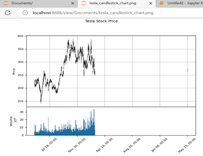
輸出
結論
總之,使用Python中的mplfinance模組繪製K線圖提供了一個強大的工具,用於視覺化和分析金融市場資料。透過利用mplfinance的使用者友好介面、可定製功能和廣泛的圖表功能,使用者可以有效地解釋股票價格趨勢和模式。

1K+ 次瀏覽
