
 資料結構
資料結構 網路
網路 關係資料庫管理系統 (RDBMS)
 作業系統
作業系統 Java
Java iOS
iOS HTML
HTML CSS
CSS Android
 Python
 C 程式設計
 C++
C++ C#
C# MongoDB
 MySQL
MySQL Javascript
 PHP
PHP如何在 Python 的 Matplotlib 中向圖表新增標記?
在使用 Matplotlib(Python 的一個庫)建立圖表時,一個常見的任務是新增標記來指示資料點。Matplotlib 提供了各種標記樣式,包括圓形、三角形、正方形、點和菱形。這些標記可以透過不同的尺寸、顏色和邊框尺寸進一步自定義。在本文中,我們將討論如何在 Python 的 Matplotlib 中向圖表新增標記並自定義它們。
Matplotlib
Matplotlib 是一個主要用於為 Python 程式語言及其數值計算擴充套件庫 NumPy 繪製圖表和繪圖的庫。它面向物件的 API 可以包含使用 Tkinter、wxPython、Qt 和 GTK GUI 工具包的圖表。
matplotlib.pyplot 是一個命令式方法集合,允許 matplotlib 的功能類似於 MATLAB。每個 pyplot 函式都會以某種方式更改圖形,無論是新增繪圖區域、繪製線條、新增標籤等等。
Pyplot 是 Python matplotlib 工具的一個子模組。它是一個 Python 庫,包含一組用於繪製二維圖表的函式和方法。
Matplotlib.markers
matplotlib 的 marker 引數用於向圖表新增標記。它具有一些處理標記的函式。plot 和 scatter 都使用它來實現標記功能。
語法
plt.plot(values, marker= ‘value’)
如何在 Matplotlib 中向圖表新增標記?
我們將使用 Matplotlib 的 marker 引數向圖表新增標記。
讓我們來看一個例子:
示例
import matplotlib.pyplot as p

# Create some sample data
x = [11, 22, 33, 44, 55,66,77,88,99,100]
y = [88, 44, 11, 99, 55,77,66,100,33,11]

# Create a scatter plot with circles as markers
p.scatter(x, y, marker='o')

# Show the plot
p.show()
輸出

自定義標記大小和顏色
我們可以使用 scatter() 函式的 s 和 c 引數來自定義標記的大小和顏色。s 引數指定標記的大小,c 引數指定標記的顏色。讓我們來看一個例子。
示例
import matplotlib.pyplot as p

# Create some sample data
x = [11, 22, 33, 44, 55, 66, 77, 88, 99, 100]
y = [88, 44, 11, 99, 55, 77, 66, 100, 33, 11]

# Create a scatter plot with customized markers
p.scatter(x, y, marker='o', s=100, c='red')

# Add labels and title
p.xlabel('X Axis')
p.ylabel('Y Axis')
p.title('Graph with different size and color markers')

# Show the plot
p.show()
輸出

在上面的例子中,我們設定了標記大小為 100,顏色為紅色。
自定義標記邊框樣式
我們還可以使用 scatter() 函式的 edgecolors 引數來自定義標記的邊框樣式。edgecolors 引數指定標記邊緣的顏色。
示例
import matplotlib.pyplot as p

# Create some sample data
x = [11, 22, 33, 44, 55, 66, 77, 88, 99, 100]
y = [88, 44, 11, 99, 55, 77, 66, 100, 33, 11]

# Create a scatter plot with customized markers
p.scatter(x, y, marker='s', s=100, c='red', edgecolors='black')

# Add labels and title
p.xlabel('X Axis')
p.ylabel('Y Axis')
p.title('Graph with different size and color markers')

# Show the plot
p.show()
輸出

使用不同的標記樣式
Matplotlib 提供了各種標記樣式,可用於指示圖表上的資料點。下表列出了一些常用的標記樣式。
序號 |
標記樣式 |
描述 |
|---|---|---|
1. |
‘o’ |
圓形標記 |
2. |
‘s’ |
正方形標記 |
3. |
‘^’ |
三角形標記 |
4. |
‘d’ |
菱形標記 |
5. |
‘.’ |
點狀標記 |
要使用不同的標記樣式,只需將 scatter() 函式的 marker 引數設定為所需的標記樣式即可。
新增菱形標記的程式
import matplotlib.pyplot as plt

# Create some sample data
x = [11, 22, 33, 44, 55, 66, 77, 88, 99, 100]
y = [88, 44, 11, 99, 55, 77, 66, 100, 33, 11]

# Create a scatter plot with triangles as markers
plt.scatter(x, y, marker='d', s=100, c='blue', edgecolors='black')

# Add labels and title
plt.xlabel('X Axis')
plt.ylabel('Y Axis')
plt.title('Graph with diamond-shaped markers')

# Show the plot
plt.show()
輸出

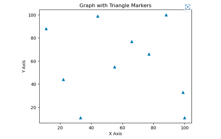
新增三角形標記的程式
import matplotlib.pyplot as p

# Create some sample data
x = [11, 22, 33, 44, 55,66,77,88,99,100]
y = [88, 44, 11, 99, 55,77,66,100,33,11]


# Create a scatter plot with triangles as markers
p.scatter(x, y, marker='^')

# Add labels and title
p.xlabel('X Axis')
p.ylabel('Y Axis')
p.title('Graph with Triangle Markers')

# Show the plot
p.show()
輸出
結論
總之,我們可以使用 Python 的 Matplotlib 向圖表新增標記,並根據需要進行自定義。Matplotlib 提供了各種標記樣式,包括圓形、菱形、點、三角形和正方形,可用於指示圖表上的資料點。標記的大小、顏色和邊框樣式也可以使用 scatter() 函式的各種引數進行自定義。我們可以藉助 Matplotlib 在 Python 中使用標記建立視覺上吸引人且資訊豐富的圖表。

瀏覽量:1000+
