
 資料結構
資料結構 網路
網路 關係型資料庫管理系統 (RDBMS)
 作業系統
作業系統 Java
Java iOS
iOS HTML
HTML CSS
CSS Android
 Python
 C語言程式設計
 C++
C++ C#
C# MongoDB
 MySQL
MySQL Javascript
 PHP
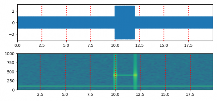
PHP如何用與 pylab 的 specgram() 函式相同的方式繪製頻譜圖?(Matplotlib)
要以與 pylab 的 specgram() 函式相同的方式繪製頻譜圖,我們可以採取以下步驟:
- 設定圖形大小並調整子圖之間和周圍的填充。
- 使用 numpy 建立 **t、s1、s2、nse、x、NEFT** 和 **Fs** 資料點。
- 使用 **subplots()** 方法(**nrows=2**)建立一個新圖形或啟用現有圖形。
- 使用 **plot()** 方法繪製 **t** 和 **x** 資料點。
- 以當前線型繪製網格。
- 設定 X 軸邊界。
- 使用 **specgram()** 方法繪製頻譜圖。
- 以虛線線型和其他屬性繪製當前線型的網格。
- 要顯示圖形,請使用 **show()** 方法。
示例
import matplotlib.pyplot as plt
import numpy as np

plt.rcParams["figure.figsize"] = [7.50, 3.50]
plt.rcParams["figure.autolayout"] = True

dt = 0.0005
t = np.arange(0.0, 20.0, dt)
s1 = np.sin(2 * np.pi * 100 * t)
s2 = 2 * np.sin(2 * np.pi * 400 * t)
s2[t <= 10] = s2[12 <= t] = 0
nse = 0.01 * np.random.random(size=len(t))
x = s1 + s2 + nse
NFFT = 1024
Fs = int(1.0 / dt)

fig, (ax1, ax2) = plt.subplots(nrows=2)
ax1.plot(t, x)
ax1.grid(axis="x", ls="dotted", lw=2, color="red")
ax1.margins(x=0)

Pxx, freqs, bins, im = ax2.specgram(x, NFFT=NFFT, Fs=Fs, noverlap=900)
ax2.grid(axis="x", ls="dotted", lw=2, color="red")

plt.show()
輸出

更新於:2021年6月9日
380 次瀏覽

廣告