
 資料結構
資料結構 網路
網路 關係資料庫管理系統
 作業系統
作業系統 Java
Java iOS
iOS HTML
HTML CSS
CSS Android
 Python
 C 程式設計
 C++
C++ C#
C# MongoDB
 MySQL
MySQL Javascript
 PHP
PHPPython-Plotly 中的懸停文字和格式化
Python-Plotly 是一個廣泛使用的 資料視覺化 庫,它提供了各種增強視覺化的功能,其中一項功能是懸停文字和格式化,它允許使用者在懸停在資料點上時提供其他資訊並自定義工具提示的外觀。資料視覺化是理解和呈現複雜資訊的強大工具。在本文中,我們將探討如何在 Python-Plotly 中利用懸停文字和格式化來改進資料視覺化並有效地傳達見解。
如何在 Python-Plotly 中進行懸停文字和格式化?
以下是使用不同 hovermode 在 Python-Plotly 中進行懸停文字和格式化的示例。
預設 hovermode
按照以下步驟操作,即可使用預設 hovermode 和自定義 hovertemplate:
匯入必要的庫,包括 Plotly Express。
從 Plotly Express 載入內建資料集 iris,其中包含有關鳶尾花的資訊。
使用 px.scatter 建立散點圖。
指定資料集 (df) 並將 sepal_width 和 sepal_length 列分別對映到 x 和 y 軸。
使用 color 引數根據 species 列區分資料點。
要在懸停文字中包含其他資訊,我們使用 hover_data 引數指定 petal_length 和 petal_width 列。
將 hover_name 引數設定為 "species",以便物種名稱也顯示在懸停文字中。
透過使用 fig.update_traces 更新軌跡來自定義懸停文字和格式。我們將 hovertemplate 屬性設定為格式化懸停文字,使用佔位符 %{x}、%{y}、%{text} 和 %{customdata[1]} 來顯示來自相應列的值。
將 text 屬性設定為提供 y 軸的懸停文字,使用列表推導式為每個資料點重複格式化的花瓣長度值。
使用 fig.show() 顯示圖形。
預設情況下,屬性 hovermode 的值為“closest”。
示例
import plotly.express as px
# Load the inbuilt dataset
df = px.data.iris()

# Create the scatter plot
fig = px.scatter(df, x="sepal_width", y="sepal_length", color="species",
   hover_data=["petal_length", "petal_width"],
   hover_name="species",
   title="Hover Text and Formatting Example")

# Customize hover text and formatting for the y-axis
fig.update_traces(hovertemplate="Sepal Width: %{x}<br>Sepal Length: %{y}<br>%{text}<br>Petal Width: %{customdata[1]}",
   text=["Petal Length: %{customdata[0]}"] * len(df))
fig.update_layout(hovermode="closest")

# Show the plot
fig.show()
輸出
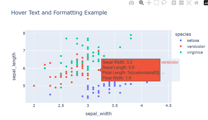
執行此程式時,您應該會看到一個萼片寬度與萼片長度的散點圖,其中點根據物種顏色區分。當您將滑鼠懸停在某個點上時,懸停文字將顯示該資料點的萼片寬度、萼片長度、花瓣長度和花瓣寬度。y 軸懸停文字將為每個資料點顯示格式化的萼片長度值。
Y- 統一 hovermode
按照以下步驟操作,即可使用 Y-統一 hovermode 和自定義 hovertemplate:
匯入必要的庫,包括 Plotly Express。
從 Plotly Express 載入內建資料集 iris,其中包含有關鳶尾花的資訊。
使用 px.scatter 建立散點圖。
指定資料集 (df) 並將 sepal_width 和 sepal_length 列分別對映到 x 和 y 軸。
使用 color 引數根據 species 列區分資料點。
要在懸停文字中包含其他資訊,我們使用 hover_data 引數指定 petal_length 和 petal_width 列。
將 hover_name 引數設定為 "species",以便物種名稱也顯示在懸停文字中。
透過使用 fig.update_traces 更新軌跡來自定義懸停文字和格式。我們將 hovertemplate 屬性設定為格式化懸停文字,使用佔位符 %{x}、%{y}、%{text} 和 %{customdata[1]} 來顯示來自相應列的值。
將 text 屬性設定為提供 y 軸的懸停文字,使用列表推導式為每個資料點重複格式化的花瓣長度值。
使用 fig.update_layout() 方法並將 hovermode 屬性設定為 y 統一。
使用 fig.show() 顯示圖形。
示例
import plotly.express as px

# Load the inbuilt dataset
df = px.data.iris()

# Create the scatter plot
fig = px.scatter(df, x="sepal_width", y="sepal_length", color="species",
   hover_data=["petal_length", "petal_width"],
   hover_name="species",
   title="Hover Text and Formatting Example")

# Customize hover text and formatting for the y-axis
fig.update_traces(hovertemplate="Sepal Width: %{x}<br>Sepal Length: %{y}<br>%{text}<br>Petal Width: %{customdata[1]}",
                  text=["Petal Length: %{customdata[0]}"] * len(df))
fig.update_layout(hovermode="y unified")

# Show the plot
fig.show()
輸出
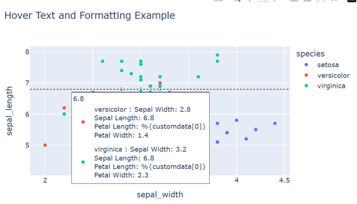
X- 統一 hovermode
按照以下步驟操作,即可使用 X-統一 hovermode 和自定義 hovertemplate:
匯入必要的庫,包括 Plotly Express。
從 Plotly Express 載入內建資料集 iris,其中包含有關鳶尾花的資訊。
使用 px.scatter 建立散點圖。
指定資料集 (df) 並將 sepal_width 和 sepal_length 列分別對映到 x 和 y 軸。
使用 color 引數根據 species 列區分資料點。
要在懸停文字中包含其他資訊,我們使用 hover_data 引數指定 petal_length 和 petal_width 列。
將 hover_name 引數設定為 "species",以便物種名稱也顯示在懸停文字中。
透過使用 fig.update_traces 更新軌跡來自定義懸停文字和格式。我們將 hovertemplate 屬性設定為格式化懸停文字,使用佔位符 %{x}、%{y}、%{text} 和 %{customdata[1]} 來顯示來自相應列的值。
將 text 屬性設定為提供 y 軸的懸停文字,使用列表推導式為每個資料點重複格式化的花瓣長度值。
使用 fig.update_layout() 方法並將 hovermode 屬性設定為 x 統一。
使用 fig.show() 顯示圖形。
示例
import plotly.express as px

# Load the inbuilt dataset
df = px.data.iris()

# Create the scatter plot
fig = px.scatter(df, x="sepal_width", y="sepal_length", color="species",
   hover_data=["petal_length", "petal_width"],
   hover_name="species",
   title="Hover Text and Formatting Example")

# Customize hover text and formatting for the y-axis
fig.update_traces(hovertemplate="Sepal Width: %{x}<br>Sepal Length: %{y}<br>%{text}<br>Petal Width: %{customdata[1]}",
   text=["Petal Length: %{customdata[0]}"] * len(df))
fig.update_layout(hovermode="x unified")

# Show the plot
fig.show()
輸出
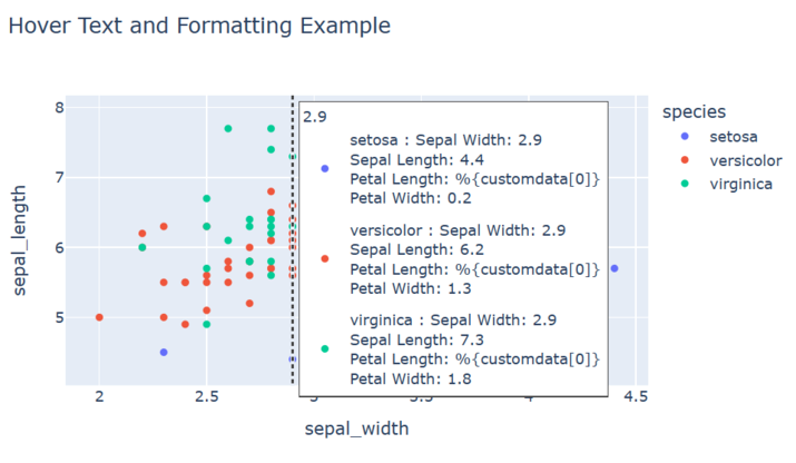
結論
總之,Python-Plotly 中的懸停文字和格式化提供了一種無縫的方式來增強資料視覺化。透過提供其他上下文並自定義工具提示的外觀,使用者可以有效地傳達見解並提高資料理解。懸停文字的互動性為視覺化增加了深度和參與度,使它們更具資訊性和使用者友好性。憑藉 Python-Plotly 的強大功能,資料分析師和視覺化設計師可以建立視覺上吸引人且互動式的圖形,以有效地傳達資訊。

2K+ 瀏覽量
