
 資料結構
資料結構 網路
網路 RDBMS
RDBMS 作業系統
作業系統 Java
Java MS Excel
 iOS
iOS HTML
HTML CSS
CSS Android
 Python
 C 程式設計
 C++
C++ C#
C# MongoDB
 MySQL
MySQL Javascript
 PHP
PHP 物理學
物理學 化學
化學 生物學
生物學 數學
數學 英語
英語 經濟學
經濟學 心理學
心理學 社會學
社會學 時尚研究
時尚研究 法律研究
法律研究CSS 中心、水平和垂直對齊
我們可以使用 CSS 對齊元素或其內部內容,CSS 提供了各種選項來水平、垂直或居中對齊元素及其內容。
水平對齊
- 內聯元素
內聯元素或內聯塊元素,例如文字、錨點、span 等,可以使用 CSS text-align 屬性進行水平對齊。
- 塊級元素
塊級元素,例如 div、p 等,可以使用 CSS margin 屬性進行水平對齊,但元素的寬度不應相對於父元素為 100%,因為那樣就不需要對齊了。
- 使用浮動或定位方案的塊級元素
可以使用 CSS float 屬性水平對齊元素,該屬性將多個元素對齊到左側/右側,而不是居中,或者使用 CSS 定位方案的 absolute 方法。
示例
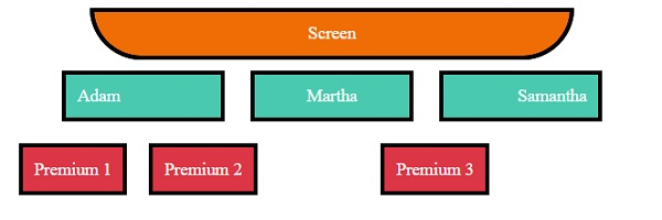
讓我們看一個 CSS 水平對齊的示例:
<!DOCTYPE html>
<html>
<head>
<title>CSS Horizontal Alignment</title>
<style>
.screen {
   padding: 10px;
   width: 70%;
   margin: 0 auto;
   background-color: #f06d06;
   text-align: center;
   color: white;
   border-radius: 0 0 50px 50px;
   border: 4px solid #000;
}
.seats span, .backSeats div{
   margin: 10px;
   padding: 10px;
   color: white;
   border: 4px solid #000;
}
.seats span{
   width: 120px;
   display: inline-block;
   background-color: #48C9B0;
}
.left{
   text-align: left;
}
.right{
   text-align: right;
}
.center{
   text-align: center;
}
.seats{
   text-align: center;
}
.backSeats div {
   background-color: #dc3545;
}
.leftFloat{
   float: left;
}
.rightAbsolute{
   position: absolute;
   right: 150px;
}
</style>
</head>
<body>
<div class="screen">Screen</div>
<div class="seats">
<span class="left">Adam</span>
<span class="center">Martha</span>
<span class="right">Samantha</span>
<div class="backSeats">
<div class="leftFloat">Premium 1</div>
<div class="leftFloat">Premium 2</div>
<div class="rightAbsolute">Premium 3</div>
</div>
</div>
</body>
</html>
輸出
這將產生以下輸出:
垂直對齊
- 內聯元素
內聯元素或內聯塊元素,例如文字、錨點等,可以使用 CSS padding、CSS line-height 或 CSS vertical-align 屬性進行垂直對齊。
- 塊級元素
塊級元素,例如 div、p 等,可以使用 CSS margin 屬性、CSS flex 屬性以及 CSS align-items,或使用定位方案的 absolute 方法和 CSS transform 屬性進行垂直對齊。
示例
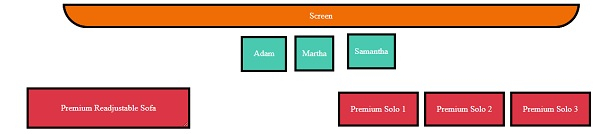
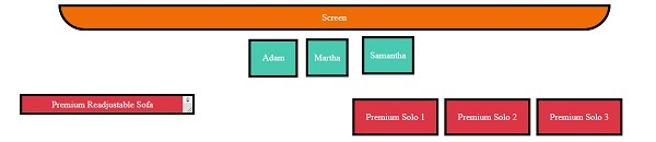
讓我們看一個 CSS 垂直對齊的示例:
<!DOCTYPE html>
<html>
<head>
<title>CSS Horizontal Alignment</title>
<style>
.screen {
   padding: 10px;
   width: 70%;
   margin: 0 auto;
   background-color: #f06d06;
   text-align: center;
   color: white;
   border-radius: 0 0 50px 50px;
   border: 4px solid #000;
}
.seats span:not(.withPadding){
   margin: 10px;
   padding: 10px;
   color: white;
   border: 4px solid #000;
}
.seats span:not(.vertical){
   height: 40px;
   display: inline-block;
   background-color: #48C9B0;
}
.withPadding{
   padding: 20px 20px 0px;
   height: 20px;
   color: white;
   border: 4px solid #000;
}
.vertical{
   display: inline-table;
   background-color: #48C9B0;
   height: 40px;
}
.verticalText {
   display: table-cell;
   vertical-align: middle;
}
.withLineHeight{
   line-height: 40px;
}
.seats{
   text-align: center;
}
.backLeftSeat{
   background-color: #dc3545;
   max-height: 100px;
   height: 70px;
   margin: 20px;
   width: 300px;
   display: inline-block;
   position: relative;
   resize: vertical;
   overflow: auto;
   border: 4px solid #000;
}
.withPosition{
   position: absolute;
   top: 50%;
   left: 2px;
   right: 2px;
   color: white;
   padding: 20px;
   transform: translateY(-50%);
}
.backRightSeats{
   height: 122px;
   width: 800px;
   float: right;
   display: inline-flex;
   flex-direction: row;
   justify-content: center;
   align-items: center;
}
.withFlex {
   background-color: #dc3545;
   border: 4px solid #000;
   margin-right: 10px;
   color: white;
   padding: 20px;
}
</style></head>
<body>
<div class="screen">Screen</div>
<div class="seats">
<span class="withPadding">Adam</span>
<span class="withLineHeight">Martha</span>
<span class="vertical"><p class="verticalText">Samantha</p></span>
<div>
<div class="backLeftSeat">
<div class="withPosition">Premium Readjustable Sofa</div>
</div>
<div class="backRightSeats">
<div class="withFlex">Premium Solo 1</div>
<div class="withFlex">Premium Solo 2</div>
<div class="withFlex">Premium Solo 3</div>
</div>
</div>
</body>
</html>
輸出
這將產生以下輸出:
當 div 未調整時
當 div 已調整時
居中對齊
我們可以使用上面在水平和垂直對齊中提到的方法將元素居中對齊。

更新於:2020年1月8日
3K+ 瀏覽量

廣告