
 資料結構
資料結構 網路
網路 關係資料庫管理系統
 作業系統
作業系統 Java
Java iOS
iOS HTML
HTML CSS
CSS Android
 Python
 C 程式設計
 C++
C++ C#
C# MongoDB
 MySQL
MySQL Javascript
 PHP
PHP使用 ggplot2 和 Shiny 建立互動式視覺化
使用 ggplot2 和 Shiny 建立互動式視覺化是深入挖掘資料並以引人入勝且互動的方式呈現資料的一種有效方法。Shiny 是一個 R 包,允許我們使用 R 工具構建互動式 Web 應用程式。我們可以將 ggplot2(R 中一個流行的資料視覺化包)與 Shiny 整合,以建立動態且響應式的視覺化效果。
下面是一個分步指南,說明如何使用 ggplot2 和 Shiny 建立互動式視覺化 -
步驟 1 - 安裝必要的包
確保您在 R 環境中安裝了 ggplot2 和 Shiny。如果您尚未安裝它們,可以使用以下命令安裝它們 -
install.packages("ggplot2")
install.packages("shiny")
步驟 2 - 載入所需的庫:完成所需包的安裝後,我們需要使用名為 library() 的函式將庫“ggplot2”和“Shiny”載入到我們的 R 會話中 -
library(ggplot2)
library(shiny)
步驟 3 - 建立 Shiny 應用程式結構:使用 shinyApp() 函式建立一個新的 Shiny 應用程式。此函式的作用是考慮兩個引數:ui 和 server。
ui 引數定義了應用程式的使用者介面元素,server 引數將定義伺服器端邏輯中包含的內容。以下是一個基本的示例,用於理解這一點 -
ui <- fluidPage(
   # UI elements go here
)
server <- function(input, output) {
   # Server-side logic goes here
}
shinyApp(ui, server)
步驟 4 - 定義 UI 元素在 fluidPage() 函式內,您可以定義應用程式的 UI 元素。您可以使用 Shiny 的各種輸入和輸出函式來建立互動式元素。例如,您可以像這樣建立一個滑塊輸入和一個繪圖輸出 -
ui <- fluidPage(
   sliderInput("num_points", "Number of Points", min = 10, max = 100, value = 50),
   plotOutput("scatter_plot")
)
步驟 5 - 定義伺服器端邏輯:在 server 函式中,我們定義了要構建到應用程式中的伺服器端邏輯。在此步驟中,我們將使用 ggplot2 根據使用者輸入建立繪圖。我們可以使用 input$
語法訪問在 UI 中定義的輸入值。以下是一個示例 -
server <- function(input, output) {
   output$scatter_plot <- renderPlot({
      # Generate data based on input
      data <- data.frame(
         x = rnorm(input$num_points),
         y = rnorm(input$num_points)
      )
      # Create the scatter plot using ggplot2
      ggplot(data, aes(x = x, y = y)) +
         geom_point()
   })
}
步驟 6 - 執行應用程式:現在我們已經設計了應用程式,下一步將執行 Shiny 應用程式。為此,我們將使用 runApp() 函式,並將 Shiny 應用程式物件傳遞給它,如下所示 -
runApp(shinyApp(ui, server))
輸出
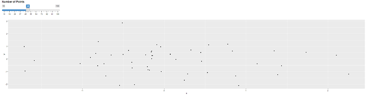
就是這樣!您已經建立了一個 Shiny 應用程式,其中包含使用 ggplot2 建立的互動式散點圖。
您可以透過新增更多 UI 元素、自定義繪圖以及根據您的特定需求加入其他互動性來增強應用程式。
步驟 7 - 增強互動性:我們可以進一步增強或向 Shiny 應用程式新增更多互動式元素,這可以幫助進一步吸引使用者。在下面的示例中,我們可以新增一個下拉選單,該選單將提供選擇不同繪圖型別的選項。以下是一個更新的示例 -
ui <- fluidPage(
   selectInput("plot_type", "Plot Type", choices = c("Scatter", "Line")),
   sliderInput("num_points", "Number of Points", min = 10, max = 100, value = 50),
   plotOutput("my_plot")
)
步驟 8 - 更新伺服器端邏輯:使用名為“server”的函式,我們可以更新伺服器端邏輯,該邏輯將基於所選的繪圖型別。使用 input$
訪問輸入值。以下是一個示例,它根據使用者的選擇建立散點圖或折線圖 -
server <- function(input, output) {
   output$my_plot <- renderPlot({
      data <- data.frame(
         x = rnorm(input$num_points),
         y = rnorm(input$num_points)
      )

      if (input$plot_type == "Scatter") {
         ggplot(data, aes(x = x, y = y)) +
            geom_point()
      } else if (input$plot_type == "Line") {
         ggplot(data, aes(x = x, y = y)) +
           geom_line()
      }
   })
}
步驟 9 - 新增反應式元素:我們還可以新增反應式元素,這些元素將根據使用者輸入進行更新。例如,您可以顯示資料的彙總統計資訊。以下是一個更新的示例,顯示了均值和標準差 -
server <- function(input, output) {
   output$my_plot <- renderPlot({
      data <- data.frame(
         x = rnorm(input$num_points),
         y = rnorm(input$num_points)
      )

      if (input$plot_type == "Scatter") {
      ggplot(data, aes(x = x, y = y)) +
         geom_point()
      } else if (input$plot_type == "Line") {
      ggplot(data, aes(x = x, y = y)) +
         geom_line()
      }
   })

   output$summary_stats <- renderText({
      data <- data.frame(
         x = rnorm(input$num_points),
         y = rnorm(input$num_points)
      )

      paste("Mean of x:", mean(data$x), "
",
         "Standard Deviation of y:", sd(data$y))
   })

   outputOptions(output, "summary_stats", suspendWhenHidden = FALSE)
}
步驟 10 - 更新 UI 最後,您可以更新 UI 以顯示彙總統計資訊。向 UI 新增文字輸出元素 -
ui <- fluidPage(
   selectInput("plot_type", "Plot Type", choices = c("Scatter", "Line")),
   sliderInput("num_points", "Number of Points", min = 10, max = 100, value = 50),
   plotOutput("my_plot"),
   verbatimTextOutput("summary_stats")
)
執行應用程式要執行 Shiny 應用程式,您可以使用 runApp() 函式,並將 Shiny 應用程式物件傳遞給它。這是一個示例 -
runApp(shinyApp(ui, server))
輸出
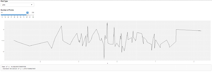
就是這樣!您現在已經建立了一個帶有互動式元素、不同繪圖型別和顯示彙總統計資訊的反應式元素的 Shiny 應用程式。我們可以根據我們的要求和需求進一步自定義和擴充套件應用程式。
請記住,將您的應用程式檔案儲存為 R 副檔名,並在 R 環境中執行指令碼以執行應用程式。

295 次瀏覽
