
 資料結構
資料結構 網路
網路 關係型資料庫管理系統 (RDBMS)
 作業系統
作業系統 Java
Java MS Excel
 iOS
iOS HTML
HTML CSS
CSS Android
 Python
 C語言程式設計
 C++
C++ C#
C# MongoDB
 MySQL
MySQL Javascript
 PHP
PHP 物理
物理 化學
化學 生物
生物 數學
數學 英語
英語 經濟學
經濟學 心理學
心理學 社會學
社會學 服裝設計
服裝設計 法律研究
法律研究使用HTML和CSS建立一個響應式咖啡網站
本文將向您展示如何使用HTML和CSS建立一個響應式咖啡網站。我們將設計英雄區域、產品列表和聯絡表單等部分,並確保它們在臺式機和移動裝置上都能很好地顯示。
在這篇文章中,我們將使用HTML和CSS建立一個響應式咖啡網站。
使用HTML和CSS建立一個響應式咖啡網站
在本教程中,我們將透過六個簡單的步驟來構建一個時尚的響應式咖啡店網站。
響應式咖啡網站應該具備
我們將構建一個簡潔時尚的咖啡店網站,該網站可以適應不同的螢幕尺寸。網站將包括
- 一個具有醒目歡迎資訊的英雄區域。
- 一個展示幾種咖啡選項及其描述的產品區域。
- 一個用於使用者諮詢的聯絡表單。
- 響應式設計,使網站在臺式機和移動螢幕上都能顯示良好。
理解響應式網頁設計
響應式設計意味著網站佈局會自動調整以適應不同的螢幕尺寸。對於這個咖啡網站,我們將使用CSS媒體查詢來確保我們的網站佈局在較小的螢幕(例如手機)上平滑地變化。
影像資源
為了建立一個視覺上吸引人的咖啡網站,我們需要幾張圖片
- 英雄區域圖片:coffee-hero.jpg - 英雄區域的全寬、醒目的咖啡圖片。
- 產品圖片:coffee1.jpg、coffee2.jpg和coffee3.jpg - 產品區域中顯示的各種咖啡型別(如濃縮咖啡、拿鐵和卡布奇諾)的圖片。
咖啡網站的HTML結構
讓我們從基本的HTML結構開始。我們將在HTML檔案中建立一個英雄區域、一個產品區域和一個聯絡區域。
<!DOCTYPE html>
<html lang="en">

<head>
    <meta charset="UTF-8">
    <meta name="viewport" content="width=device-width, initial-scale=1.0">
    <title>Responsive Coffee Website</title>
    <link rel="stylesheet" href="style.css">
    <script>
        document.addEventListener("DOMContentLoaded", function() {
            const faders = document.querySelectorAll(".about, .products, .contact");

            const appearOptions = {
                threshold: 0.2, // Trigger when 20% of the section is in view
                rootMargin: "0px 0px -100px 0px"
            };

            const appearOnScroll = new IntersectionObserver(function(entries, appearOnScroll) {
                entries.forEach(entry => {
                    if (!entry.isIntersecting) {
                        return;
                    } else {
                        entry.target.classList.add("appear");
                        appearOnScroll.unobserve(entry.target);
                    }
                });
            }, appearOptions);

            faders.forEach(fader => {
                appearOnScroll.observe(fader);
            });
        });
    </script>


</head>

<body>
    <!-- Header Section -->
    <header>
        <div class="container">
            <h1 class="logo">CoffeeHouse</h1>
            <nav>
                <ul class="nav-links">
                    <li><a href="#home">Home</a></li>
                    <li><a href="#about">About</a></li>
                    <li><a href="#products">Products</a></li>
                    <li><a href="#contact">Contact</a></li>
                </ul>
            </nav>
        </div>
    </header>

    <!-- Hero Section -->
    <section id="home" class="hero">
        <div class="container hero-content">
            <div class="hero-text">
                <h2>Welcome to CoffeeHouse</h2>
                <p>Experience the rich aroma and flavors of our carefully selected beans.</p>
                <a href="#products" class="btn">Shop Now</a>
            </div>
        </div>
    </section>


    <!-- About Section -->
    <section id="about" class="about">
        <div class="container">
            <h2>About Us</h2>
            <p>At CoffeeHouse, we believe in providing the best coffee experience. Our beans are sourced from the finest farms around the world and roasted to perfection to deliver a bold, smooth taste with every sip.</p>
        </div>
    </section>

    <!-- Products Section -->
    <section id="products" class="products">
        <div class="container">
            <h2>Our Products</h2>
            <div class="product-list">
                <div class="product">
                    <img src="img/coffee1.jpg" alt="Espresso">
                    <h3>Espresso</h3>
                    <p>A rich and intense coffee experience.</p>
                </div>
                <div class="product">
                    <img src="img/coffee2.jpg" alt="Latte">
                    <h3>Latte</h3>
                    <p>A smooth and creamy delight.</p>
                </div>
                <div class="product">
                    <img src="img/coffee3.png" alt="Cappuccino">
                    <h3>Cappuccino</h3>
                    <p>The perfect blend of coffee and foam.</p>
                </div>
            </div>
        </div>
    </section>

    <!-- Contact Section -->
    <section id="contact" class="contact">
        <div class="container">
            <h2>Contact Us</h2>
            <p>Got questions? We'd love to hear from you!</p>
            <a href="mailto:info@coffeehouse.com" class="btn">Email Us</a>
        </div>
    </section>

    <!-- Footer Section -->
    <footer>
        <div class="container">
            <p>© 2024 CoffeeHouse. All rights reserved.</p>
        </div>
    </footer>

</body>

</html>
用於樣式和響應式的CSS
在我們的CSS檔案中,我們將應用樣式以使網站看起來簡潔。我們還將新增媒體查詢以使佈局適應較小的螢幕。
/* Basic Reset */
 * {
     margin: 0;
     padding: 0;
     box-sizing: border-box;
     font-family: Arial, sans-serif;
}
 body {
     line-height: 1.6;
     color: #333;
}
 html {
     scroll-behavior: smooth;
}
/* Container */
 .container {
     width: 90%;
     max-width: 1200px;
     margin: auto;
}
/* Header */
 header {
     background-color: #333;
     color: #fff;
     padding: 10px 0;
     position: fixed;
     width: 100%;
     top: 0;
     z-index: 10;
     box-shadow: 0 4px 8px rgba(0, 0, 0, 0.2);
     animation: fadeIn 1.2s cubic-bezier(0.4, 0.0, 0.2, 1) forwards;
}
 header .container {
     display: flex;
     align-items: center;
     justify-content: space-between;
}
 header .logo {
     font-size: 24px;
     font-weight: bold;
     text-transform: uppercase;
}
 header nav ul {
     list-style-type: none;
     display: flex;
     gap: 20px;
}
 header nav ul li a {
     color: #fff;
     text-decoration: none;
     padding: 5px 10px;
     border-radius: 5px;
     transition: background 0.3s;
}
 header nav ul li a:hover {
     background-color: #f0a500;
}
/* Hero Section */
 .hero {
     background: url('img/coffee-hero.jpg') no-repeat center center/cover;
     height: 80vh;
     color: #fff;
     display: flex;
     align-items: center;
     justify-content: center;
     text-align: center;
     position: relative;
     overflow: hidden;
     clip-path: ellipse(100% 60% at 50% 40%);
}
 .hero-content {
     display: flex;
     align-items: center;
     justify-content: center;
     gap: 20px;
     max-width: 1200px;
     width: 100%;
}
 .hero-text {
     max-width: 50%;
     text-align: left;
     animation: fadeIn 1.8s cubic-bezier(0.4, 0.0, 0.2, 1) forwards;
     animation-delay: 0.5s;
     animation-fill-mode: backwards;
}
 .hero h2 {
     font-size: 42px;
     font-weight: bold;
}
 .hero p {
     margin: 10px 0 20px;
     font-size: 18px;
}
 .hero .btn {
     background-color: #f0a500;
     color: #fff;
     padding: 10px 20px;
     text-decoration: none;
     border-radius: 50px;
     transition: background 0.3s, transform 0.3s;
}
 .hero .btn:hover {
     background-color: #e89b00;
     transform: scale(1.05);
}
 .btn {
     background-color: #f0a500;
     color: #fff;
     padding: 10px 20px;
     text-decoration: none;
     border-radius: 50px;
     transition: transform 0.5s cubic-bezier(0.4, 0.0, 0.2, 1), background-color 0.5s cubic-bezier(0.4, 0.0, 0.2, 1);
}
 .btn:hover {
     background-color: #e89b00;
     transform: scale(1.05);
}
/* Coffee Bag Image Styling */
 .hero-image {
     max-width: 40%;
     display: flex;
     justify-content: center;
}
 .hero-image img {
     width: 100%;
     max-width: 300px;
     border-radius: 8px;
     box-shadow: 0 8px 16px rgba(0, 0, 0, 0.2);
     transition: transform 0.3s;
     animation: scaleUp 1.8s cubic-bezier(0.4, 0.0, 0.2, 1) forwards;
     animation-delay: 0.7s;
     animation-fill-mode: backwards;
}
 .hero-image img:hover {
     transition: transform 0.5s cubic-bezier(0.4, 0.0, 0.2, 1);
     transform: scale(1.05);
}
/* Responsive Design for Hero Section */
 @media (max-width: 768px) {
     .hero-content {
         flex-direction: column;
         text-align: center;
    }
     .hero-text, .hero-image {
         max-width: 100%;
    }
     .hero h2 {
         font-size: 32px;
    }
     .hero p {
         font-size: 16px;
    }
}
/* About Section with cool shape */
 .about {
     padding: 60px 0;
     text-align: center;
     background-color: #fff;
     clip-path: polygon(0 15%, 100% 0, 100% 85%, 0% 100%);
     margin-top: -80px;
     z-index: 1;
     opacity: 0;
     animation: fadeIn 1.8s cubic-bezier(0.4, 0.0, 0.2, 1) forwards;
     animation-delay: 0.5s;
}
 .about h2 {
     font-size: 32px;
     margin-bottom: 20px;
     color: #f0a500;
}
 .about p {
     max-width: 700px;
     margin: auto;
     font-size: 18px;
}
/* Products Section */
/* Products Section */
 .products {
     padding: 60px 0;
     text-align: center;
}
 .products h2 {
     font-size: 36px;
     margin-bottom: 40px;
     color: #333;
}
 .product-list {
     display: flex;
     gap: 20px;
     justify-content: center;
     flex-wrap: wrap;
}
 .product {
     width: 280px;
     padding: 20px;
     border-radius: 10px;
     box-shadow: 0 8px 16px rgba(0, 0, 0, 0.1);
     transition: transform 0.3s ease, box-shadow 0.3s ease;
     background-color: #fff;
     cursor: pointer;
     overflow: hidden;
     text-align: center;
}
 .product img {
     width: 100%;
     height: auto;
     border-radius: 10px;
     transition: transform 0.3s ease;
}
 .product h3 {
     font-size: 24px;
     color: #333;
     margin: 15px 0 5px;
     transition: color 0.3s ease;
}
 .product p {
     color: #666;
     font-size: 16px;
     transition: color 0.3s ease;
}
/* Hover Effects */
 .product:hover {
     transform: translateY(-10px) scale(1.03);
    /* Lift and scale effect */
     box-shadow: 0 12px 24px rgba(0, 0, 0, 0.2);
    /* Stronger shadow on hover */
}
 .product:hover img {
     transform: scale(1.1);
    /* Slight zoom effect on image */
}
 .product:hover h3 {
     color: #e89b00;
    /* Change text color on hover */
}
 .product:hover p {
     color: #444;
    /* Darken text color on hover */
}
/* Contact Section */
 .contact {
     padding: 40px 0;
     text-align: center;
     background-color: #333;
     color: #fff;
     position: relative;
     clip-path: ellipse(100% 90% at 50% 10%);
     opacity: 0;
     animation: fadeIn 1.8s cubic-bezier(0.4, 0.0, 0.2, 1) forwards;
     animation-delay: 0.3s;
}
 .contact h2 {
     font-size: 32px;
     margin-bottom: 20px;
     color: #f0a500;
}
 .contact p {
     font-size: 18px;
}
 .contact .btn {
     background-color: #f0a500;
     color: #fff;
     padding: 10px 20px;
     text-decoration: none;
     border-radius: 50px;
     transition: background 0.3s, transform 0.3s;
}
 .contact .btn:hover {
     background-color: #e89b00;
     transform: scale(1.05);
}
/* Footer */
 footer {
     background-color: #222;
     color: #fff;
     padding: 10px 0;
     text-align: center;
     font-size: 14px;
}
/* Responsive Design */
 @media (max-width: 768px) {
     header .container {
         flex-direction: column;
    }
     header nav ul {
         flex-direction: column;
         gap: 10px;
    }
     .product-list {
         flex-direction: column;
    }
     .hero h2 {
         font-size: 32px;
    }
     .hero p {
         font-size: 16px;
    }
}
/* Fade-in Animation */
 @keyframes fadeIn {
     0% {
         opacity: 0;
         transform: translateY(40px);
    }
     100% {
         opacity: 1;
         transform: translateY(0);
    }
}
/* Slide-in Animation */
 @keyframes slideIn {
     0% {
         opacity: 0;
         transform: translateX(-40px);
    }
     100% {
         opacity: 1;
         transform: translateX(0);
    }
}
/* Scale Animation */
 @keyframes scaleUp {
     0% {
         transform: scale(0.8);
         opacity: 0;
    }
     100% {
         transform: scale(1);
         opacity: 1;
    }
}
/* Sections that fade in on scroll */
 .about, .products, .contact {
     opacity: 0;
     transform: translateY(40px);
     transition: opacity 1.8s cubic-bezier(0.4, 0.0, 0.2, 1), transform 1.8s cubic-bezier(0.4, 0.0, 0.2, 1);
}
 .appear {
     opacity: 1;
     transform: translateY(0);
     }
網站各部分的解釋
這個咖啡網站被組織成幾個關鍵部分,每個部分都旨在增強使用者體驗並引導訪問者瀏覽網站。
頁首和英雄區域
- 頁首包含徽標和導航連結,允許使用者跳轉到頁面的不同部分,例如“產品”和“聯絡”。
- 英雄區域包含一個全寬背景圖片(coffee-hero.jpg),展示了一張視覺上醒目的咖啡圖片,並以大型友好的標題和簡短的標語歡迎使用者。
關於部分
- 此可選部分提供了對咖啡店的簡短描述。這是一個介紹咖啡店獨特之處或特色產品的機會,從而與訪客建立個人聯絡。
產品部分
此部分顯示精選的咖啡產品,例如濃縮咖啡、拿鐵和卡布奇諾,每個產品都配有圖片和描述。
- 網格佈局:在臺式機螢幕上,產品以網格形式排列,這使每個產品都具有相同的可見性,並使佈局簡潔有序。
- 響應式佈局:在較小的螢幕(如移動裝置)上,網格佈局切換為單列格式,使影像和文字更易於檢視。
聯絡部分
- 聯絡部分包含一個表單,供使用者在有疑問或想聯絡時填寫。
- 該表單通常包括“姓名”、“電子郵件”和“訊息”等欄位,以及一個用於傳送訊息的號召性用語按鈕。此部分鼓勵使用者互動,並可以幫助咖啡店收集諮詢。
頁尾部分
- 頁尾包含簡單的版權資訊,使網站具有專業的完成度。
- 您也可以在此處新增指向社交媒體個人資料或聯絡資訊的連結。
完整程式碼(HTML和CSS)
以下是我們咖啡網站的完整程式碼,結合了上面各部分的HTML和CSS程式碼。
<!DOCTYPE html>
<html lang="en">

<head>
    <meta charset="UTF-8">
    <meta name="viewport" content="width=device-width, initial-scale=1.0">
    <title>Responsive Coffee Website</title>
    <!-- <link rel="stylesheet" href="style.css"> -->

    <style>
        /* Basic Reset */

        * {
            margin: 0;
            padding: 0;
            box-sizing: border-box;
            font-family: Arial, sans-serif;
        }

        body {
            line-height: 1.6;
            color: #333;
        }

        html {
            scroll-behavior: smooth;
        }

        /* Container */

        .container {
            width: 90%;
            max-width: 1200px;
            margin: auto;
        }

        /* Header */

        header {
            background-color: #333;
            color: #fff;
            padding: 10px 0;
            position: fixed;
            width: 100%;
            top: 0;
            z-index: 10;
            box-shadow: 0 4px 8px rgba(0, 0, 0, 0.2);
            animation: fadeIn 1.2s cubic-bezier(0.4, 0.0, 0.2, 1) forwards;
        }

        header .container {
            display: flex;
            align-items: center;
            justify-content: space-between;
        }

        header .logo {
            font-size: 24px;
            font-weight: bold;
            text-transform: uppercase;
        }

        header nav ul {
            list-style-type: none;
            display: flex;
            gap: 20px;
        }

        header nav ul li a {
            color: #fff;
            text-decoration: none;
            padding: 5px 10px;
            border-radius: 5px;
            transition: background 0.3s;
        }

        header nav ul li a:hover {
            background-color: #f0a500;
        }

        /* Hero Section */

        .hero {
            background: url('img/coffee-hero.jpg') no-repeat center center/cover;
            height: 80vh;
            color: #fff;
            display: flex;
            align-items: center;
            justify-content: center;
            text-align: center;
            position: relative;
            overflow: hidden;
            clip-path: ellipse(100% 60% at 50% 40%);
        }

        .hero-content {
            display: flex;
            align-items: center;
            justify-content: center;
            gap: 20px;
            max-width: 1200px;
            width: 100%;
        }

        .hero-text {
            max-width: 50%;
            text-align: left;
            animation: fadeIn 1.8s cubic-bezier(0.4, 0.0, 0.2, 1) forwards;
            animation-delay: 0.5s;
            animation-fill-mode: backwards;
        }

        .hero h2 {
            font-size: 42px;
            font-weight: bold;
        }

        .hero p {
            margin: 10px 0 20px;
            font-size: 18px;
        }

        .hero .btn {
            background-color: #f0a500;
            color: #fff;
            padding: 10px 20px;
            text-decoration: none;
            border-radius: 50px;
            transition: background 0.3s, transform 0.3s;
        }


        .hero .btn:hover {
            background-color: #e89b00;
            transform: scale(1.05);
        }

        .btn {
            background-color: #f0a500;
            color: #fff;
            padding: 10px 20px;
            text-decoration: none;
            border-radius: 50px;
            transition: transform 0.5s cubic-bezier(0.4, 0.0, 0.2, 1), background-color 0.5s cubic-bezier(0.4, 0.0, 0.2, 1);
        }

        .btn:hover {
            background-color: #e89b00;
            transform: scale(1.05);
        }

        /* Coffee Bag Image Styling */

        .hero-image {
            max-width: 40%;
            display: flex;
            justify-content: center;
        }

        .hero-image img {
            width: 100%;
            max-width: 300px;
            border-radius: 8px;
            box-shadow: 0 8px 16px rgba(0, 0, 0, 0.2);
            transition: transform 0.3s;
            animation: scaleUp 1.8s cubic-bezier(0.4, 0.0, 0.2, 1) forwards;
            animation-delay: 0.7s;
            animation-fill-mode: backwards;
        }

        .hero-image img:hover {
            transition: transform 0.5s cubic-bezier(0.4, 0.0, 0.2, 1);
            transform: scale(1.05);
        }

        /* Responsive Design for Hero Section */

        @media (max-width: 768px) {
            .hero-content {
                flex-direction: column;
                text-align: center;
            }

            .hero-text,
            .hero-image {
                max-width: 100%;
            }

            .hero h2 {
                font-size: 32px;
            }

            .hero p {
                font-size: 16px;
            }
        }

        /* About Section with cool shape */

        .about {
            padding: 60px 0;
            text-align: center;
            background-color: #fff;
            clip-path: polygon(0 15%, 100% 0, 100% 85%, 0% 100%);
            margin-top: -80px;
            z-index: 1;
            opacity: 0;
            animation: fadeIn 1.8s cubic-bezier(0.4, 0.0, 0.2, 1) forwards;
            animation-delay: 0.5s;
        }

        .about h2 {
            font-size: 32px;
            margin-bottom: 20px;
            color: #f0a500;
        }

        .about p {
            max-width: 700px;
            margin: auto;
            font-size: 18px;
        }

        /* Products Section */

        /* Products Section */

        .products {
            padding: 60px 0;
            text-align: center;
        }

        .products h2 {
            font-size: 36px;
            margin-bottom: 40px;
            color: #333;
        }

        .product-list {
            display: flex;
            gap: 20px;
            justify-content: center;
            flex-wrap: wrap;
        }

        .product {
            width: 280px;
            padding: 20px;
            border-radius: 10px;
            box-shadow: 0 8px 16px rgba(0, 0, 0, 0.1);
            transition: transform 0.3s ease, box-shadow 0.3s ease;
            background-color: #fff;
            cursor: pointer;
            overflow: hidden;
            text-align: center;
        }

        .product img {
            width: 100%;
            height: auto;
            border-radius: 10px;
            transition: transform 0.3s ease;
        }

        .product h3 {
            font-size: 24px;
            color: #333;
            margin: 15px 0 5px;
            transition: color 0.3s ease;
        }

        .product p {
            color: #666;
            font-size: 16px;
            transition: color 0.3s ease;
        }

        /* Hover Effects */

        .product:hover {
            transform: translateY(-10px) scale(1.03);
            /* Lift and scale effect */
            box-shadow: 0 12px 24px rgba(0, 0, 0, 0.2);
            /* Stronger shadow on hover */
        }

        .product:hover img {
            transform: scale(1.1);
            /* Slight zoom effect on image */
        }

        .product:hover h3 {
            color: #e89b00;
            /* Change text color on hover */
        }

        .product:hover p {
            color: #444;
            /* Darken text color on hover */
        }


        /* Contact Section */

        .contact {
            padding: 40px 0;
            text-align: center;
            background-color: #333;
            color: #fff;
            position: relative;
            clip-path: ellipse(100% 90% at 50% 10%);
            opacity: 0;
            animation: fadeIn 1.8s cubic-bezier(0.4, 0.0, 0.2, 1) forwards;
            animation-delay: 0.3s;
        }


        .contact h2 {
            font-size: 32px;
            margin-bottom: 20px;
            color: #f0a500;
        }

        .contact p {
            font-size: 18px;
        }

        .contact .btn {
            background-color: #f0a500;
            color: #fff;
            padding: 10px 20px;
            text-decoration: none;
            border-radius: 50px;
            transition: background 0.3s, transform 0.3s;
        }

        .contact .btn:hover {
            background-color: #e89b00;
            transform: scale(1.05);
        }

        /* Footer */

        footer {
            background-color: #222;
            color: #fff;
            padding: 10px 0;
            text-align: center;
            font-size: 14px;
        }

        /* Responsive Design */

        @media (max-width: 768px) {
            header .container {
                flex-direction: column;
            }

            header nav ul {
                flex-direction: column;
                gap: 10px;
            }

            .product-list {
                flex-direction: column;
            }

            .hero h2 {
                font-size: 32px;
            }

            .hero p {
                font-size: 16px;
            }
        }

        /* Fade-in Animation */

        @keyframes fadeIn {
            0% {
                opacity: 0;
                transform: translateY(40px);
            }

            100% {
                opacity: 1;
                transform: translateY(0);
            }
        }

        /* Slide-in Animation */

        @keyframes slideIn {
            0% {
                opacity: 0;
                transform: translateX(-40px);
            }

            100% {
                opacity: 1;
                transform: translateX(0);
            }
        }

        /* Scale Animation */

        @keyframes scaleUp {
            0% {
                transform: scale(0.8);
                opacity: 0;
            }

            100% {
                transform: scale(1);
                opacity: 1;
            }
        }

        /* Sections that fade in on scroll */

        .about,
        .products,
        .contact {
            opacity: 0;
            transform: translateY(40px);
            transition: opacity 1.8s cubic-bezier(0.4, 0.0, 0.2, 1), transform 1.8s cubic-bezier(0.4, 0.0, 0.2, 1);
        }

        .appear {
            opacity: 1;
            transform: translateY(0);
        }
    </style>

    <script>
        document.addEventListener("DOMContentLoaded", function() {
            const faders = document.querySelectorAll(".about, .products, .contact");

            const appearOptions = {
                threshold: 0.2, // Trigger when 20% of the section is in view
                rootMargin: "0px 0px -100px 0px"
            };

            const appearOnScroll = new IntersectionObserver(function(entries, appearOnScroll) {
                entries.forEach(entry => {
                    if (!entry.isIntersecting) {
                        return;
                    } else {
                        entry.target.classList.add("appear");
                        appearOnScroll.unobserve(entry.target);
                    }
                });
            }, appearOptions);

            faders.forEach(fader => {
                appearOnScroll.observe(fader);
            });
        });
    </script>


</head>

<body>
    <!-- Header Section -->
    <header>
        <div class="container">
            <h1 class="logo">CoffeeHouse</h1>
            <nav>
                <ul class="nav-links">
                    <li><a href="#home">Home</a></li>
                    <li><a href="#about">About</a></li>
                    <li><a href="#products">Products</a></li>
                    <li><a href="#contact">Contact</a></li>
                </ul>
            </nav>
        </div>
    </header>

    <!-- Hero Section -->
    <section id="home" class="hero">
        <div class="container hero-content">
            <div class="hero-text">
                <h2>Welcome to CoffeeHouse</h2>
                <p>Experience the rich aroma and flavors of our carefully selected beans.</p>
                <a href="#products" class="btn">Shop Now</a>
            </div>
        </div>
    </section>


    <!-- About Section -->
    <section id="about" class="about">
        <div class="container">
            <h2>About Us</h2>
            <p>At CoffeeHouse, we believe in providing the best coffee experience. Our beans are sourced from the finest farms around the world and roasted to perfection to deliver a bold, smooth taste with every sip.</p>
        </div>
    </section>

    <!-- Products Section -->
    <section id="products" class="products">
        <div class="container">
            <h2>Our Products</h2>
            <div class="product-list">
                <div class="product">
                    <img src="img/coffee1.jpg" alt="Espresso">
                    <h3>Espresso</h3>
                    <p>A rich and intense coffee experience.</p>
                </div>
                <div class="product">
                    <img src="img/coffee2.jpg" alt="Latte">
                    <h3>Latte</h3>
                    <p>A smooth and creamy delight.</p>
                </div>
                <div class="product">
                    <img src="img/coffee3.png" alt="Cappuccino">
                    <h3>Cappuccino</h3>
                    <p>The perfect blend of coffee and foam.</p>
                </div>
            </div>
        </div>
    </section>

    <!-- Contact Section -->
    <section id="contact" class="contact">
        <div class="container">
            <h2>Contact Us</h2>
            <p>Got questions? We'd love to hear from you!</p>
            <a href="mailto:info@coffeehouse.com" class="btn">Email Us</a>
        </div>
    </section>

    <!-- Footer Section -->
    <footer>
        <div class="container">
            <p>© 2024 CoffeeHouse. All rights reserved.</p>
        </div>
    </footer>

</body>

</html>
輸出
以下是最終輸出的樣子。
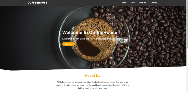
在這篇文章中,我們使用HTML和CSS建立了一個響應式咖啡網站。我們設計了一個簡潔易用的佈局,其中包含英雄橫幅、產品和聯絡表單部分,確保它在所有螢幕尺寸上都能顯示良好。本專案演示了構建響應式網站的基礎知識,為類似專案提供了堅實的基礎。

更新於:2024年11月7日
40 次瀏覽

廣告