
 資料結構
資料結構 網路
網路 關係資料庫管理系統 (RDBMS)
 作業系統
作業系統 Java
Java MS Excel
 iOS
iOS HTML
HTML CSS
CSS Android
 Python
 C語言程式設計
 C++
C++ C#
C# MongoDB
 MySQL
MySQL Javascript
 PHP
PHP 物理學
物理學 化學
化學 生物學
生物學 數學
數學 英語
英語 經濟學
經濟學 心理學
心理學 社會學
社會學 時尚研究
時尚研究 法學研究
法學研究使用HTML和CSS建立玻璃質感登入表單
本文將向您展示如何使用HTML和CSS設計一個玻璃質感登入表單。玻璃質感是一種流行的UI設計趨勢,它基於磨砂玻璃效果,使元素看起來半透明,並帶有模糊的背景。
在本文中,我們將使用HTML和CSS建立一個玻璃質感登入表單。
什麼是玻璃質感?
玻璃質感是一種UI設計風格,它使元素具有磨砂玻璃效果。
- 模糊背景:建立玻璃狀的磨砂效果。
- 透明度:允許部分背景顯示。
- 淺色邊框和陰影:增加深度並定義形狀。
在本文中,我們將瞭解如何使用HTML和CSS建立一個玻璃質感登入表單。
使用HTML和CSS建立玻璃質感登入表單
我們將遵循三個步驟。
建立HTML結構
我們首先構建登入表單的結構。我們使用單個容器來容納使用者名稱和密碼輸入欄位以及提交按鈕。
<!DOCTYPE html>
<html lang="en">

<head>
    <meta charset="UTF-8">
    <meta name="viewport" content="width=device-width, initial-scale=1.0">
    <title>Glassmorphism Login Form</title>
    <link rel="stylesheet" href="styles.css">
</head>

<body>
    <div class="glass-container">
        <h2>Login</h2>
        <form>
            <input type="text" class="input-field" placeholder="Username" required>
            <input type="password" class="input-field" placeholder="Password" required>
            <button type="submit" class="btn">Login</button>
        </form>
    </div>
</body>

</html>
解釋
- 容器包含表單並將其居中於頁面。
- `glass-form` 類為表單提供了特定的類來應用玻璃質感樣式。
- 在表單內,我們有一個標題(h2)、兩個輸入欄位(用於使用者名稱和密碼)和一個提交按鈕。
使用CSS設計表單
* {
     margin: 0;
     padding: 0;
     box-sizing: border-box;
     font-family: Arial, sans-serif;
}
/* Background Animation */
 body {
     display: flex;
     justify-content: center;
     align-items: center;
     height: 100vh;
     background: linear-gradient(135deg, #ff8a00, #da1b60);
     overflow: hidden;
}
/* Background Gradient Animation */
 body::before {
     content: '';
     position: absolute;
     width: 200%;
     height: 200%;
     top: -50%;
     left: -50%;
     background: linear-gradient(135deg, #ff8a00, #da1b60, #fcb045, #e91e63);
     background-size: 400% 400%;
     z-index: -2;
     animation: gradient-animation 8s ease infinite;
}
 @keyframes gradient-animation {
     0% {
         background-position: 0% 50%;
    }
     50% {
         background-position: 100% 50%;
    }
     100% {
         background-position: 0% 50%;
    }
}
/* Glass Effect Container */
 .glass-container {
     position: relative;
     width: 350px;
     padding: 40px;
     background: rgba(255, 255, 255, 0.1);
     border-radius: 15px;
     box-shadow: 0 8px 32px rgba(0, 0, 0, 0.4);
     backdrop-filter: blur(15px);
     -webkit-backdrop-filter: blur(15px);
     border: 1px solid rgba(255, 255, 255, 0.2);
}
/* Heading Styling */
 .glass-container h2 {
     text-align: center;
     color: #fff;
     margin-bottom: 20px;
     font-size: 1.8em;
}
/* Input Styling */
 .input-field {
     width: 100%;
     padding: 12px 10px;
     margin: 15px 0;
     border: none;
     outline: none;
     background: rgba(255, 255, 255, 0.15);
     color: #fff;
     font-size: 1em;
     border-radius: 5px;
     transition: 0.4s ease;
}
/* Focused Input Field Effect */
 .input-field:focus {
     background: rgba(255, 255, 255, 0.3);
     box-shadow: 0 4px 8px rgba(0, 0, 0, 0.3);
     transform: scale(1.02);
}
/* Button Styling */
 .btn {
     width: 100%;
     padding: 12px;
     margin-top: 20px;
     background: linear-gradient(135deg, #ff8a00, #da1b60);
     border: none;
     border-radius: 5px;
     color: #fff;
     font-size: 1em;
     cursor: pointer;
     transition: all 0.4s ease;
     text-shadow: 0px 0px 5px rgba(0, 0, 0, 0.5);
}
/* Glowing Button Hover */
 .btn:hover {
     background: linear-gradient(135deg, #e91e63, #ff8a00);
     box-shadow: 0 0 15px rgba(255, 138, 0, 0.6), 0 0 15px rgba(234, 30, 99, 0.6);
     transform: scale(1.05);
}
/* Placeholder Styling */
 ::placeholder {
     color: rgba(255, 255, 255, 0.7);
     opacity: 0.9;
}
 * {
     margin: 0;
     padding: 0;
     box-sizing: border-box;
     font-family: Arial, sans-serif;
}
/* Background Animation */
 body {
     display: flex;
     justify-content: center;
     align-items: center;
     height: 100vh;
     background: linear-gradient(135deg, #ff8a00, #da1b60);
     overflow: hidden;
}
/* Background Gradient Animation */
 body::before {
     content: '';
     position: absolute;
     width: 200%;
     height: 200%;
     top: -50%;
     left: -50%;
     background: linear-gradient(135deg, #ff8a00, #da1b60, #fcb045, #e91e63);
     background-size: 400% 400%;
     z-index: -2;
     animation: gradient-animation 8s ease infinite;
}
 @keyframes gradient-animation {
     0% {
         background-position: 0% 50%;
    }
     50% {
         background-position: 100% 50%;
    }
     100% {
         background-position: 0% 50%;
    }
}
/* Glass Effect Container */
 .glass-container {
     position: relative;
     width: 350px;
     padding: 40px;
     background: rgba(255, 255, 255, 0.1);
     border-radius: 15px;
     box-shadow: 0 8px 32px rgba(0, 0, 0, 0.4);
     backdrop-filter: blur(15px);
     -webkit-backdrop-filter: blur(15px);
     border: 1px solid rgba(255, 255, 255, 0.2);
}
/* Heading Styling */
 .glass-container h2 {
     text-align: center;
     color: #fff;
     margin-bottom: 20px;
     font-size: 1.8em;
}
/* Input Styling */
 .input-field {
     width: 100%;
     padding: 12px 10px;
     margin: 15px 0;
     border: none;
     outline: none;
     background: rgba(255, 255, 255, 0.15);
     color: #fff;
     font-size: 1em;
     border-radius: 5px;
     transition: 0.4s ease;
}
/* Focused Input Field Effect */
 .input-field:focus {
     background: rgba(255, 255, 255, 0.3);
     box-shadow: 0 4px 8px rgba(0, 0, 0, 0.3);
     transform: scale(1.02);
}
/* Button Styling */
 .btn {
     width: 100%;
     padding: 12px;
     margin-top: 20px;
     background: linear-gradient(135deg, #ff8a00, #da1b60);
     border: none;
     border-radius: 5px;
     color: #fff;
     font-size: 1em;
     cursor: pointer;
     transition: all 0.4s ease;
     text-shadow: 0px 0px 5px rgba(0, 0, 0, 0.5);
}
/* Glowing Button Hover */
 .btn:hover {
     background: linear-gradient(135deg, #e91e63, #ff8a00);
     box-shadow: 0 0 15px rgba(255, 138, 0, 0.6), 0 0 15px rgba(234, 30, 99, 0.6);
     transform: scale(1.05);
}
/* Placeholder Styling */
 ::placeholder {
     color: rgba(255, 255, 255, 0.7);
     opacity: 0.9;
}
解釋
這裡我們只解釋了關鍵的CSS屬性。
- 背景動畫:::before偽元素在玻璃容器後面建立平滑的漸變動畫,增加了動態視覺效果。
- 背景濾鏡:backdrop-filter: blur(15px) 屬性將磨砂玻璃模糊效果應用於容器。
- 透明度 (RGBA):我們使用rgba(255, 255, 255, 0.1)作為背景顏色,它結合了透明度和白色,營造出玻璃狀的半透明外觀。
- 輸入欄位焦點效果:當用戶點選輸入欄位時,輕微的縮放和陰影效果增強了互動性,使用了transform: scale(1.02) 和 box-shadow。
- 按鈕懸停輝光:登入按鈕在懸停時使用漸變和陰影效果,建立柔和的光暈以吸引注意力。
完整程式碼(HTML & CSS)
<!DOCTYPE html>
<html lang="en">

<head>
    <meta charset="UTF-8">
    <meta name="viewport" content="width=device-width, initial-scale=1.0">
    <title>Portfolio and Login Page</title>
    <style>
        /* Reset */

        * {
            margin: 0;
            padding: 0;
            box-sizing: border-box;
            font-family: Arial, sans-serif;
        }

        /* Background Animation */

        body {
            display: flex;
            justify-content: center;
            align-items: center;
            height: 100vh;
            background: linear-gradient(135deg, #ff8a00, #da1b60);
            overflow: hidden;
            flex-direction: column;
        }

        /* Background Gradient Animation */

        body::before {
            content: '';
            position: absolute;
            width: 200%;
            height: 200%;
            top: -50%;
            left: -50%;
            background: linear-gradient(135deg, #ff8a00, #da1b60, #fcb045, #e91e63);
            background-size: 400% 400%;
            z-index: -2;
            animation: gradient-animation 8s ease infinite;
        }

        @keyframes gradient-animation {
            0% {
                background-position: 0% 50%;
            }
            50% {
                background-position: 100% 50%;
            }
            100% {
                background-position: 0% 50%;
            }
        }

        /* Glass Effect Container */

        .glass-container {
            position: relative;
            width: 350px;
            padding: 40px;
            background: rgba(255, 255, 255, 0.1);
            border-radius: 15px;
            box-shadow: 0 8px 32px rgba(0, 0, 0, 0.4);
            backdrop-filter: blur(15px);
            -webkit-backdrop-filter: blur(15px);
            border: 1px solid rgba(255, 255, 255, 0.2);
            margin-bottom: 20px;
        }

        /* Heading Styling */

        .glass-container h2 {
            text-align: center;
            color: #fff;
            margin-bottom: 20px;
            font-size: 1.8em;
        }

        /* Input Styling */

        .input-field {
            width: 100%;
            padding: 12px 10px;
            margin: 15px 0;
            border: none;
            outline: none;
            background: rgba(255, 255, 255, 0.15);
            color: #fff;
            font-size: 1em;
            border-radius: 5px;
            transition: 0.4s ease;
        }

        /* Focused Input Field Effect */

        .input-field:focus {
            background: rgba(255, 255, 255, 0.3);
            box-shadow: 0 4px 8px rgba(0, 0, 0, 0.3);
            transform: scale(1.02);
        }

        /* Button Styling */

        .btn {
            width: 100%;
            padding: 12px;
            margin-top: 20px;
            background: linear-gradient(135deg, #ff8a00, #da1b60);
            border: none;
            border-radius: 5px;
            color: #fff;
            font-size: 1em;
            cursor: pointer;
            transition: all 0.4s ease;
            text-shadow: 0px 0px 5px rgba(0, 0, 0, 0.5);
        }

        /* Glowing Button Hover */

        .btn:hover {
            background: linear-gradient(135deg, #e91e63, #ff8a00);
            box-shadow: 0 0 15px rgba(255, 138, 0, 0.6), 0 0 15px rgba(234, 30, 99, 0.6);
            transform: scale(1.05);
        }

        /* Placeholder Styling */

        ::placeholder {
            color: rgba(255, 255, 255, 0.7);
            opacity: 0.9;
        }

        /* Portfolio Header */

        .header {
            width: 100%;
            background-color: lightblue;
            padding: 20px;
        }

        nav {
            display: flex;
            margin: auto;
            width: 90%;
            padding: 20px;
            align-items: center;
            justify-content: space-between;
        }

        li {
            display: inline-block;
            list-style: none;
            margin: 10px;
        }

        a {
            text-decoration: none;
            color: black;
            font-weight: bolder;
            padding: 5px;
        }

        a:hover {
            background-color: seagreen;
            border-radius: 2px;
            color: white;
        }

        .button-cv,
        .button-gfc {
            display: inline-block;
            margin-left: 0%;
            border-radius: 5px;
            transition: background-color 0.5s;
            background: black;
            padding: 10px;
            text-decoration: none;
            font-weight: bold;
            color: white;
            border: none;
            cursor: pointer;
        }

        .button-cv:hover {
            background-color: white;
            color: black;
        }

        .button-gfc {
            background: lightsalmon;
        }

        .button-gfc:hover {
            background-color: white;
            color: black;
        }

        .body {
            margin: 20px 100px;
        }

        h1 {
            font-size: 30px;
            color: black;
            margin-bottom: 20px;
        }

        .demo1 {
            color: orange;
            margin-bottom: 30px;
        }

        .demo2 {
            line-height: 20px;
        }

        .button-lrn,
        .button-hire {
            background: lightsalmon;
            padding: 10px 12px;
            text-decoration: none;
            font-weight: bold;
            color: whitesmoke;
            display: inline-block;
            margin: 30px 8px;
            border-radius: 5px;
            transition: background-color 0.3s;
            border: none;
            letter-spacing: 1px;
            cursor: pointer;
        }

        .button-lrn:hover {
            background-color: whitesmoke;
            color: black;
        }

        .button-hire {
            background: black;
        }

        .button-hire:hover {
            background-color: seagreen;
        }

        .green {
            color: seagreen;
        }
    </style>
</head>

<body>

    <!-- Login Form Section -->
    <div class="glass-container">
        <h2>Login</h2>
        <input class="input-field" type="text" placeholder="Username" required>
        <input class="input-field" type="password" placeholder="Password" required>
        <button class="btn">Login</button>
    </div>

</body>

</html>
輸出
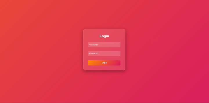
在本文中,我們學習並瞭解瞭如何使用HTML和CSS設計玻璃質感登入表單。我們設計了一個基本的玻璃質感登入表單,它具有統一的背景。該表單具有磨砂玻璃外觀,使其在視覺上脫穎而出。

更新於:2024年11月6日
39 次瀏覽

廣告