
 資料結構
資料結構 網路
網路 關係型資料庫管理系統
 作業系統
作業系統 Java
Java iOS
iOS HTML
HTML CSS
CSS Android
 Python
 C 程式設計
 C++
C++ C#
C# MongoDB
 MySQL
MySQL Javascript
 PHP
PHP使用 Python Matplotlib 繪製基本甘特圖
專案管理可能是一項複雜的工作,需要仔細計劃、組織和跟蹤任務以及時間表。甘特圖長期以來一直是專案管理中的一個主要工具,它以視覺化的方式展示了專案計劃、任務時長和依賴關係。這些圖表使專案經理和團隊能夠有效地計劃、監控和溝通專案進度。
在本文中,我們將開始使用強大的 Python 庫 Matplotlib 建立基本的甘特圖。透過利用 Matplotlib 的繪圖功能,我們將建立動態且資訊豐富的甘特圖,從而增強和擴充套件視覺化和決策能力。
使用 Python Matplotlib 繪製基本甘特圖
甘特圖是專案經理的重要工具,使他們能夠概述專案計劃並跟蹤任務隨時間的執行情況。Python 憑藉其豐富的庫生態系統,為建立甘特圖提供了靈活的解決方案。Matplotlib 是 Python 中最流行的資料視覺化庫之一,它為生成可自定義的甘特圖提供了強大的平臺。使用 Matplotlib,您可以輕鬆地繪製任務、設定持續時間並以清晰準確的方式視覺化專案時間線。無論是個人專案、團隊協作還是專業專案管理,掌握使用 Python Matplotlib 建立基本甘特圖是一項重要的技能。
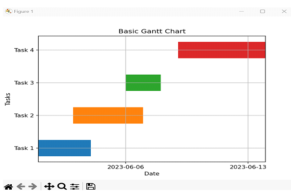
方法 1:Python – 使用 Python Matplotlib 的水平條形圖繪製基本甘特圖
在這種方法中,我們將使用 Matplotlib 的水平條形圖來建立甘特圖。我們將把每個任務繪製成一個水平條,並顯示其開始和結束日期。
演算法
步驟 1 − 匯入必要的庫:Matplotlib 和 NumPy。
步驟 2 − 建立甘特圖的資料,包括任務名稱、開始日期和持續時間。
步驟 3 − 初始化圖表和座標軸。
步驟 4 − 將 y 軸刻度標籤設定為任務名稱。
步驟 5 − 遍歷任務並將其繪製為水平條。
步驟 6 − 根據任務的開始和結束日期設定 x 軸限制。
步驟 7 − 使用適當的標籤、標題和網格線自定義圖表。
步驟 8 − 使用 'plt.show()' 顯示甘特圖。
示例
import matplotlib.pyplot as plt
import numpy as np
import pandas as pd
import matplotlib.dates as mdates

# Step 2: Create the data for the Gantt chart
tasks = ['Task 1', 'Task 2', 'Task 3', 'Task 4']
start_dates = ['2023-06-01', '2023-06-03', '2023-06-06', '2023-06-09']
durations = [3, 4, 2, 5]

# Step 3: Initialize the figure and axis
fig, ax = plt.subplots()

# Step 4: Set y-axis tick labels
ax.set_yticks(np.arange(len(tasks)))
ax.set_yticklabels(tasks)

# Step 5: Plot each task as a horizontal bar
for i in range(len(tasks)):
    start_date = pd.to_datetime(start_dates[i])
    end_date = start_date + pd.DateOffset(days=durations[i])
    ax.barh(i, end_date - start_date, left=start_date, height=0.5, align='center')

# Step 6: Set x-axis limits
min_date = pd.to_datetime(min(start_dates))
max_date = pd.to_datetime(max(start_dates)) + pd.DateOffset(days=max(durations))
ax.set_xlim(min_date, max_date)

# Step 7: Customize the chart
ax.xaxis_date()
ax.xaxis.set_major_locator(mdates.WeekdayLocator())
ax.xaxis.set_major_formatter(mdates.DateFormatter('%Y-%m-%d'))
ax.set_xlabel('Date')
ax.set_ylabel('Tasks')
ax.set_title('Basic Gantt Chart')

# Step 8: Display the chart
plt.grid(True)
plt.show()
輸出
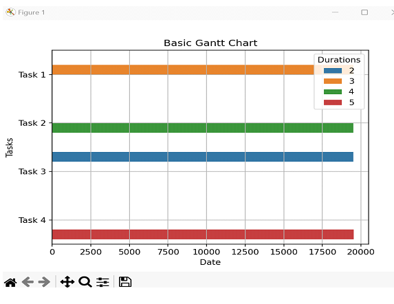
方法 2:Python – 使用 Python Matplotlib 和 Seaborn 的條形圖繪製基本甘特圖
在這種方法中,我們將使用 Seaborn 庫(它構建在 Matplotlib 之上)來建立甘特圖。我們將使用 Seaborn 的 barplot() 函式,它提供了一個高階介面來建立條形圖。
演算法
步驟 1 − 匯入必要的庫:Seaborn 和 Pandas。
步驟 2 − 建立一個 Pandas 資料幀來儲存任務資料,包括任務名稱、開始日期和持續時間
步驟 3 − 初始化圖表和座標軸。
步驟 4 − 使用 Seaborn 的 barplot() 函式建立甘特圖。
步驟 5 − 使用適當的標籤、標題和網格線自定義圖表。
步驟 6 − 使用 plt.show() 顯示甘特圖。
示例
import seaborn as sns
import pandas as pd
import matplotlib.pyplot as plt
import matplotlib.dates as mdates

# Step 2: Create the data for the Gantt chart
data = {
    'Tasks': ['Task 1', 'Task 2', 'Task 3', 'Task 4'],
    'Start Dates': ['2023-06-01', '2023-06-03', '2023-06-06', '2023-06-09'],
    'Durations': [3, 4, 2, 5]
}
df = pd.DataFrame(data)

# Convert 'Start Dates' to numeric duration values
df['Start Dates'] = mdates.datestr2num(df['Start Dates'])

# Step 3: Initialize the figure and axis
fig, ax = plt.subplots()

# Step 4: Create the Gantt chart
sns.barplot(data=df, x='Start Dates', y='Tasks', hue='Durations', ax=ax)

# Step 5: Customize the chart
ax.set_xlabel('Date')
ax.set_ylabel('Tasks')
ax.set_title('Basic Gantt Chart')
ax.grid(True)

# Step 6: Display the chart
plt.show()
輸出
結論
在本文中,我們探討了三種使用 Python 的 Matplotlib 庫建立簡單甘特圖的不同方法。第一種方法使用了水平條形圖,第二種方法使用了 Seaborn 的 Barplot 功能,第三種方法使用了 Plotly Express 建立互動式圖表。

4K+ 閱讀量
