
 資料結構
資料結構 網路
網路 關係資料庫管理系統
 作業系統
作業系統 Java
Java iOS
iOS HTML
HTML CSS
CSS Android
 Python
 C 程式設計
 C++
C++ C#
C# MongoDB
 MySQL
MySQL Javascript
 PHP
PHP在 Matplotlib 條形圖上新增值標籤
在這個程式中,我們可以初始化一些輸入值,然後嘗試使用這些值繪製條形圖。我們可以例項化一個圖形和軸,以便我們可以設定標籤、刻度,並註釋條形的高度和寬度。
步驟
建立一個年份列表。
建立該年份的人口列表。
使用 np.arrange(len(years)) 方法獲取標籤數量。
設定條形的寬度。
使用 subplots() 方法建立 fig 和 ax 變數,其中預設的 nrows 和 ncols 為 1。
使用 set_ylabel() 設定圖形的 Y 軸標籤。
使用 set_title() 設定圖形的標題。
使用 set_xticks 方法設定 X 刻度,使用步驟 3 中建立的 x。
使用 set_xticklabels 方法設定 xtick_labels 為 years 資料。
使用 ax.bar() 繪製條形圖。
迭代條形容器(來自步驟 10)以添加註釋,為每個條形設定值。
使用 plt.show() 顯示圖形。
示例
from matplotlib import pyplot as plt
import numpy as np
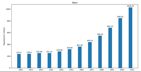
years = [1901, 1911, 1921, 1931, 1941, 1951, 1961, 1971, 1981, 1991, 2001, 2011]
population = [237.4, 238.4, 252.09, 251.31, 278.98, 318.66, 361.09, 439.23, 548.16, 683.33, 846.42, 1028.74]
x = np.arange(len(years)) # the label locations
width = 0.35 # the width of the bars
fig, ax = plt.subplots()
ax.set_ylabel('Population(in million)')
ax.set_title('Years')
ax.set_xticks(x)
ax.set_xticklabels(years)
pps = ax.bar(x - width/2, population, width, label='population')
for p in pps:
height = p.get_height()
ax.annotate('{}'.format(height),
xy=(p.get_x() + p.get_width() / 2, height),
xytext=(0, 3), # 3 points vertical offset
textcoords="offset points",
ha='center', va='bottom')
plt.show()輸出

更新於: 2021年3月15日
22K+ 瀏覽量

廣告