
 資料結構
資料結構 網路
網路 關係型資料庫管理系統
 作業系統
作業系統 Java
Java iOS
iOS HTML
HTML CSS
CSS Android
 Python
 C 程式設計
 C++
C++ C#
C# MongoDB
 MySQL
MySQL Javascript
 PHP
PHP如何在 Seaborn 條形圖上顯示數值?
在 Seaborn 的條形圖中,會顯示數值變數的平均值,誤差線則表示圍繞平均值的可能值範圍。在比較數值與 0 時,這很有幫助。在 Python 中,我們有一些內建函式,如 barplot()、enumerate() 和 text(),可用於在 Seaborn 條形圖上顯示數值。例如,我們可以使用條形圖比較各種產品的平均銷售額或不同教室的學生的平均考試成績。
語法
以下語法在示例中使用:
barplot()
這是 Python 中的內建函式,用於比較類別之間的相似性。它可以用於比較不同組的平均值。
enumerate()
這是 Python 中的內建函式,它為可迭代物件新增計數器並返回列舉物件。此函式接受兩個引數:一個可迭代物件和一個起始索引(預設值為 0)。
show()
show 方法在程式的末尾使用,根據問題陳述返回圖形結果。
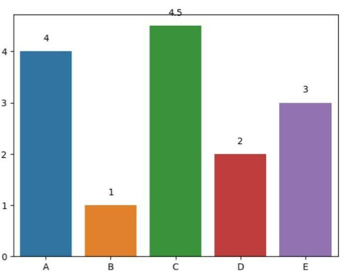
示例 1
在以下示例中,我們將顯示條形圖上方的數值。程式以必要的模組 seaborn 和 matplotlib.pyplot 開始,分別引用為 sns 和 plt。然後它定義了兩個軸 x_ax 和 y_ax 來填充資料。接下來,使用內建函式 barplot() 建立條形圖,並將其儲存在變數 ax 中。透過使用 enumerate() 迭代 y 值並在 ax.text() 中新增文字,在條形圖上方新增數值。最後,使用 show() 方法返回結果。
# Show values above bars
import seaborn as sns
import matplotlib.pyplot as plt

# Data
x_ax = ['A', 'B', 'C', 'D', 'E']
y_ax = [4, 1, 4.5, 2, 3]

# Create a barplot
ax = sns.barplot(x=x_ax, y=y_ax)

# Add values above bars
for i, v in enumerate(y):
   ax.text(i, v + 0.2, str(v), ha='center')
plt.show()
輸出
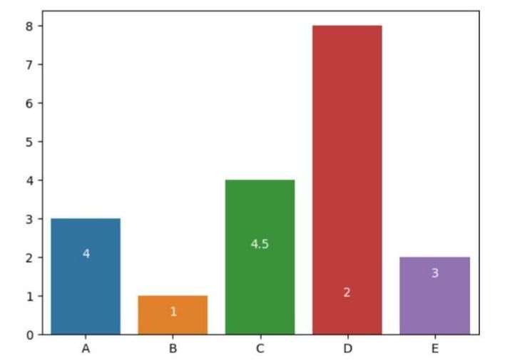
示例 2
在以下示例中,我們將透過匯入模組 seaborn 和 matplotlib.pyplot 開始程式,分別引用為 sns 和 plt。然後使用 sns.barplot() 建立條形圖,分別使用 x_ax 和 y_ax 作為 x 軸和 y 軸的引數。接下來,使用 for 迴圈和 enumerate(y) 迭代 y 軸資料,以獲取列表中每個元素的索引 i 和值 v。然後使用 ax 物件的 text() 方法在條形圖內新增文字。第一個引數是文字的 x 座標,設定為 i 以與每個條形圖的中心對齊。
第二個引數是文字的 y 座標,設定為 v/2 以將文字放置在每個條形圖的中間。第三個引數是要顯示的文字,設定為 str(v) 以將每個條形圖的值顯示為字串。ha 引數設定為 'center' 以將文字水平居中對齊在每個條形圖的中心。color 引數設定為 'white' 以使文字為白色。最後,我們藉助內建方法 show() 獲取結果。
# Show values inside bars
import seaborn as sns
import matplotlib.pyplot as plt

# Data
x_ax = ['A', 'B', 'C', 'D', 'E']
y_ax = [3, 1, 4, 8, 2]

# Create a barplot
ax = sns.barplot(x=x_ax, y=y_ax)
# Add values inside bars
for i, v in enumerate(y):
   ax.text(i, v/2, str(v), ha='center', color='white')
plt.show()
輸出
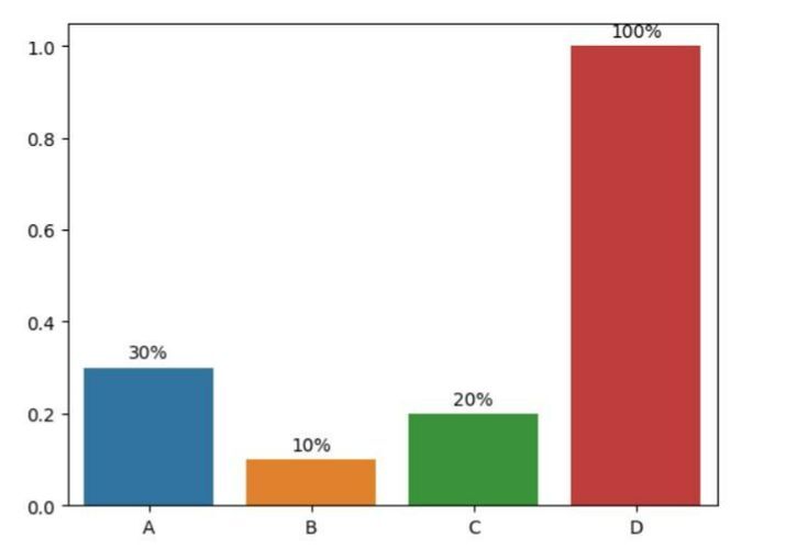
示例 3
在以下示例中,我們將顯示具有自定義格式的數值。透過匯入必要的模組 seaborn(用於建立條形圖)和 matplotlib.pyplot(用於顯示圖形)開始程式。然後定義 x 軸和 y 軸的資料。接下來,使用 sns.barplot() 建立條形圖,分別使用 x 和 y 作為 x 軸和 y 軸的引數。然後使用 for 迴圈迭代 y 軸資料,並使用 ax 物件的 text() 方法在條形圖內新增文字,並使用自定義格式。最後,使用 plt.show() 顯示圖形。
# Show values with custom formatting
import seaborn as sns
import matplotlib.pyplot as plt

# Data
x = ['A', 'B', 'C', 'D']
y = [0.3, 0.1, 0.2, 1]

# Create a barplot
ax = sns.barplot(x=x, y=y)

# Add values with custom formatting
for i, v in enumerate(y):
   ax.text(i, v + 0.02, f'{v:.0%}', ha='center')

plt.show()
輸出
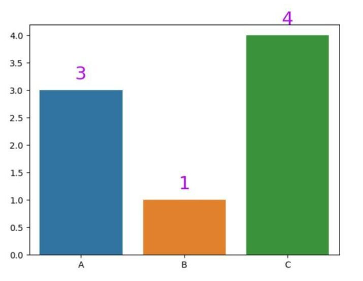
示例 4
在以下示例中,我們將顯示具有自定義顏色和字型大小的數值。我們將首先提及必要的模組 seaborn 和 matplotlib.pyplot。然後建立 x 軸和 y 軸的資料,並使用內建方法 barplot() 根據軸設定條形圖。然後使用 for 迴圈迭代 y 軸資料,並使用 ax 物件的 text() 方法在條形圖內新增文字,並使用自定義顏色和字型大小。最後,使用 show() 顯示圖形。
# Show values with custom color and font size
import seaborn as sns
import matplotlib.pyplot as plt

# Data
x_axes = ['A', 'B', 'C']
y_axes = [3, 1, 4]

# Create a barplot
ax = sns.barplot(x=x_axes, y=y_axes)

# Add values with custom color and font size
for i, v in enumerate(y):
   ax.text(i, v + 0.2, str(v), ha='center', color='#ab09eb', fontsize=21)

plt.show()
輸出
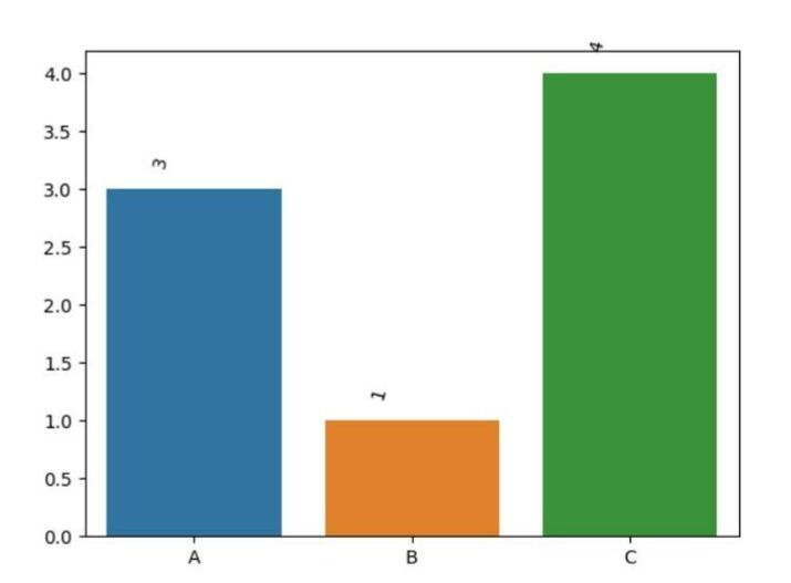
示例 5
在以下示例中,使用 seaborn 和 matplotlib 模組,此程式生成條形圖並在條形圖內顯示具有自定義位置和旋轉的數值。數值旋轉 45 度,並放置在每個條形圖中心的左側。
#Show values with custom position and rotation
import seaborn as sns
import matplotlib.pyplot as plt

# Data
x = ['A', 'B', 'C']
y = [3, 1, 4]

# Create a barplot
ax = sns.barplot(x=x, y=y)

# Add values with custom position and rotation
for i, v in enumerate(y):
   ax.text(i - 0.15, v + 0.2, str(v), ha='center', rotation=45)

plt.show()
輸出
結論
我們討論了表示 Seaborn 條形圖的不同方法。我們看到了 enumerate() 函式如何幫助新增計數器以進行迭代。然後我們看到了使用名為 ha、rotation、color 等引用的數值格式。這種型別的圖形通常用於資料科學和資料分析領域。

5K+ 閱讀量
