
 資料結構
資料結構 網路
網路 關係型資料庫管理系統
 作業系統
作業系統 Java
Java iOS
iOS HTML
HTML CSS
CSS Android
 Python
 C 語言程式設計
 C++
C++ C#
C# MongoDB
 MySQL
MySQL JavaScript
 PHP
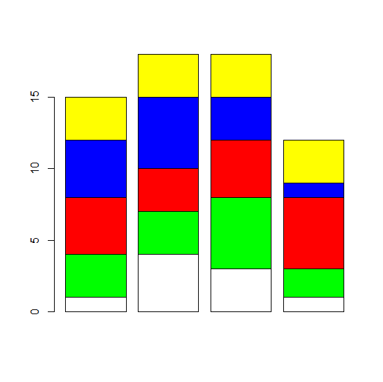
PHP如何使用 barplot 函式在 R 中建立每個條形具有唯一顏色的堆積條形圖?
在條形圖中,每個條形代表單個分類變數的一個類別,而在堆積條形圖中,條形代表相同的分類變數,但每個條形分為子類別。如果我們希望每個條形中顏色的分佈相似,則可以使用 barplot 函式的 col 引數。
示例1
M1<−matrix(sample(c(1:5),20,replace=TRUE),ncol=4)
M1
輸出
   [,1] [,2] [,3] [,4]
[1,] 4    3    5    3
[2,] 4    2    1    4
[3,] 5    5    2    3
[4,] 3    2    2    4
[5,] 1    5    2    5
示例
barplot(M1,col=rep(c("white","green","red","blue","yellow"),5))輸出
示例2
M2<−matrix(sample(c(26:30),20,replace=TRUE),ncol=4)
M2
[,1] [,2] [,3] [,4]
[1,] 28 27 27 29
[2,] 30 28 28 27
[3,] 28 28 30 29
[4,] 30 28 28 28
[5,] 26 28 29 30
示例
barplot(M2,col=rep(c("white","green","red","blue","yellow"),5))輸出

示例
M3<−matrix(rpois(20,5),ncol=4)
M3
輸出
[,1] [,2] [,3] [,4]
[1,] 6 8 4 5
[2,] 8 3 7 2
[3,] 5 4 4 2
[4,] 5 3 5 2
[5,] 6 5 2 3
示例
barplot(M3,col=rep(c("white","green","red","blue","yellow"),5))輸出

更新於: 2020 年 11 月 7 日
321 次瀏覽

廣告