
 資料結構
資料結構 網路
網路 關係型資料庫管理系統
 作業系統
作業系統 Java
Java iOS
iOS HTML
HTML CSS
CSS Android
 Python
 C 程式設計
 C++
C++ C#
C# MongoDB
 MySQL
MySQL Javascript
 PHP
PHP如何使用 Python Scikit-learn 建立樣本資料集?
在本教程中,我們將學習如何使用 Python Scikit-learn 建立樣本資料集。
Scikit-learn 有各種內建資料集,我們可以輕鬆地將其用於我們的機器學習模型,但有時我們需要一些玩具資料集。為此,scikit-learn Python 庫為我們提供了一個很棒的樣本資料集生成器。
使用 Scikit-Learn 建立樣本 Blob 資料集
要建立樣本 Blob 資料集,我們需要匯入sklearn.datsets.make_blobs,它非常快速且易於使用。
示例
在下面給出的示例中,讓我們看看如何使用此庫來建立樣本 Blob 資料集。
# Importing libraries
from sklearn.datasets import make_blobs

# Matplotlib for plotting the dataset blobs
from matplotlib import pyplot as plt
from matplotlib import style

# Set the figure size
plt.rcParams["figure.figsize"] = [7.50, 3.50]
plt.rcParams["figure.autolayout"] = True

# Creating Blob Test Datasets using sklearn.datasets.make_blobs

style.use("Solarize_Light2")

X, y = make_blobs(n_samples = 500, centers = 3,
      cluster_std = 1, n_features = 2)

plt.scatter(X[:, 0], X[:, 1], s = 20, color = 'red')
plt.xlabel("X-axis")
plt.ylabel("Y-axis")
plt.show()
輸出
它將產生以下輸出:

以上輸出顯示它從 500 個樣本中建立了 3 個 Blob。
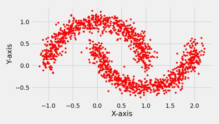
使用 Scikit-Learn 建立樣本月牙形資料集
要建立樣本月牙形資料集,我們需要匯入sklearn.datsets.male_moons,它非常快速且易於使用。
示例
在下面給出的示例中,讓我們看看如何使用此庫來建立樣本月牙形資料集。
# Importing libraries
from sklearn.datasets import make_moons

# Matplotlib for plotting the moon dataset
from matplotlib import pyplot as plt
from matplotlib import style

# Set the figure size
plt.rcParams["figure.figsize"] = [7.16, 3.50]
plt.rcParams["figure.autolayout"] = True

# Creating Moon Test Datasets using sklearn.datasets.make_moon
style.use("fivethirtyeight")
X, y = make_moons(n_samples = 1500, noise = 0.1)
plt.scatter(X[:, 0], X[:, 1], s = 15, color ='red')
plt.xlabel("X-axis")
plt.ylabel("Y-axis")
plt.show()
輸出
它將產生以下輸出
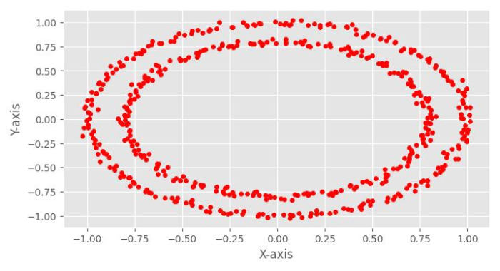
使用 Scikit-Learn 建立樣本圓形資料集
要建立樣本圓形資料集,我們需要匯入 sklearn.datsets.make_circles,它非常快速且易於使用。
示例
在下面給出的示例中,讓我們看看如何使用此庫來建立樣本圓形資料集。
# Importing libraries
from sklearn.datasets import make_circles

# Matplotlib for plotting the circle dataset
from matplotlib import pyplot as plt
from matplotlib import style

# Set the figure size
plt.rcParams["figure.figsize"] = [7.16, 3.50]
plt.rcParams["figure.autolayout"] = True

# Creating the circle Test Datasets using sklearn.datasets.make_circles
style.use("ggplot")
X, y = make_circles(n_samples = 500, noise = 0.02)
plt.scatter(X[:, 0], X[:, 1], s = 20, color ='red')
plt.xlabel("X-axis")
plt.ylabel("Y-axis")
plt.show()
輸出
它將產生以下輸出:

更新於: 2022年10月4日
711 次檢視

廣告