
 資料結構
資料結構 網路
網路 RDBMS
RDBMS 作業系統
作業系統 Java
Java iOS
iOS HTML
HTML CSS
CSS Android
 Python
 C 程式設計
 C++
C++ C#
C# MongoDB
 MySQL
MySQL Javascript
 PHP
PHP如何在 R 中將 ggplot2 圖形轉換成 plotly 圖形?
要在 R 中將 ggplot2 圖形轉換成 plotly 圖形,我們可以按以下步驟操作:
- 首先,建立資料框。
- 然後,建立 ggplot2 圖形並將其儲存在物件中。
- 之後,載入 plotly 包並使用 ggplotly 函式建立 ggplot2 圖形。
建立資料框
讓我們建立一個數據框,如下所示:
x<-rnorm(25)
y<-rnorm(25)
df<-data.frame(x,y)
df
執行時,上述指令碼將生成以下輸出(此輸出因系統上的隨機化而異):
輸出
         x          y
1 0.160361011 -0.88189510
2 0.771392061 0.69962247
3 -0.308439127 0.22427952
4 -0.837255067 0.67392311
5 0.495957782 1.04842600
6 -0.189008279 -0.77466960
7 -1.549495414 -0.19465584
8 -1.872725294 -0.33989568
9 1.940702795 -0.44784231
10 0.442866654 -1.39346251
11 -0.193691298 0.07398365
12 -0.476113218 1.09803808
13 -0.892223940 0.17936301
14 0.001449752 -0.30526590
15 -1.544441879 0.18589968
16 -1.815990647 0.35021341
17 -0.737028805 -1.20777165
18 -0.120356999 2.30394059
19 1.003978769 -0.10736088
20 0.443776893 0.08895760
21 1.403476566 -0.92807236
22 -1.182746347 1.90537257
23 0.706294800 0.12941663
24 -0.620933679 -0.83009552
25 -0.350476727 1.84697007
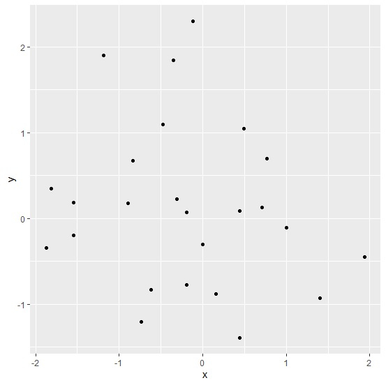
使用 ggplot2 建立圖形
載入 ggplot2 包並在 x 和 y 之間建立散點圖:
x<-rnorm(25)
y<-rnorm(25)
df<-data.frame(x,y)
library(ggplot2)
Plot<-ggplot(df,aes(x,y))+geom_point()
Plot
輸出
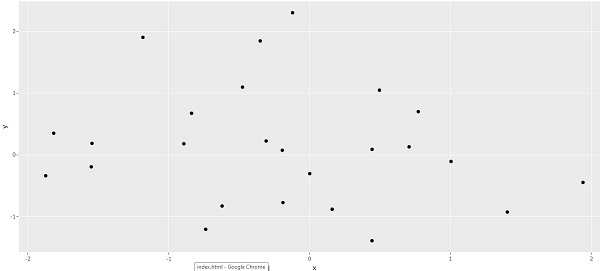
將 ggplot2 圖形轉換成 plotly 圖形
載入 plotly 包並使用 ggplotly 函式建立 ggplot2 圖形:
x<-rnorm(25)
y<-rnorm(25)
df<-data.frame(x,y)
library(ggplot2)
Plot<-ggplot(df,aes(x,y))+geom_point()
library(plotly)
ggplotly(Plot)
輸出

更新日期:2021 年 8 月 11 日
2 千次以上瀏覽

廣告