
 資料結構
資料結構 網路
網路 RDBMS
RDBMS 作業系統
作業系統 Java
Java MS Excel
 iOS
iOS HTML
HTML CSS
CSS Android
 Python
 C 程式設計
 C++
C++ C#
C# MongoDB
 MySQL
MySQL Javascript
 PHP
PHP 物理學
物理學 化學
化學 生物學
生物學 數學
數學 英語
英語 經濟學
經濟學 心理學
心理學 社會學
社會學 時尚研究
時尚研究 法律研究
法律研究使用 CSS 建立媒體相關樣式表
媒體相關樣式表是基礎樣式表,但僅在媒體型別與裝置型別匹配時才會應用於 html 文件。
我們可以透過以下方法建立媒體相關樣式表 -
- 使用 @media At 規則
- 使用 @import At 規則
- 在 HTML 中使用帶 media 屬性的 <link> 元素
示例
讓我們看一個建立媒體相關樣式表的示例 -
HTML 文件
<!DOCTYPE html>
<html>
<head>
<link rel="stylesheet" type="text/css" media="screen" href="screen.css">
<link rel="stylesheet" type="text/css" media="print" href="print.css">
</head>
<body>
<div></div>
</body>
</html>
CSS 文件 (screen.css)
div {
height: 50px;
width: 100px;
border-radius: 20%;
border: 2px solid blueviolet;
box-shadow: 22px 12px 3px 3px lightblue;
position: absolute;
left: 30%;
top: 20px;
}
CSS 文件 (print.css)
div {
   height: 50px;
   width: 100px;
   border-radius: 20%;
   border: 2px solid #dc3545;
   box-shadow: 22px 12px 3px 3px #dc3545;
   position: absolute;
   left: 30%;
   top: 20px;
}
輸出
這會產生以下輸出 -
當文件以螢幕媒體型別顯示時 -

當文件以列印媒體型別顯示時 -

示例
讓我們看另一個建立媒體相關樣式表的示例 -
<!DOCTYPE html>
<html>
<head>
<style type="text/css">
p {
background-origin: content-box;
background-repeat: no-repeat;
background-size: cover;
box-shadow: 0 0 3px black;
padding: 20px;
background-origin: border-box;
}
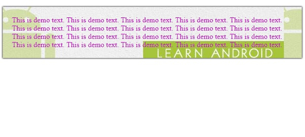
@media screen and (max-width: 900px) {
p{
background: url("https://tutorialspoint.tw/android/images/android.jpg");
color: #c303c3;
}
}
@media screen and (max-width: 500px) {
p {
color: black;
background: url("https://tutorialspoint.tw/react_native/images/react-native.jpg");
}
}
</style>
</head>
<body>
<p>This is demo text. This is demo text. This is demo text. This is demo text.
This is demo text. This is demo text. This is demo text. This is demo text.
This is demo text. This is demo text. This is demo text. This is demo text.
This is demo text. This is demo text. This is demo text. This is demo text.
This is demo text. This is demo text. This is demo text. This is demo text. </p>
</body>
</html>輸出
這會產生以下輸出 -
當螢幕寬度大於 500px 時 -
當螢幕寬度小於 500px 時 -


更新於:08-Jan-2020
197 次瀏覽

廣告