
 資料結構
資料結構 網路
網路 關係資料庫管理系統 (RDBMS)
 作業系統
作業系統 Java
Java MS Excel
 iOS
iOS HTML
HTML CSS
CSS Android
 Python
 C語言程式設計
 C++
C++ C#
C# MongoDB
 MySQL
MySQL Javascript
 PHP
PHP 物理學
物理學 化學
化學 生物學
生物學 數學
數學 英語
英語 經濟學
經濟學 心理學
心理學 社會學
社會學 服裝設計
服裝設計 法學
法學Flutter中的圓形和線性進度指示器
Flutter中的進度指示器是什麼?
進度指示器用於顯示Android應用程式中正在執行的特定任務的當前進度。如果我們正在從網際網路載入一些資料或進行API呼叫,在這種情況下,為了處理載入任務,我們在應用程式中顯示進度指示器,以告知使用者資料正在載入。我們可以在應用程式中顯示兩種型別的進度指示器。
線性進度指示器 - 此指示器用於顯示線性進度條,該進度條顯示任務的當前進度。
圓形進度指示器 - 此指示器類似於圓形進度條,用於顯示Android應用程式中特定任務的進度。
圓形和線性進度指示器的實現
我們將建立一個簡單的應用程式,用於在我們的Android應用程式中顯示圓形和線性進度指示器。我們將遵循循序漸進的指南,在Android應用程式中實現吐司訊息。
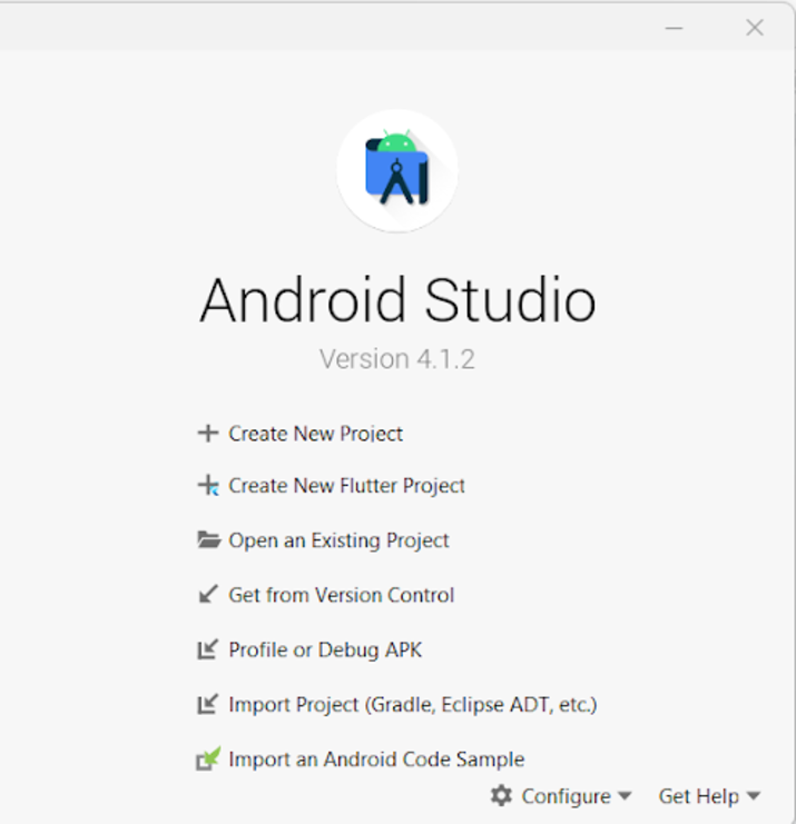
步驟1:在Android Studio中建立一個新的Flutter專案
導航到Android Studio,如下面的螢幕所示。在下面的螢幕中,單擊“新建專案”以建立一個新的Flutter專案。
單擊“新建專案”後,您將看到下面的螢幕。
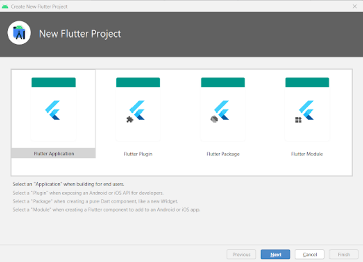
在此螢幕中,您必須選擇Flutter Application,然後單擊“下一步”,您將看到下面的螢幕。
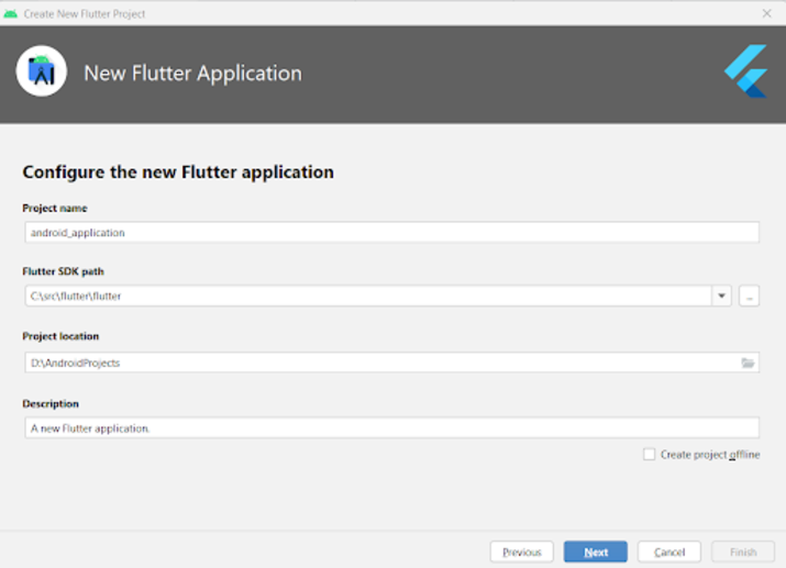
在此螢幕中,您必須指定專案名稱,然後只需單擊“下一步”。
步驟2:使用main.dart檔案
導航到您的專案>lib>main.dart檔案,並將以下程式碼新增到其中。程式碼中添加了註釋以便詳細瞭解。
import 'package:flutter/material.dart';

void main() {
   runApp(const MyApp());
}

class MyApp extends StatelessWidget {
   const MyApp({Key? key}) : super(key: key);

   @override
   Widget build(BuildContext context) {
      return MaterialApp(
         // on below line adding title for our application.
         title: 'Flutter Demo',
         // on below line specifying theme data for our application
         theme: ThemeData(
            primarySwatch: Colors.blue,
         ),
         // on below line calling our home page.
         home: MyHomePage(),
         // on below line disabling our debug check mode banner
         debugShowCheckedModeBanner: false,
      );
   }
}

class MyHomePage extends StatefulWidget {
   MyHomePage({Key? key}) : super(key: key);

   @override
   _MyHomePageState createState() => _MyHomePageState();
}

class _MyHomePageState extends State<MyHomePage>
with SingleTickerProviderStateMixin {

   @override
   Widget build(BuildContext context) {
      return Scaffold(
         // on below line creating app bar for our app
         appBar: AppBar(
            // specifying text in our app bar
            title: Text("Android Application"),
         ),
         // adding padding for it.
         body: Padding(
            padding: const EdgeInsets.all(16.0),
            // wrapping our column to center of screen.
            child: Center(
               child: Column(
                  // aligning column on below line.
                  crossAxisAlignment: CrossAxisAlignment.center,
                  mainAxisAlignment: MainAxisAlignment.center,
                  // specifying main axis size on below line.
                  mainAxisSize: MainAxisSize.min,
                  // creating childrens to be displayed on below line.
                  children: const <Widget>[
                     // creating a text for circular animation on below line.
                     Text(
                        "Progress Indicator in Flutter",
                        // specifying text alignment, max lines, style for our text
                        textAlign: TextAlign.center,
                        maxLines: 1,
                        style: TextStyle(
                           color: Colors.black,
                           fontSize: 20.0,
                           fontWeight: FontWeight.bold),
                     ),
                     // creating a sized box on below line.
                     SizedBox(
                        height: 30,
                     ),

                     Text(
                        "Linear Progress Indicator",
                        // specifying text alignment, max lines, style for our text
                        textAlign: TextAlign.center,
                        maxLines: 1,
                        style: TextStyle(
                           color: Colors.black,
                           fontSize: 20.0,
                           fontWeight: FontWeight.bold),
                     ),

                     SizedBox(
                        height: 20,
                     ),

                     // creating a linear progress bar on below line.
                     LinearProgressIndicator(),
                     // on below line creating a sized box
                     SizedBox(
                        height: 40,
                     ),
                     Text(
                        "Circular Progress Indicator",
                        // specifying text alignment, max lines, style for our text
                        textAlign: TextAlign.center,
                        maxLines: 1,
                        style: TextStyle(
                           color: Colors.black,
                           fontSize: 20.0,
                           fontWeight: FontWeight.bold),
                     ),
                     // on below line creating a sized box
                     SizedBox(
                        height: 20,
                     ),
                     // creating a circular progress bar on below line.
                     CircularProgressIndicator(),
                  ],
               ),
            ),
         ),
      );
   }
}
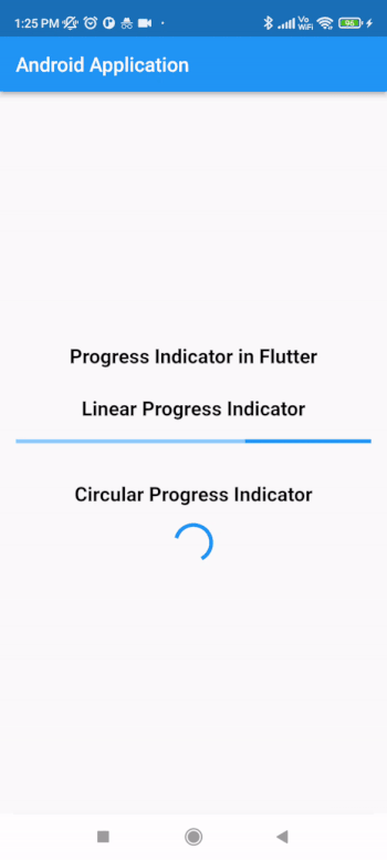
說明 - 在上面的程式碼中,我們可以看到main方法,在其中我們呼叫我們下面建立的MyApp類作為無狀態小部件。在這個無狀態小部件中,我們建立一個build方法,在其中我們返回我們的material app。在material app中,我們指定應用程式標題、應用程式主題、要顯示的主頁以及將除錯檢查模式橫幅設定為false。
之後,我們建立一個HomePage狀態方法,它將擴充套件HomePage的狀態。之後,我們建立一個build方法,在其中我們指定我們的app bar併為其新增標題。之後,我們為螢幕的四面新增填充。然後,我們將應用程式中的所有子項新增到螢幕的中心。在其中,我們指定列。在此列中,我們建立不同的子項,這些子項將垂直對齊。在此列中,我們首先建立一個文字小部件來顯示應用程式標題。
之後,我們建立一個sized box小部件來在兩個小部件之間新增間隙。然後,我們再次建立一個文字小部件,在其中顯示“線性進度指示器”文字。之後,我們指定一個sized box,然後建立我們的線性進度指示器。建立此線性進度指示器後,我們再次指定一個sized box,然後建立一個文字小部件來顯示“圓形進度指示器”文字。在此小部件之後,我們建立一個sized box並顯示一個圓形進度指示器。
新增上述程式碼後,現在我們只需單擊頂欄中的綠色圖示即可在移動裝置上執行我們的應用程式。
注意 - 確保您已連線到您的真實裝置或模擬器。
結論
在本教程中,我們學習了Flutter中的進度指示器是什麼,以及如何在Flutter應用程式中使用圓形和線性進度指示器。

1K+ 次瀏覽
