
 資料結構
資料結構 網路
網路 關係資料庫管理系統
 作業系統
作業系統 Java
Java MS Excel
 iOS
iOS HTML
HTML CSS
CSS Android
 Python
 C 程式設計
 C++
C++ C#
C# MongoDB
 MySQL
MySQL Javascript
 PHP
PHP 物理學
物理學 化學
化學 生物學
生物學 數學
數學 英語
英語 經濟學
經濟學 心理學
心理學 社會學
社會學 服裝設計
服裝設計 法律研究
法律研究Flexbox 的 `min-width` 和 `max-width` 宣告在 Safari 上不起作用?為什麼?
為了使 Flexbox 在所有 網路瀏覽器 上都能正常工作,請使用 min-width 和 max-width 的 Flex 等效項。例如,對於以下情況 -
min-width: 40%;
max-width: 40%;
使用 CSS 簡寫屬性。它將 flex-grow | flex-shrink | flex-basis 指定為如下語法所示 -
flex: flex-grow flex-shrink flex-basis|auto;
對於上述情況,我們可以設定 Flex 為 -
flex: 0 0 40%;
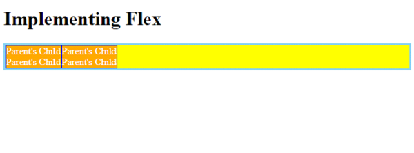
現在讓我們來看一個在所有網路瀏覽器上都能正常工作的 Flexbox 示例。我們在父 div `parentBox` 內有兩個 div -
<div class='parentBox'>
   <div class='childBox'>
      <div class='babyChildBox'>Parent's Child</div>
      <div class='babyChildBox'>Parent's Child</div>
   </div>
   <! - - -
   !-->
</div>
父容器的樣式。我們使用了 CSS Flex 簡寫屬性 -
.parentBox {
   display: flex;
   flex: 1 0 100%;
   background-color:yellow;
   border: 3px solid skyblue;
}
對於子元素,即 `childBox`,我們再次使用了簡寫屬性來設定彈性專案上的彈性長度 -
.childBox {
   flex: 1 1 50%
   background-color: green;
   color: white;
   border: 1px solid blue;
}
上面 .childBox 中的巢狀子元素設定為 Flex。這以及以上內容嵌套了 Flex 容器 -
.babyChildBox {
   flex: 1 1 50%;
   background-color: orange;
}
示例
以下是完整的示例 -
<!DOCTYPE html>
<html>
<head>
   <style>
      .parentBox {
         display: flex;
         flex: 1 0 100%;
         background-color:yellow;
         border: 3px solid skyblue;
      }
      .childBox {
         flex: 1 1 50%
         background-color: green;
         color: white;
         border: 1px solid blue;
      }
      .babyChildBox {
         flex: 1 1 50%;
         background-color: orange;
      }
   </style>
</head>
<body>
<h1>Implementing Flex</h1>
<div class='parentBox'>
   <div class='childBox'>
      <div class='babyChildBox'>Parent's Child</div>
      <div class='babyChildBox'>Parent's Child</div>
   </div>
   <div class='childBox'>
      <div class='babyChildBox'>Parent's Child</div>
      <div class='babyChildBox'>Parent's Child</div>
   </div>
</div>
</body>
</html>
輸出

更新於: 2023-11-24
2K+ 次瀏覽

廣告