
 資料結構
資料結構 網路
網路 關係型資料庫管理系統 (RDBMS)
 作業系統
作業系統 Java
Java MS Excel
 iOS
iOS HTML
HTML CSS
CSS Android
 Python
 C 程式設計
 C++
C++ C#
C# MongoDB
 MySQL
MySQL Javascript
 PHP
PHP 物理學
物理學 化學
化學 生物學
生物學 數學
數學 英語
英語 經濟學
經濟學 心理學
心理學 社會學
社會學 服裝設計
服裝設計 法學
法學帶不同顏色的標準 Android 按鈕?
本例演示瞭如何建立帶不同顏色的標準 Android 按鈕。
步驟 1 − 在 Android Studio 中建立一個新專案,轉到檔案 ⇒ 新建專案,並填寫所有必需的詳細資訊以建立新專案。
步驟 2 − 將以下程式碼新增到 res/layout/activity_main.xml。
<?xml version = "1.0" encoding = "utf-8"?>
<LinearLayout xmlns:android = "http://schemas.android.com/apk/res/android"
   xmlns:app = "http://schemas.android.com/apk/res-auto"
   xmlns:tools = "http://schemas.android.com/tools"
   android:layout_width = "match_parent"
   android:gravity = "center"
   android:layout_height = "match_parent"
   tools:context = ".MainActivity"
   android:orientation = "vertical">
   <Button
      android:id = "@+id/parcleObject"
      android:layout_width = "wrap_content"
      android:layout_height = "wrap_content"
      android:layout_alignParentTop = "true"
      android:layout_centerHorizontal = "true"
      android:layout_marginTop = "27dp"
      android:background = "@drawable/background"
      android:text = "Click here"/>
</LinearLayout>
在上面的程式碼中,我們使用了按鈕檢視來顯示不同的顏色。
步驟 3 − 將以下程式碼新增到 drawable/background.xml
<?xml version = "1.0" encoding = "utf-8"?>
<selector
   xmlns:android = "http://schemas.android.com/apk/res/android">
   <item android:state_pressed = "true" >
      <shape>
         <gradient
            android:startColor = "#f0ff00"
            android:endColor = "#d9dd95"
            android:angle = "270" />
         <stroke
            android:width = "3dp"
            android:color = "#d1d3e3" />
         <corners
            android:radius = "3dp" />
         <padding
            android:left = "10dp"
            android:top = "10dp"
            android:right = "10dp"
            android:bottom = "10dp" />
      </shape>
   </item>
   <item android:state_focused = "true" >
      <shape>
         <gradient
            android:endColor = "#fd5900"
            android:startColor = "#eca680"
            android:angle = "270" />
         <stroke
            android:width = "3dp"
            android:color = "#d1d3e3" />
         <corners
            android:radius = "3dp" />
         <padding
            android:left = "10dp"
            android:top = "10dp"
            android:right = "10dp"
            android:bottom = "10dp" />
      </shape>
   </item>
   <item>
      <shape>
         <gradient
            android:endColor = "#4356e7"
            android:startColor = "#a1aaee"
            android:angle = "270" />
         <stroke
            android:width = "3dp"
            android:color = "#d1d3e3" />
         <corners
            android:radius = "3dp" />
         <padding
            android:left = "10dp"
            android:top = "10dp"
            android:right = "10dp"
            android:bottom = "10dp" />
      </shape>
   </item>
</selector>
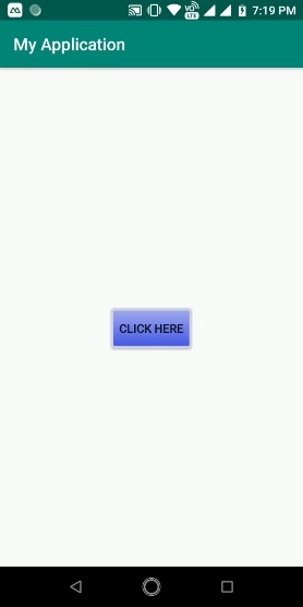
讓我們嘗試執行您的應用程式。我假設您已將實際的 Android 移動裝置連線到您的計算機。要在 Android Studio 中執行應用程式,請開啟專案的某個活動檔案,然後單擊執行  工具欄中的圖示。選擇您的移動裝置作為選項,然後檢查您的移動裝置,它將顯示您的預設螢幕 –
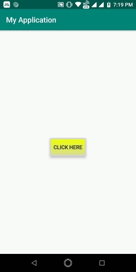
現在點選按鈕,結果將如下所示 –
點選 這裡 下載專案程式碼

更新於:2019年7月30日
356 次瀏覽

廣告