


如何用 Python 結合多張圖表
導言
Matplotlib 允許在同一個圖表中新增多個繪圖。在本教程中,我將向你展示如何使用兩個不同的軸線將資料顯示在同一個繪圖中。
如何操作
1. 安裝 matplotlib,開啟 Python 命令提示符並啟動 pip install matplotlib。
import matplotlib.pyplot as plt
2. 準備要顯示的資料。
import matplotlib.pyplot as plt

# data prep (I made up data no accuracy in these stats)
mobile = ['Iphone','Galaxy','Pixel']

# Data for the mobile units sold for 4 Quaters in Million
units_sold = (('2016',12,8,6),
('2017',14,10,7),
('2018',16,12,8),
('2019',18,14,10),
('2020',20,16,5),)
3. 將資料拆分為每個公司的手機單元的陣列。
# data prep - splitting the data
Years, IPhone_Sales, Galaxy_Sales, Pixel_Sales = zip(*units_sold)

# set the position
Position = list(range(len(units_sold)))

# set the width
Width = 0.2
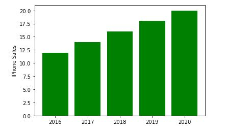
4. 建立第一個子繪圖。
plt.subplot(2, 1, 1)
<matplotlib.axes._subplots.AxesSubplot at 0x214185d4e50>
5. 使用有關 IPhone_Sales 的資訊建立一個條形圖。
Iphone = plt.bar(Position, IPhone_Sales,color='green')
plt.ylabel('IPhone Sales')
plt.xticks(Position, Years)
([<matplotlib.axis.XTick at 0x214186115e0>, <matplotlib.axis.XTick at 0x21418611580>, <matplotlib.axis.XTick at 0x2141861fc40>, <matplotlib.axis.XTick at 0x21418654e20>, <matplotlib.axis.XTick at 0x2141865f370>], [Text(0, 0, '2016'), Text(0, 0, '2017'), Text(0, 0, '2018'), Text(0, 0, '2019'), Text(0, 0, '2020')])
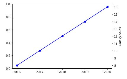
6. 現在建立另一個 y 軸以新增有關三星 Galaxy 銷量的資訊。
plt.twinx()
Galaxy = plt.plot(Position, Galaxy_Sales, 'o-', color='blue')
plt.ylabel('Galaxy Sales')
plt.xticks(Position, Years)
([<matplotlib.axis.XTick at 0x214186b4c40>, <matplotlib.axis.XTick at 0x214186b4c10>, <matplotlib.axis.XTick at 0x21418682ac0>, <matplotlib.axis.XTick at 0x214186dd8e0>, <matplotlib.axis.XTick at 0x214186dddf0>], [Text(0, 0, '2016'), Text(0, 0, '2017'), Text(0, 0, '2018'), Text(0, 0, '2019'), Text(0, 0, '2020')])
7. 我們現在將繪製最終的 Google Pixel 銷量。
plt.subplot(2, 1, 2)
plt.plot(Position, Pixel_Sales, color='yellow')
plt.gca().set_ylim(ymin=0)
plt.xticks(Position, Years)
([<matplotlib.axis.XTick at 0x2141870f9a0>,
<matplotlib.axis.XTick at 0x2141870f580>,
<matplotlib.axis.XTick at 0x2141870a730>,
<matplotlib.axis.XTick at 0x2141873c9d0>,
<matplotlib.axis.XTick at 0x2141873cee0>],
[Text(0, 0, '2016'),
Text(0, 0, '2017'),
Text(0, 0, '2018'),
Text(0, 0, '2019'),
Text(0, 0, '2020')])
![]()
plt.show()
示例
8. 將所有內容放在一起並儲存圖表。
import matplotlib.pyplot as plt

# data prep (I made up data no accuracy in these stats)
mobile = ['Iphone','Galaxy','Pixel']

# Data for the mobile units sold for 4 Quaters in Million
units_sold = (('2016',12,8,6),
('2017',14,10,7),
('2018',16,12,8),
('2019',18,14,10),
('2020',20,16,5),)
# data prep - splitting the data
Years, IPhone_Sales, Galaxy_Sales, Pixel_Sales = zip(*units_sold)

# set the position
Position = list(range(len(units_sold)))

# set the width
Width = 0.2

plt.subplot(2, 1, 1)
Iphone = plt.bar(Position, IPhone_Sales,color='green')
plt.ylabel('IPhone Sales')
plt.xticks(Position, Years)

plt.twinx()
Galaxy = plt.plot(Position, Galaxy_Sales, 'o-', color='blue')
plt.ylabel('Galaxy Sales')
plt.xticks(Position, Years)

plt.subplot(2, 1, 2)
plt.plot(Position, Pixel_Sales, color='yellow')
plt.ylabel('Pixel Sales')
plt.gca().set_ylim(ymin=0)
plt.xticks(Position, Years)

# plt.show()
plt.savefig('CombiningGraphs.png', dpi=72)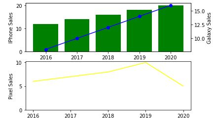

更新時間: 2020-11-10
18K+ 瀏覽量

廣告