
 資料結構
資料結構 網路
網路 RDBMS
RDBMS 作業系統
作業系統 Java
Java iOS
iOS HTML
HTML CSS
CSS Android
 Python
 C 程式設計
 C++
C++ C#
C# MongoDB
 MySQL
MySQL Javascript
 PHP
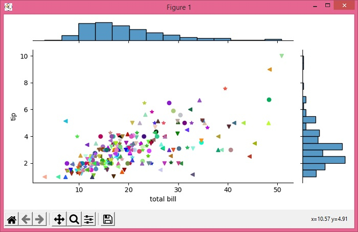
PHP使用 Seaborn jointplot 更改每個點的顏色和標記
若要使用 Seaborn jointplot 更改每個點的顏色和標記,我們可以採取以下步驟 -
設定圖形大小並調整子圖之間和周圍的邊距。
從線上儲存庫載入示例資料集(需要網際網路)。
使用 jointplot() 方法繪製提示資料。
使用 cla() 方法清除當前軸。
列出每個點的顏色和標記。
使用 set_axis_labels() 方法設定軸標籤。
若要顯示圖形,請使用 show() 方法。
示例
from matplotlib import pyplot as plt
import seaborn as sns
import numpy as np

plt.rcParams["figure.figsize"] = [7.50, 3.50]
plt.rcParams["figure.autolayout"] = True

tips = sns.load_dataset("tips")
g = sns.jointplot("total_bill", "tip", data=tips, height=4.50)

g.ax_joint.cla()

colors = np.random.random((len(tips), 3))
markers = ['v', '^', '<', '*', 'o'] * 100

for i, row in enumerate(tips.values):
   g.ax_joint.plot(row[0], row[1], color=colors[i], marker=markers[i])

g.set_axis_labels('total bill', 'tip', fontsize=10)
plt.show()
輸出

更新於: 2021 年 6 月 3 日
903 次瀏覽

廣告