
 資料結構
資料結構 網路
網路 RDBMS
RDBMS 作業系統
作業系統 Java
Java MS Excel
 iOS
iOS HTML
HTML CSS
CSS Android
 Python
 C 程式設計
 C++
C++ C#
C# MongoDB
 MySQL
MySQL Javascript
 PHP
PHP 物理學
物理學 化學
化學 生物學
生物學 數學
數學 英語
英語 經濟學
經濟學 心理學
心理學 社會學
社會學 時尚研究
時尚研究 法學研究
法學研究巢狀 flex 容器時正確使用 flex 屬性
Flex 容器始終是父級,而 flex 項始終是子級。flex 格式化上下文的範圍僅限於父級/子級關係。
flex 容器的後代(子級除外)不屬於 flex 佈局,不會接受 flex 屬性。有些 flex 屬性僅適用於 flex 容器 −
- justify-content,
- flex-wrap 和
- flex-direction
有些 flex 屬性僅適用於 flex 項”
- align-self
- flex-grow
- flex
始終對父級應用 display: flex 或 display: inline-flex,以便對子級應用 flex 屬性。
接下來,我們舉一個例子。在父級 div parentBox 內,我們有兩個 div −
<div class='parentBox'>
   <div class='childBox'>
      <div class='babyChildBox'>Parent's Child</div>
      <div class='babyChildBox'>Parent's Child</div>
   </div>
      <! - - -

      !-->
</div>
父容器的樣式。我們已使用 CSS Flex 簡寫屬性 −
.parentBox {
   display: flex;
   flex: 1 0 100%;
   background-color:yellow;
   border: 3px solid skyblue;
}
對於子級,即 childBox,我們再次使用簡寫屬性為靈活項設定靈活長度 −
.childBox {
   flex: 1 1 50%
   background-color: green;
   color: white;
   border: 1px solid blue;
}
上面 .childBox 中的巢狀子級設定為 Flex。這與上面巢狀 flex 容器相關 −
.babyChildBox {
   flex: 1 1 50%;
   background-color: orange;
}
示例
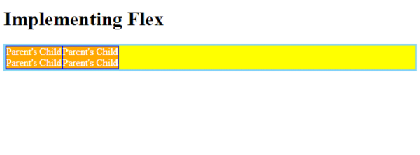
現在,讓我們看一個完整示例,以正確巢狀 flex 容器 −
<!DOCTYPE html>
<html>
<head>
   <style>
      .parentBox {
         display: flex;
         flex: 1 0 100%;
         background-color:yellow;
         border: 3px solid skyblue;
      }
      .childBox {
         flex: 1 1 50%
         background-color: green;
         color: white;
         border: 1px solid blue;
      }
      .babyChildBox {
         flex: 1 1 50%;
         background-color: orange;
      }
   </style>
</head>
<body>
   <h1>Implementing Flex</h1>
   <div class='parentBox'>
      <div class='childBox'>
         <div class='babyChildBox'>Parent's Child</div>
         <div class='babyChildBox'>Parent's Child</div>
      </div>
      <div class='childBox'>
         <div class='babyChildBox'>Parent's Child</div>
         <div class='babyChildBox'>Parent's Child</div>
      </div>
   </div>
</body>
</html>
輸出

更新於: 2022 年 12 月 6 日
1K次瀏覽

廣告