
 資料結構
資料結構 網路協議
網路協議 RDBMS
RDBMS 作業系統
作業系統 Java
Java MS Excel
 iOS
iOS HTML
HTML CSS
CSS Android
 Python
 C 程式設計
 C++
C++ C#
C# MongoDB
 MySQL
MySQL Javascript
 PHP
PHP 物理
物理 化學
化學 生物
生物 數學
數學 英語
英語 經濟
經濟 心理學
心理學 社會學
社會學 時尚學
時尚學 法律學
法律學.justify-content-*-start 類
在 Bootstrap 中使用 justify-content-start 類來對內容開頭進行排列。
Bootstrap 中的 justify-content-*-start 類用於在開頭對內容進行排列,在小、中、大等不同螢幕尺寸中實現的效果如下 -
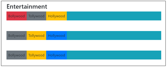
你可以嘗試執行以下程式碼來實現 justify-content-*-start 類 -
示例
<!DOCTYPE html>
<html lang="en">
  <head>
    <title>Bootstrap Example</title>
    <meta charset="utf-8">
    <meta name="viewport" content="width=device-width, initial-scale=1">
    <link rel="stylesheet" href="https://maxcdn.bootstrapcdn.com/bootstrap/4.1.0/css/bootstrap.min.css">
    <script src="https://ajax.googleapis.com/ajax/libs/jquery/3.3.1/jquery.min.js"></script>
    <script src="https://maxcdn.bootstrapcdn.com/bootstrap/4.1.0/js/bootstrap.min.js"></script>
  </head>

<body>

  <div class="container mt-3">
    <h3>Entertainment</h3>
    <div class="d-flex justify-content-sm-start bg-info mb-5">
      <div class="p-2 bg-danger">Bollywood</div>
      <div class="p-2 bg-secondary">Tollywood</div>
      <div class="p-2 bg-warning">Hollywood</div>
    </div>
    <div class="d-flex justify-content-md-start bg-info mb-5">
      <div class="p-2 bg-secondary">Bollywood</div>
      <div class="p-2 bg-warning">Tollywood</div>
      <div class="p-2 bg-primary">Hollywood</div>
    </div>
    <div class="d-flex justify-content-lg-start bg-info mb-5">
       <div class="p-2 bg-secondary">Bollywood</div>
       <div class="p-2 bg-warning">Tollywood</div>
       <div class="p-2 bg-primary">Hollywood</div>
    </div>
  </div>

</body>
</html>

更新日期: 18-Jun-2020
195 次瀏覽

廣告